Sherwin-Williams Alabaster
This Post May Contain Affiliate Links. Please Read Our Disclosure PolicyLooking for the perfect warm white paint? Sherwin-Williams Alabaster (SW 7008) is a timeless off-white that strikes the perfect balance between warmth and neutrality. With soft, creamy undertones, it creates a cozy, inviting atmosphere without feeling too yellow. Whether you’re painting walls, trim, or cabinets, Alabaster offers a fresh, bright backdrop that pairs beautifully with both cool and warm tones.
In a world where stark whites and minimalism have become the norm, spaces are looking more and more sterile. But Alabaster by Sherwin Williams has a creamy, yellowish base that makes it super cozy and inviting.
That being said, it may not be the right paint for every space. So today, we’re taking a deep dive into all things Alabaster.
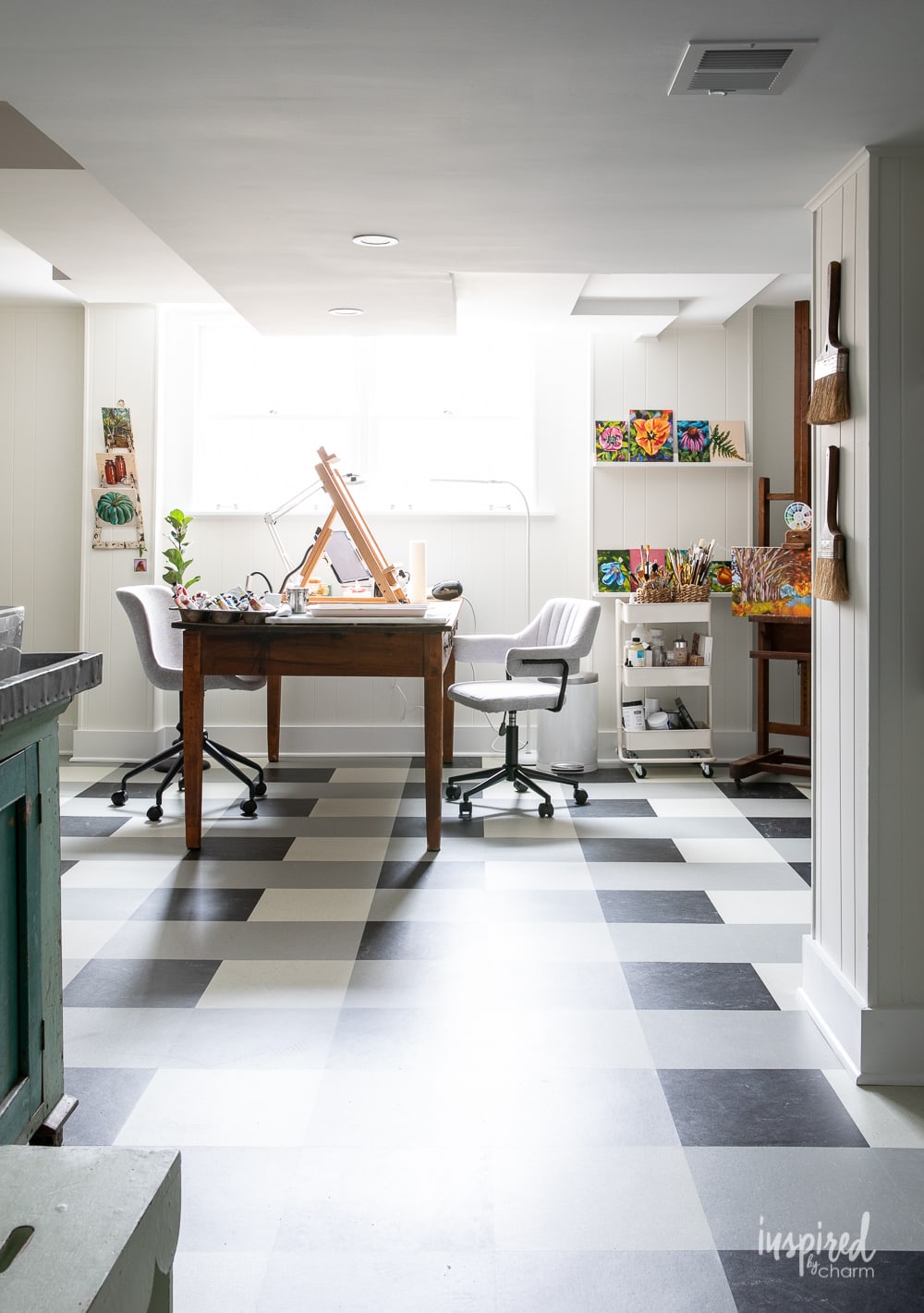
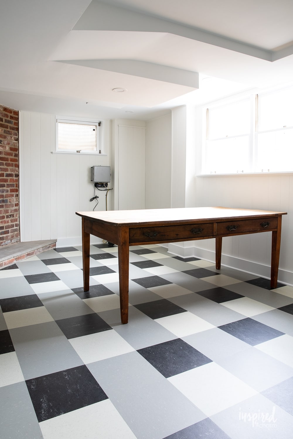
I’ll be upfront and say that I personally love Sherwin-Williams Alabaster so much that I even used it in my basement to paint the paneling for my art studio. Paired with Sherwin-Williams Extra White, the space has ample brightness to highlight all of my creations and let them really pop.
Alabaster gives you this amazing clear canvas for any and all of your furnishings while adding warmth and coziness to the space. Kind of ideal, right?
Wondering if this creamy off-white is right for your space?
Let’s find out!
What Color is Sherwin-Williams Alabaster?
Named after the soft mineral used for carving masterpieces, SW Alabaster is a bright and balanced white with a definite warm quality.
Sherwin Williams describes this Alabaster color as cozy and peaceful, and in my opinion, they hit the nail on the head.
I chose to include this white in my home because I wanted a bright neutral space that wasn’t a stark white. Alabaster has a touch of creamy warmth which gives a bit of personality to such a neutral shade.
Originally, this area had this orange wood paneling that made the space feel very dark and dated, especially because it’s in a basement that gets limited light.
Now, Alabaster brought this room back to life, making the space feel bigger and brighter. The result was kind of shocking (in a great way!). I’m super happy with the color choice and still love it to this day.
If you’re looking to incorporate Alabaster or any new color into your space, make sure to check out my post on How to Choose Paint Colors. It’ll give you tips on finding complementary colors, visualizing the paint in your space, and more!
Undertones
Paint undertones are just as important as the base color and have a big effect on the overall mood of a room.
They take a neutral paint color from “just white” and make it warm or clean, crisp or soft.
Undertones range from cool to warm, with the coolest undertones having a heavy blue influence and warmer undertones including more yellow or red. Neutral undertones have a good mix.
This alabaster color is a warm white with slightly yellow undertones. The undertones veer towards neutral-warm, keeping the color from looking overly yellow with just a hint of cream as you can see in the photos.
LRV
Another important aspect of any paint color is the LRV, also called the light reflectance value. This scale ranges from 0-100, measuring how much light is absorbed or reflected by a color.
Basically, the higher the number, the brighter the color is. Think of 100 as pure stark white and 0 as the darkest of blacks. The 100 is going to reflect a ton more light!
Sherwin-Williams Alabaster is an 82 on the scale, meaning it reflects a significant amount of light. I love using highly reflective colors in north-facing rooms or spaces like basements where there is less natural light present.
A high LRV will help prevent your space from looking dark and dungeon-y. I used Alabaster in my basement to create a bright effect without the stark qualities of an ultra-crisp white.
Where To Use
In all honesty, Sherwin-Williams Alabaster can pretty much do it all!
This off-white paint would look soft and welcoming in any space. Because it’s so neutral, it looks great on trim, molding, and ceilings for a clean look.
For kitchens, this would be a wonderful cabinet color, particularly when paired with intricate tiling and warm-toned woods.
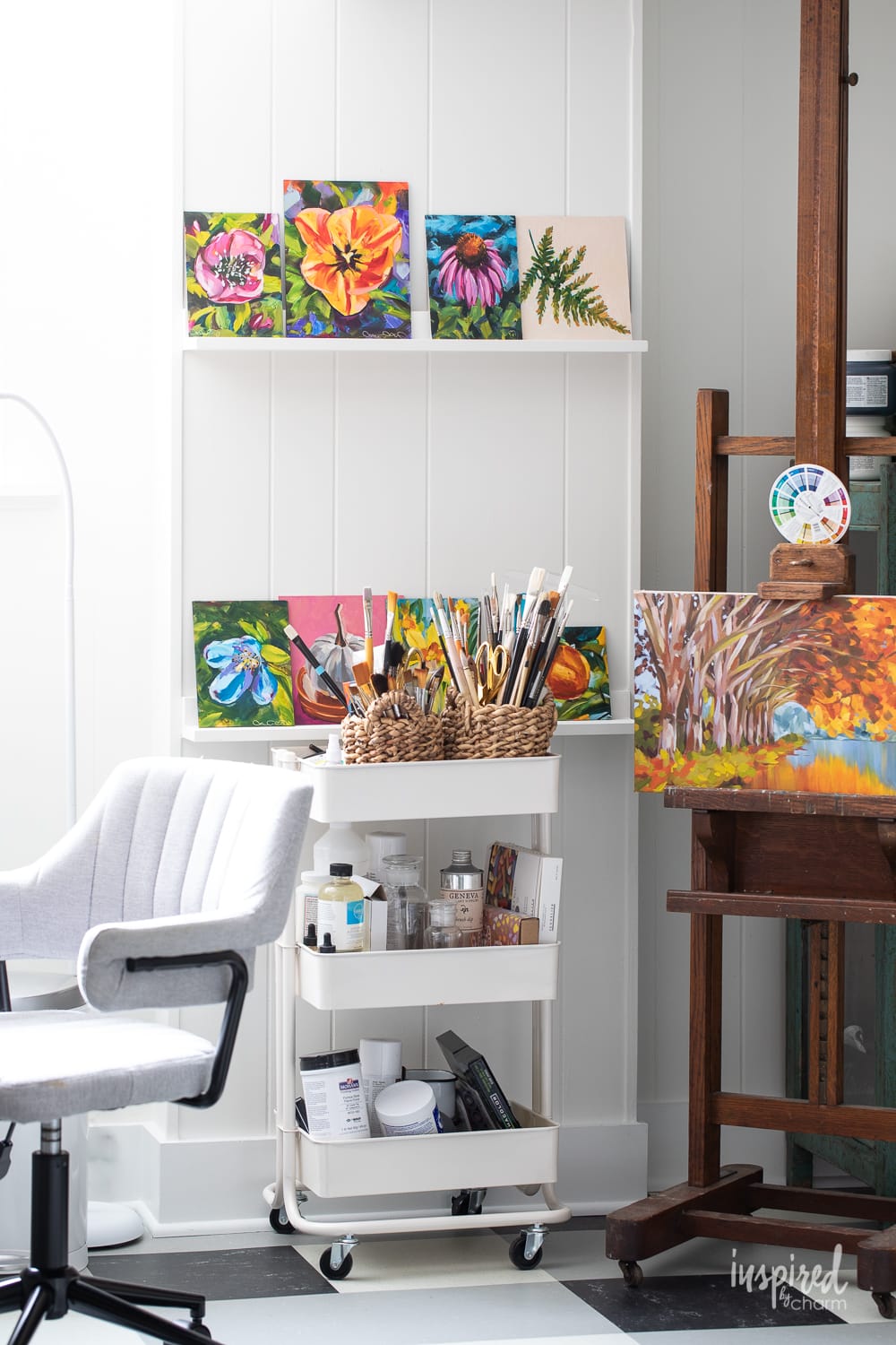
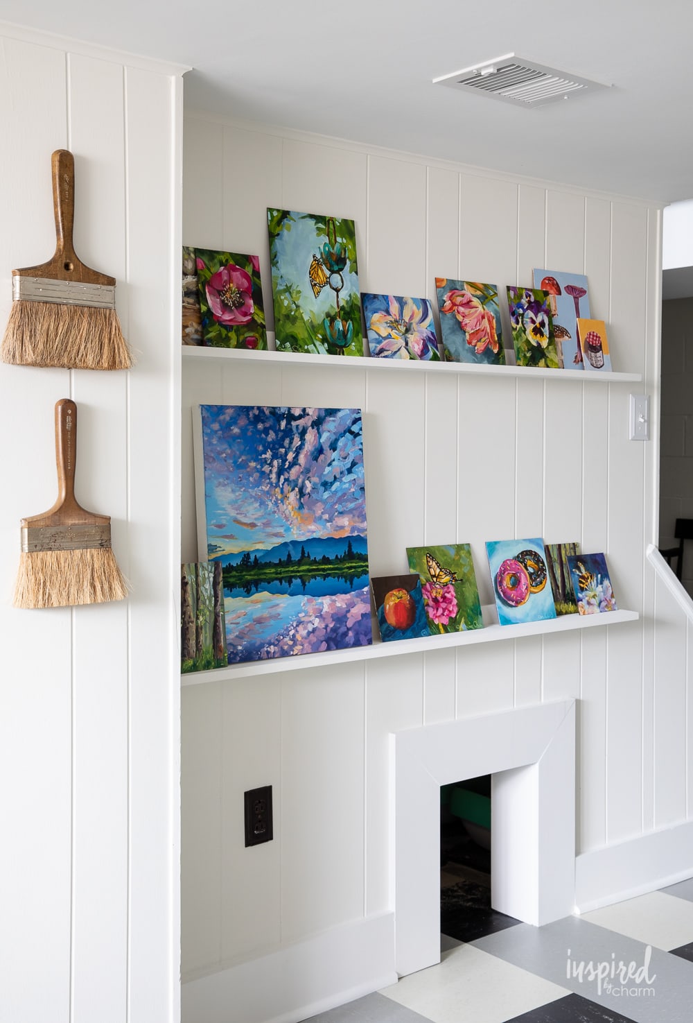
This alabaster color also creates a clean base for walls, inviting artwork, and exciting furnishings of all sorts to shine.
As I mentioned, I used this color to paint the paneling in my basement/art studio as part of my basement renovation.
It was incredibly important for me to choose a white tone for this space because it’s where I create my art. Having this simple base allows my art to shine, and I don’t have to worry about any surrounding colors affecting the way my art looks.
Take a look at the DIY Picture Ledges in my Art Studio. The warm white combined with bright white trim is the perfect combination for showcasing my creations!
💌 SAVE THIS POST / RECIPE!
Complementary Colors
Alabaster is a true neutral, looking great with a variety of colors. It’s actually hard to go wrong here!
My recommendations
In my own home, I chose to pair it with a bright white trim for a totally clean slate. This pairing really lets Alabaster pop, showing off its subtle warmth in contrast.
In general, Alabaster looks good with bright whites for a lifted, polished look. Try complementary whites like:
- Bright White SW 7007 – clean and radiant with a blue undertone
- Extra White SW 7006 – crisp and highly reflective
Warm browns and beiges play up its warm undertones for a natural, homey feel. Think about subtle, woodsy shades like:
- Natural Linen SW 9109 – light, warm, and breezy greige
- Antler Velvet SW 9111 – soft, warm, and nature-inspired
When paired with soft greens or blues, Alabaster looks peaceful and tranquil. Try pairing it with subtle gray-blues and greens like:
- Farrow and Ball Pigeon Number 25 – neutral blue-gray with major green notes
- Sea Salt SW 6204 – muted and cool-toned with blue undertones
- Sage SW 2860 – earthy gray-green
Finally, silver adds a cool-toned effect for a bit of contrast. This will make Alabaster appear more beige. Try a stunning silver like:
- Silver Strand SW 7057 – green-gray, misty, and ethereal with cool undertones
- Magnetic Gray SW 7058 – a slightly deeper gray with balanced cyan and green undertones
Sherwin Williams recommends
On their website, Sherwin Williams recommends several shades to pair with Alabaster. It was their 2016 color of the year, but don’t let that year scare you! Alabaster is a timeless neutral that remains current, especially when paired with these colors.
Neutrals
Whether you want to keep things monochromatic or add a deep woodsy brown, these are some of the best complimentary neutrals:
- Townhall Tan SW 7690 – warm, mid-toned tan with yellow undertones
- Dakota Wheat SW 9023 – yellow beige with a strong warm influence
- Wool Skein SW 6148 – beige khaki with warm undertones
- Doeskin SW 6004 – warm, soft, and muted for a gentle taupe
- Gray Area SW 7052 – earth-toned warm gray
- Urbane Bronze SW 7048 – deep, nature-inspired brown-gray
Bright Additions
Sure, neutrals are tried-and-true. But color is where you can add a burst of personality and joy to a space. These are Sherwin Williams’s top colorful picks:
- Billowy Breeze SW 9055 – meditative blue with sea-green undertones
- Retro Mint – SW 9036 – vintage-inspired pastel mint
- Antique Red SW 7587 – strong brick red
- Vintage Gold – yellow gold that can look both neutral and vivid depending on lighting
Colors similar to Sherwin-Williams Alabaster
Because Sherwin-Williams is so hugely popular in the interior design space, you might want to pick something slightly different.
In addition, sometimes a paint color is SO close to being right, but something is just a little bit off. Usually, this is because of the undertones or LRV.
These paint colors are all super close to Sherwin-Williams Alabaster, with slight tweaks that may make it more appropriate for your space.
Whether you need something slightly cooler-toned, a higher light reflectance value, or a more affordable price point, try any of these similar paint colors.
- White Dove BM OC-17 – This color is super similar, with a slightly brighter white and high LRV. It’s also a teeny bit more cool-toned and gray, though it still has a distinct warm influence.
- Greek Villa SW 7551 – This paint has warmer, yellow-beige undertones and is described as a “sunny white.”
- Alabaster BM OC-129 – Though it shares the name, this Alabaster has pink undertones and a higher, more reflective LRV.
- Pure White SW 7005 – This is a soft and gentle white that doesn’t have as yellow or creamy of a finish.
- Cloud White BM OC-130 – Lighter with taupe undertones, this paint is less creamy with a brighter white.
- Swiss Coffee BM OC-45 – This color is warm and creamy with just a hint of green undertone.
- Dune White BM OC-968 – This paint has grayish-green undertones with a lower LRV.
- Silver Leaf BEHR W-F-720 – Despite its cool-toned name, this off-white is neutral and balanced.
- Snowbound SW 7004 – This soft white has slightly gray undertones and reads crisp, yet warm.
Final Thoughts
Alabaster is a fan-favorite shade for its warmth and inviting nature within an incredibly versatile color. It’s a perfect example of how beautiful a well-made neutral can be.
It is just what my basement/art studio needed to bring light and life to the space.
More Paint Color You Will Love
- Sherwin-Williams Agreeable Gray – the best “greige” shade
- Farrow & Ball Pigeon No. 25 – neutral blue-gray with hints of green
- Sherwin-Williams Naval – the ultimate navy blue
- Sherwin-Williams Sage – my favorite green paint
- Sherwin-Williams Rock Candy – pastel blue off-white color
I’d love to hear your thoughts on this Sherwin-Williams paint. Could you see Alabaster in your own home? Let me know in the comments down below!
Want more from Inspired by Charm? Join the IBC Mailing List for inspiration in your inbox! Follow along on Instagram and TikTok for daily updates and behind-the-scenes looks at my processes. There’s even more inspiration on Facebook and Pinterest!
Wondering about this for exterior stucco? My husband doesn’t want white thats too yellow…..
Doing a dark charcoal trim but need to add a third gray trim color.
Just come over and pick it for me🥰
I love the alabaster walls in the bright, white trim. What color is your ceiling? My whole house needs a fresh paint job from its outdated color scheme.