Farrow & Ball Pigeon No. 25
This Post May Contain Affiliate Links. Please Read Our Disclosure Policy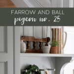
Looking for a pretty shade that is far from ordinary? Take a look at Farrow & Ball Pigeon, a neutral blue-grey (with hints of green) that transforms based on your space.
Pigeon is one of Farrow and Ball’s most popular paint colors, and for good reason. This supposed “neutral” adds a touch of color that elevates pretty much any space.
While it’s toted as a “cozy and nostalgic blue-grey,” Pigeon has a shapeshifting color that morphs throughout different spaces and light exposures.
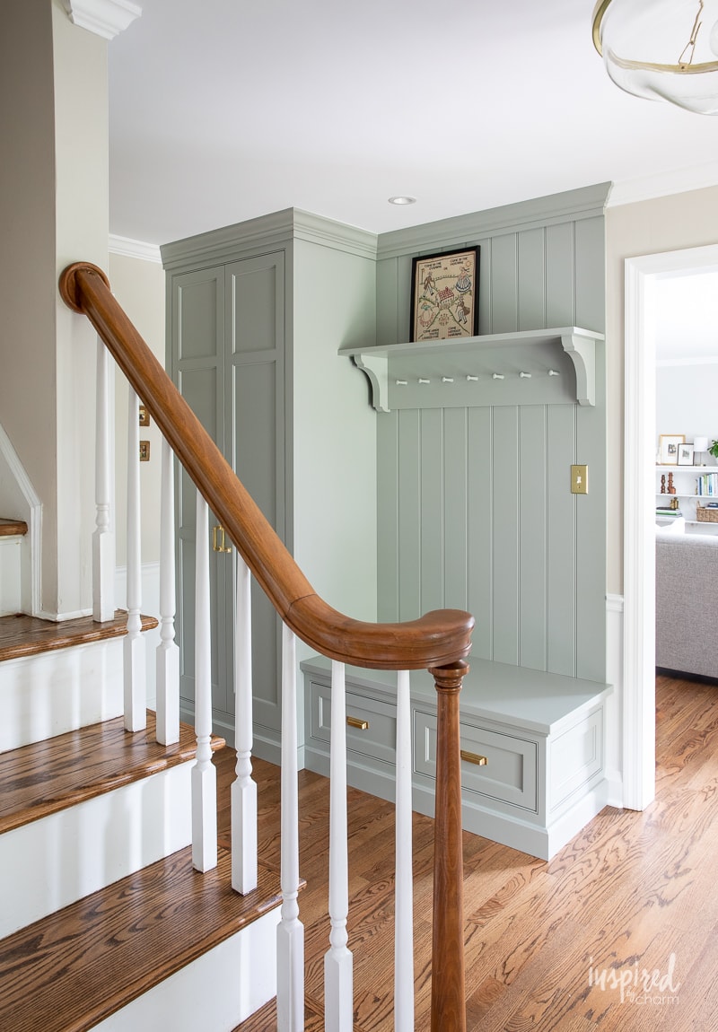
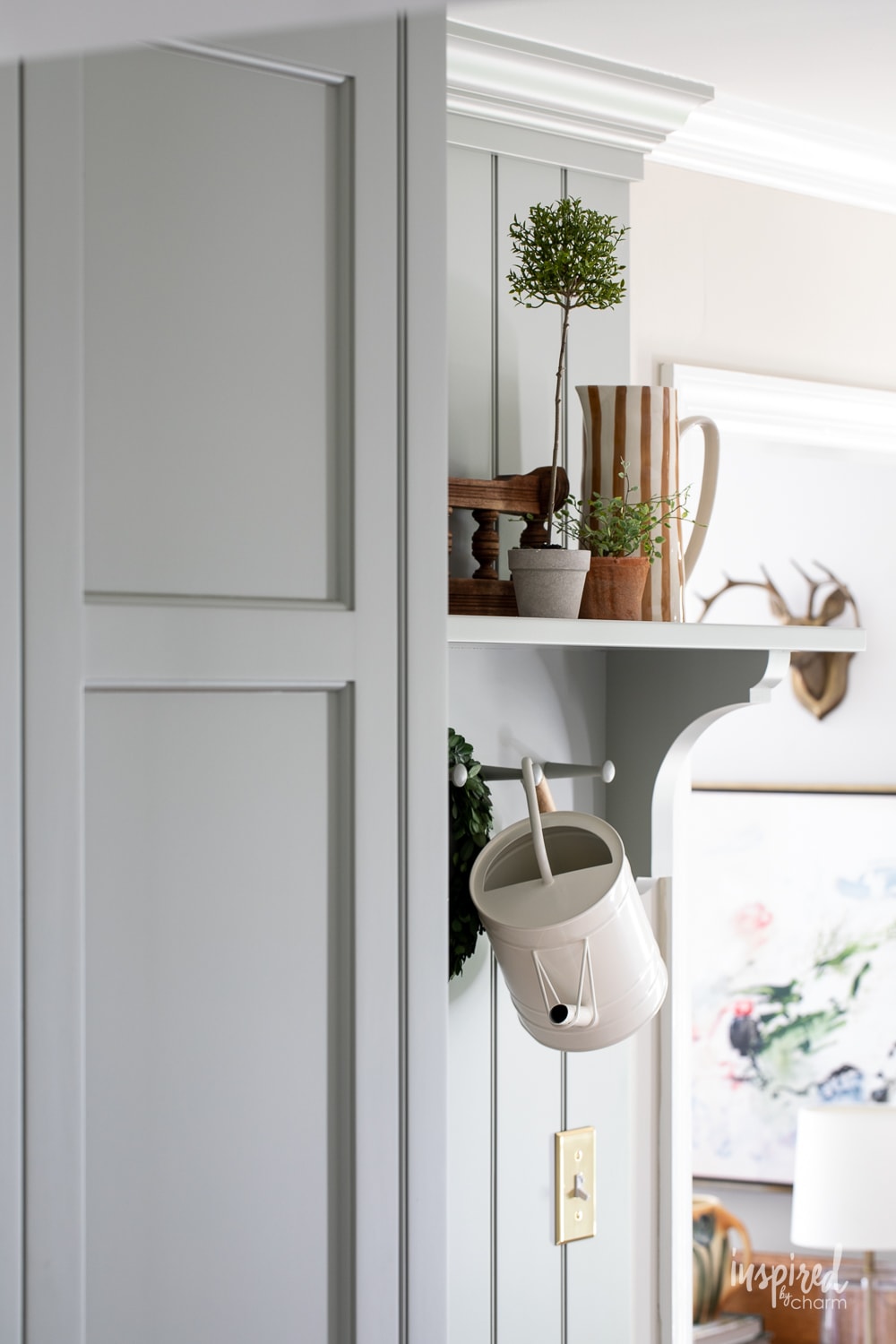
Personally, I love it so much that it made the cut as one of the paint colors in my own home. I even gave it a spot of honor in my entry room—the Pigeon custom cabinetry is one of the first things you see when you walk in.
It makes the perfect welcoming statement in my home, and it could in yours too.
So without further ado, let’s explore Pigeon!
What color is Farrow and Ball Pigeon No.25?
This is a tough question to answer! While it’s labeled (and used) as a lovely blue-grey or neutral, Farrow and Ball Pigeon looks surprisingly green when swatched.
Pigeon is an absolute chameleon when it comes to shade possibilities, changing based on space, light, time of day, and coordinating decor colors.
For example, coordinating blue, green, or neutral decor will pick up and enhance those colors in your paint.
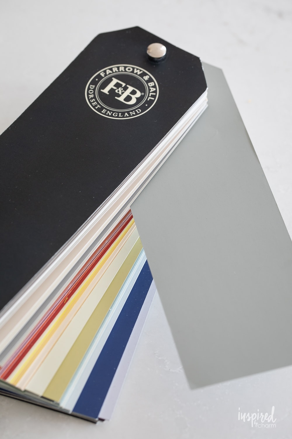
Because it’s really hard to say how this shade will look in your own actual space, you’ll absolutely want to swatch this one on your own walls before you commit. You can order a sample can of paint through Farrow and Ball—I know the extra step may seem annoying, but I promise it’s worth it!
Once it’s swatched, you’ll want to watch and see how it looks throughout the day. You may even want to see how the color morphs throughout the week based on changing weather. You’ll want to love your paint on all days – sunny and overcast!
And yes, in case you were wondering, this shade is named after the soft grey bird.
Undertones
No color is just “blue-grey” – several colors go into making this special shade.
That’s where undertones come in.
Undertones refer to the underlying colors beneath a color. Undertones give paint warm, cool, or neutral effects. For example, heavy red and yellow undertones lean warm, blue undertones lean cool, and a balanced mix leans neutral.
For Farrow & Ball Pigeon, there are clear blue and green undertones giving it a neutral effect that can be enhanced based on complimentary paint colors chosen and the direction of natural light.
The red component of this shade, however, is what makes it truly unique! There’s a subtle yet prominent red undertone that actually leans towards a warm shade. This is pretty unique for a blue-gray paint, which is almost always cool-toned.
Need a visual of how undertones work? I use this paint shade in my north-facing entryway, and I find that the grey quickly shifts to green when my front door is open; the cooler north-facing light really allows that green to peek through.
LRV
While LRV is not always considered when choosing a new paint color, it can make a big difference in a space—don’t forget to consider it!
LRV, or Light Reflective Value, measures how much light is reflected from the paint. It’s measured on a scale from 0 (pure black) to 100 (pure white).
Reading the scale is pretty straightforward. Higher numbers reflect more light, and lower numbers produce a darker effect.
Farrow and Ball Pigeon has an LRV of 35, which is considered medium dark to dark.
This means it’s going to reflect less light giving a room a calmer, darker effect. If your space gets lots of natural light, this is a great choice. There will be some reflective light, but the sun will do most of the heavy lifting.
On the flip side, if your room lacks natural lighting, Pigeon could end up looking quite a bit darker than you’re expecting.
Where to use
The Pigeon Farrow and Ball shade is neutral enough to work in most spaces while still letting that subtle green hue wink through for extra charm.
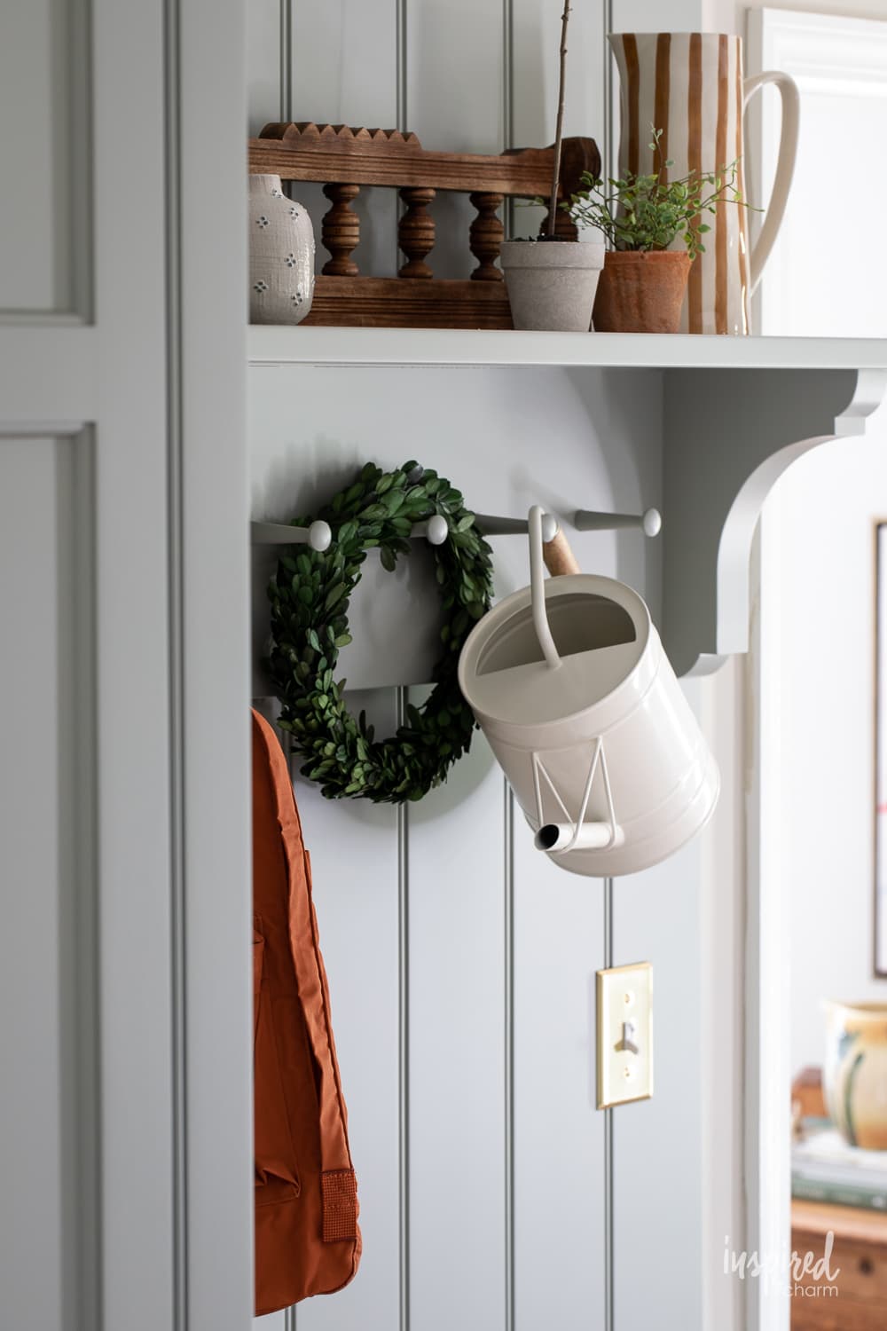
The most popular spot I see Pigeon in is cabinetry. That’s where I chose to use it myself, after all! 😉
I chose this shade for my custom entryway cabinets. The space gets an ample bout of north-facing light when my front door is open, which really draws out the paint’s green undertones.
My entryway changes consistently throughout the year, decorated differently based on the season and upcoming holidays.
💌 SAVE THIS POST / RECIPE!
Check out how my entryway changes from Halloween to Christmas time. Each holiday requires drastically different color palettes that both look at home here because Pigeon is so neutral.
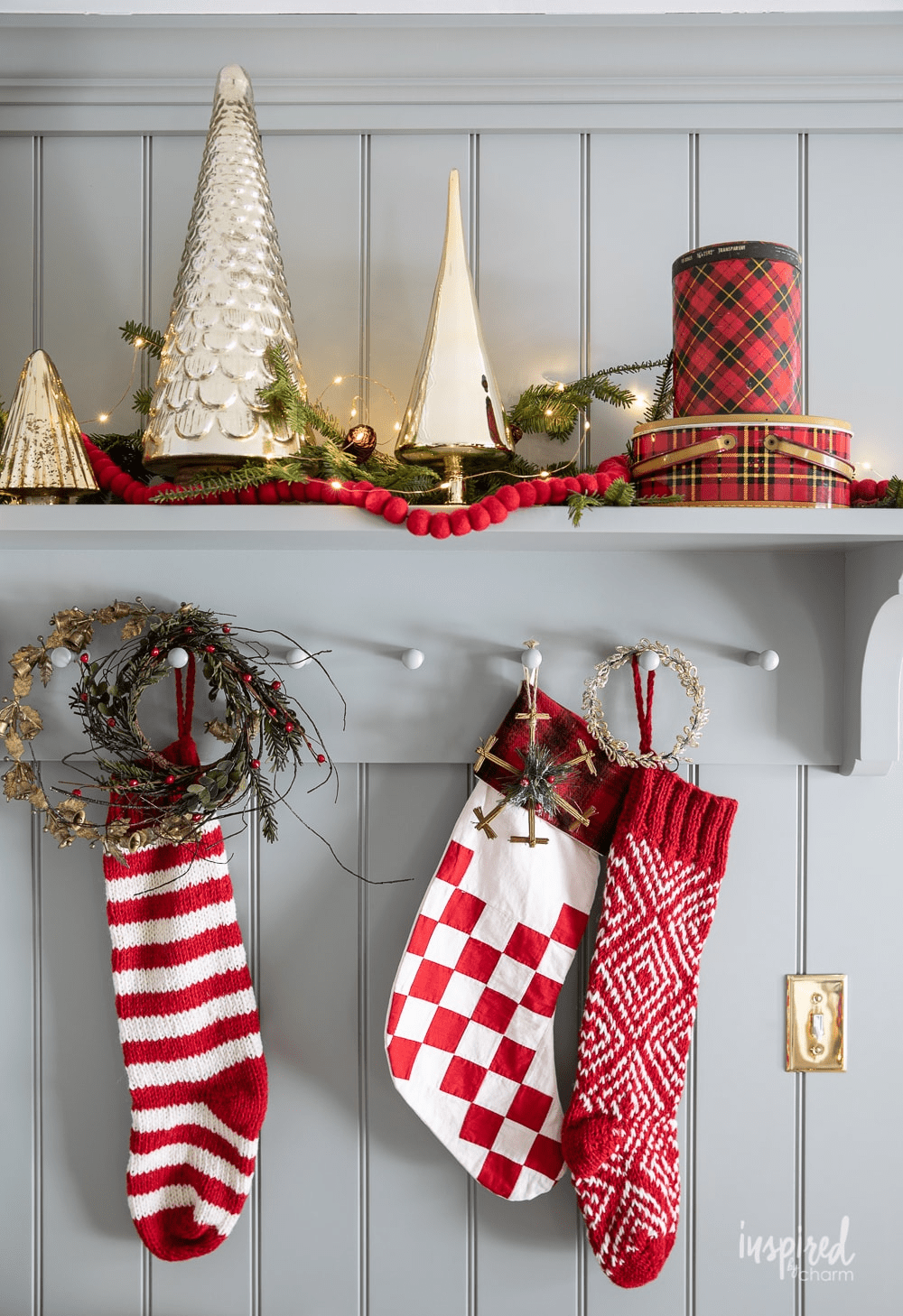
And because it has green undertones that are amplified from the north-facing light, it looks interesting enough on its own; it doesn’t require those extra decorations or pops of color to shine.
I’ve also seen a lot of beautiful kitchen cabinetry in Pigeon—particularly islands. I love the pop the color gives against a background of white cabinetry!
Pigeon would also look incredible on the walls of an office or living space. It’s a shade that lives with you, looking bright against the natural light, calming and darkening as the day progresses.
Complementary colors
If you’re looking to keep things light and airy, Pigeon pairs well with light shades like Sherwin Williams Alabaster, Farrow and Ball Dimpse, or Farrow and Ball School House White.
For a darker, moody appeal, try accent colors like Farrow and Ball Blue Gray or Salon Drab.
And, if you feel like playing with color, a brilliant accent or trim shade can add a ton of personality to your space with very little effort.
Picture Gallery Red from Farrow and Ball would be a really bold choice. But, it plays on Pigeon’s warm undertones while adding intense depth to the space.
Farrow and Ball Hague Blue is strong and slightly moody when paired with Pigeon, perfect for a den or office space.
I originally had my entryway painted Farrow and Ball Stiffkey Blue, and Pigeon did work against the blue backdrop. That being said, I ended up wanting Pigeon to pop more, and ended up re-painting the entryway to a more neutral color (and like it much better).
This photo is also a great example of those undertones and lighting—do you see how the color shifts from left to right as the shadows fall?
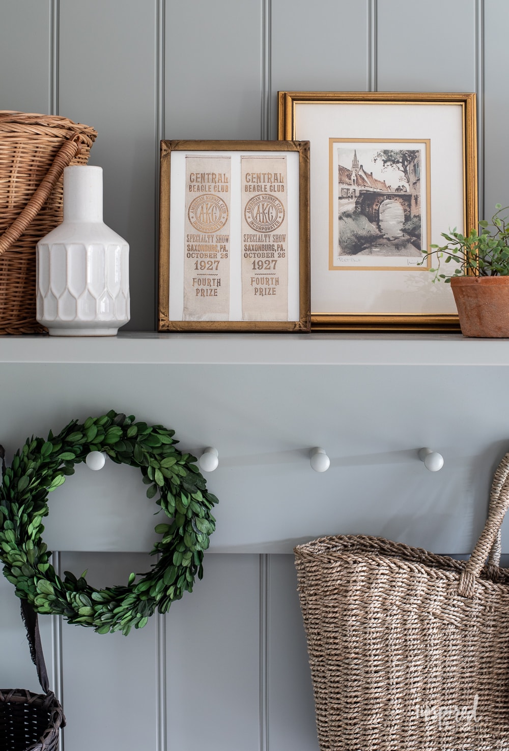
When I re-painted my entryway a few months ago, I let Farrow and Ball Pigeon be the star of the show by keeping the complimentary paints clean and neutral.
This is my personal favorite look for Pigeon. I chose Farrow and Ball Shaded White No. 201 for the walls and Sherwin-Williams Extra White SW7006 for the trim. The effect is bright and welcoming – which is my ideal for an entryway!
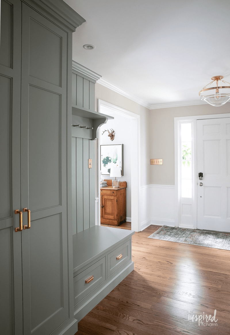
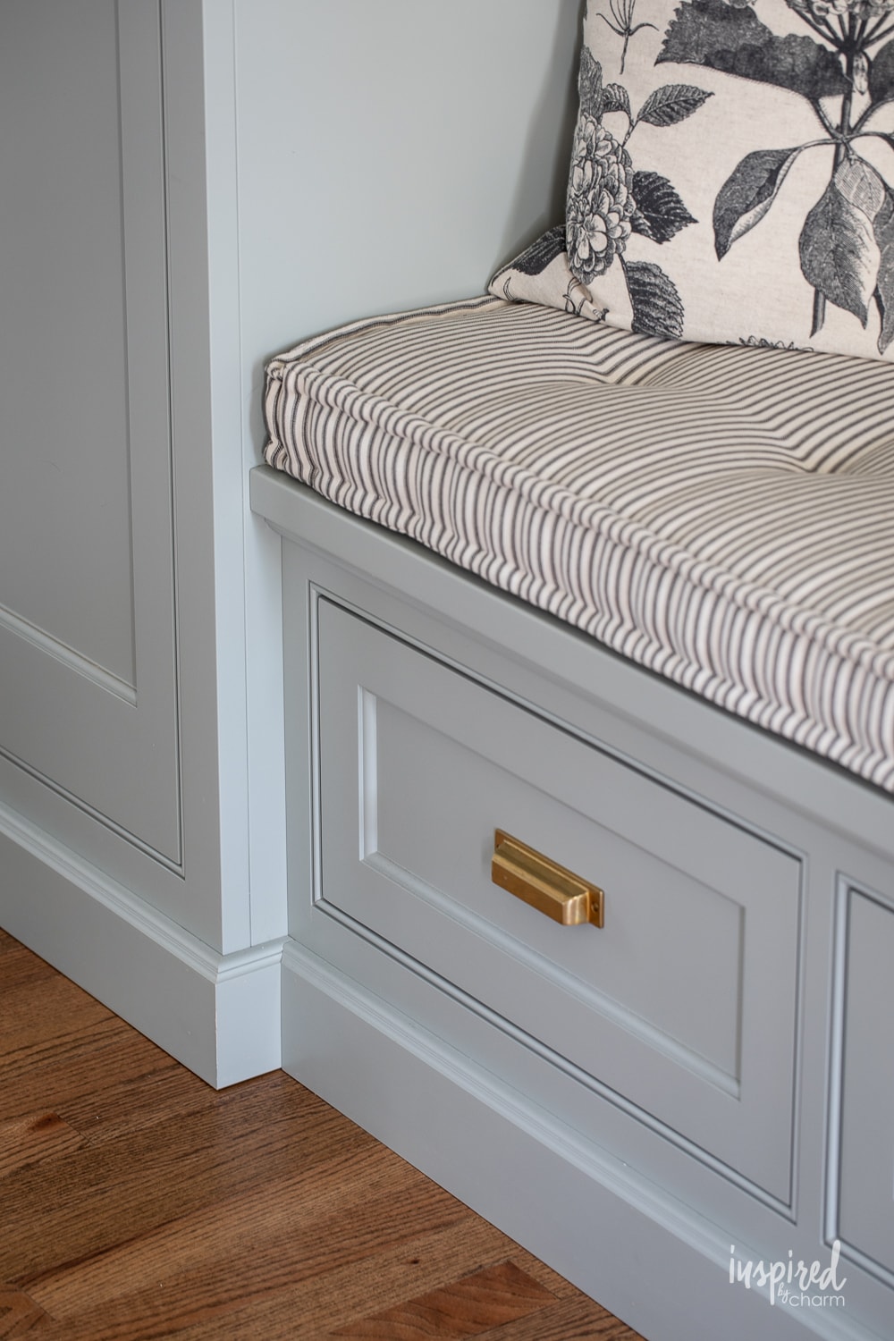
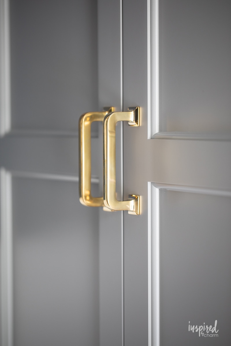
For hardware, brass looks incredible when paired with this soft green-gray, which is the route I went. I like the vintage vibes and how the gold pops!
Matte black hardware would also look stunning for a more contemporary look.
Warm wood tones compliment the shade well, picking up on some of those red undertones and providing a cozy feel to the space. You can see that in the photo above also!
Colors similar to Farrow and Ball Pigeon No. 25
Pigeon is a one-of-a-kind shade because of its transformative properties – from blue to gray to green, this paint does it all.
That being said, it’s not necessarily the right choice for every home. Here are some similar paint choices that could better fit your needs.
These paint shades fit into a variety of budgets and vary slightly from Pigeon. Use them to find the perfect paint color for your space (and don’t forget to SWATCH!):
- BEHR Urban Nature – In the green color family, Urban Nature is slightly greener than Pigeon. It’s also a more budget-friendly option.
- Benjamin Moore Heather Gray – Called a medium gray with sage undertones, this popular color is very similar to Pigeon, once again looking slightly greener under most lights.
- Benjamin Moore Arctic Shadows – This shade is cooler-toned than Pigeon with an icy effect. It’s a mid-toned neutral with green undertones.
- Benjamin Moore Aganthus Green – This medium celadon green is super soft with added chalky grey tones. If you’re a fan of the sage green trend but want to keep things neutral, this is a great shade choice.
- Benjamin Moore Oil Cloth – Deeper than Pigeon, this green-gray changes based on north or south-facing light. It tends to look grayer in south-facing rooms and greener in north-facing rooms.
- Sherwin Williams Acacia Haze – If you’re a die-hard Sherwin Williams fan, Acacia Haze is a great Pigeon dupe. Suitable for interiors and exteriors, this is a medium green shade with slate-blue undertones.
- Sherwin Williams Rushing River – For a slightly more neutral option, Rushing River provides just a hint of green to a muted gray base; it’s similar to Pigeon while having cooler undertones.
Final thoughts
Overall, Farrow and Ball Pigeon is a special color that deserves way more credit than its “neutral” label.
Transformative in nature, Pigeon can look green, grey, blue, or even beige under the right conditions. Play with this shade by adding fun, coordinating colors to bring out the undertones of your choice.
From office spaces to living rooms to welcoming entryways, Pigeon looks at home in just about any space it’s used.
Still, because of its chameleon-like color changing, you should definitely swatch this shade in your home before committing to a gallon or two. There’s no telling what the effects may be!
More Paint Colors You May Love:
- Agreeable Gray – the “best” gray paint color
- North Star – sophisticated blue-gray
- Naval – the ultimate navy paint
- See All The Paint Colors in My Home
Do you think Farrow and Ball Pigeon is the right color for your space? Let me know in the comment section below.
Want more from Inspired by Charm? Join the IBC Mailing List for inspiration in your inbox! Follow along on Instagram and TikTok for daily updates and behind-the-scenes looks at my processes. There’s even more inspiration on Facebook and Pinterest!
Nice photos and interesting comments about how Pigeon is affected by light and shade. I think it’s a really useful and attractive colour. I’ve just used it in the vestibule of my house, and now wondering about taking it through to hallway/stairs/landings. But I have a 4 storey house and Pigeon looks different on every wall of each storey! I may change to Mizzle for darker storeys. I have oak floors and will do Wimborne White ceilings and wood. May use a little orangey/red for runners or something.
Love your post on Farrow & Ball Pigeon. We just used the color to paint our Living Room, a small space off the kitchen with vaulted ceilings, wood beams, and a fireplace. We love the color but are struggling to select the upholstery color. Do you have any recommendation on how to highlight those gorgeous walls with decor? Thank you!
Can Pigeon be used in a Mexican home living room with gray/tan floor tiles including terra red accents tiles. This as adjacent to a new kitchen done with gray/white backsplash. It is my favorite color in my home in Wisconsin.
I love the color and that cabinetry is beautiful!! What a lovely home you have!