Sherwin-Williams Naval
This Post May Contain Affiliate Links. Please Read Our Disclosure PolicyThere are few colors as classic as crisp navy blue – and Sherwin-Williams Naval is a fan favorite that may just be the ultimate navy shade.
Poetically inspired by the dark waters at sea, Naval by Sherwin Williams is a dark blue with an incredible amount of depth. It’s somehow both simultaneously moody and calming and is the perfect shade to make a big visual impact while also blending seamlessly into your space.
If this shade rings a bell, it might be because Sherwin Williams named it their 2020 color of the year, and the shade’s popularity absolutely exploded.
Years later, it’s still going strong. And for a good reason!
Navy has serious staying power. It acts like a neutral, can be paired with almost anything, and is so much more interesting than a stark black (and less drastic!). Don’t believe me? Just think about your favorite pair of dark wash denim!
Because of the above, I knew Naval was the perfect shade to try in my own home (but more on that in a moment!).
With stormy undertones and incredible pairing potential, let’s dive in and find out if SW Naval is the right blue for your space!
Sherwin Williams Naval (SW6244) is described as a deep blue with stormy gray-green undertones. It’s dark and deep, much like the unknown depths of the midnight sea. Poetic, right?
While it is very close to a true navy, green and gray tones make this shade totally nautical, adding a unique twist to the color. I think the green-gray depths give this blue a touch of whimsy, making it a much more interesting shade than your typical navy.
While I’m totally into this color, I have to be a good friend and give a word of caution: you’ve got to swatch this shade on your wall before you commit!
The reason is that (just like any paint) how Naval looks in your space will depend completely on the light your room gets. In warm light, like a western-facing room, Naval can shift to slightly turquoise. Why? Undertones!
Undertones
Part of what makes Naval such a unique, pretty blue is its undertones. “Undertones” just refers to the underlying colors that make up a shade.
For example, no paint color is just navy – it’s made up of several different colors that come together to create the perfect mix.
Sherwin Williams Naval has definitive gray and green undertones that lean neutral and cool. These colors can look more prominent depending on the natural light they receive. For example, north-facing light tends to bring out a cooler effect, so you might get a tinge of gray if you paint Naval there, which is hugely different than that warm turquoise green we talked about earlier!
Moral of the story?
If you’re wondering how Naval will look in your space, I highly recommend you purchase a sample quart to try it out. Look at it throughout the day to see how it responds in different light conditions. I also recommend swatching the paint in several spots in your room, not just on one wall. It’s probably the most crucial step in choosing a paint color!
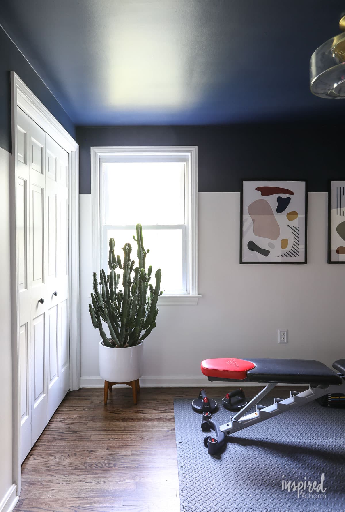
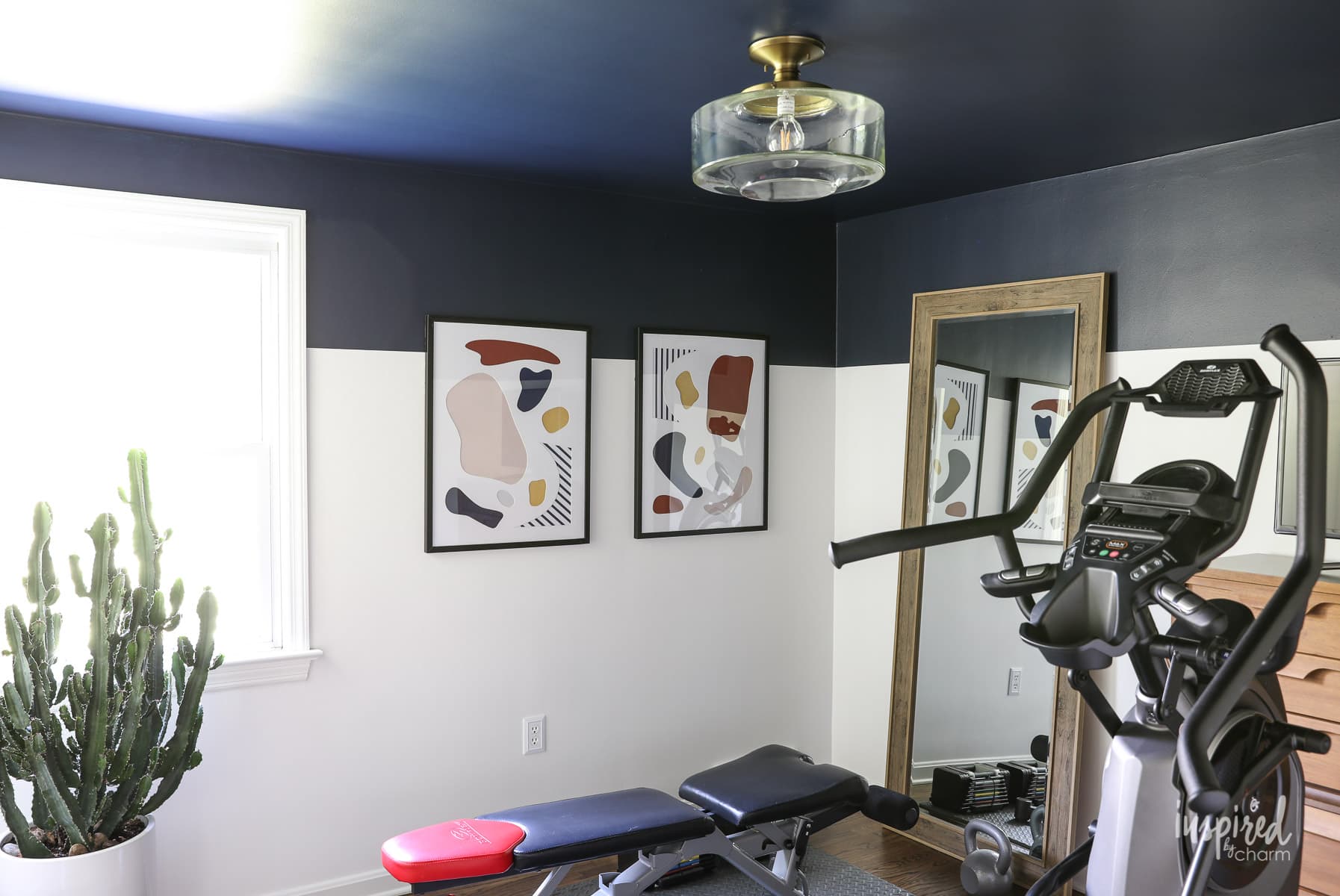
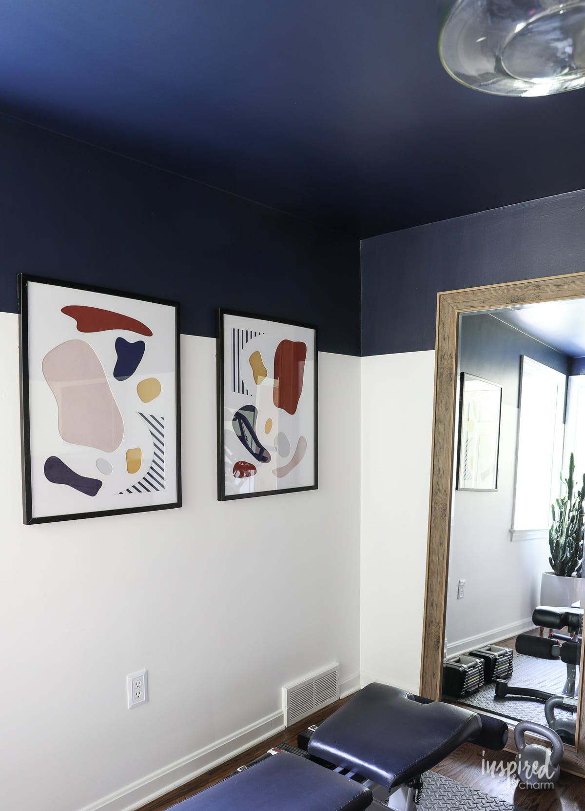
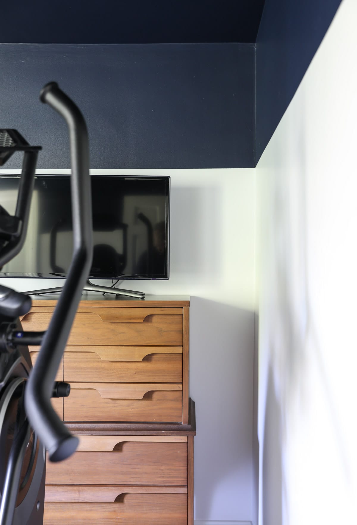
I used Naval in my home gym makeover. This photo is a great example of how different undertones peek out when the light hits it. Just look how different the top left looks compared to the corner, where it’s almost black!

LRV
Want another insider tip for picking the perfect paint color? Pay attention to the LRV. It is incredibly important to note!
LRV, or light reflectance value, refers to how much light is reflected off your paint color vs how much is absorbed. This basically tells you whether a color will appear much darker or lighter based on the score and amount of natural light received.
The LRV scale ranges from darkest to lightest, with numbers 0-100. A score of zero would be stark black, and a score of 100 would be pure white.
The higher the score, the more light is reflected off the paint. The lower the score, the more light is absorbed.
Sherwin Williams Naval has an LRV of 4. This means it’s super dark and reflects very little light. Because of that, I strongly suggest you use this color in a room that receives ample natural light…unless you are going for a cozy cave look or a super dramatic effect.
My gym is one of the brightest rooms in my house, and even then, I opted to use Naval as an accent color rather than on the entire wall.
💌 SAVE THIS POST / RECIPE!
Where to Use
One of the reasons that Naval is so popular is its versatility. I’ve studied this paint for several years now, and I have seen it look amazing on both interiors and exteriors, as an accent wall, or a whole room color.
As I shared, I used Naval in my home gym transformation. I painted the ceiling and top quarter of the walls with this beautiful navy blue, pairing it with Sherwin Williams Pure White for the bottom walls. This pairing keeps the space looking bright and energizing, perfect for a workout!
It’s amazing how different it looks with just a fresh coat of paint.
Naval would also look great on an accent wall. And, for added interest, it would look fab on a textured surface like a batten board or something with custom molding.
When used on all four walls, this deep shade looks best in spots where it’s time to relax, like bedrooms or dens. It’d also be perfect for a home theatre room!
Naval’s most popular application, however, has got to be in the kitchen! Particularly as an island color or used on lower cabinets paired with a white or tan on top.
For exteriors, Naval is a natural choice for a fun trim color paired with crisp whites or light grays. It’d also make for a pretty front door color!
Complementary Colors
Because Naval leans towards a neutral, cool-toned navy, the coordinating color options are seemingly endless.
For a bright, fresh look, pair Naval with bright whites like Sherwin Williams Pure White (the shade I chose!), Sherwin Williams Extra White, or Benjamin Moore Chantilly Lace.
Cool grays also play well with Naval’s green-gray undertones. Sherwin Williams Icicle, Sherwin Williams Misty, and Benjamin Moore Stonington Gray are soft grays that balance out Naval’s deep vibe.
Want to go dark and dramatic? Pair it with a deep gray like Sherwin Williams Outer Space, Sherwin Williams Misty, or Sherwin Williams Foggy Day.
If you’re a color lover, try a beautiful cool blue like Sherwin Williams Tradewind or a bright yellow-green like Sherwin Williams Shagreen.
Finally, if you’re interested in earthy, brown tones, try a yellow-beige like Sherwin Williams Ramie or Sherwin Williams Roycroft Suede. Both are in the yellow color family but appear khaki. While I normally wouldn’t be as drawn to those shades on their own, I think they look bright and sophisticated when paired with Sherwin Williams Naval.
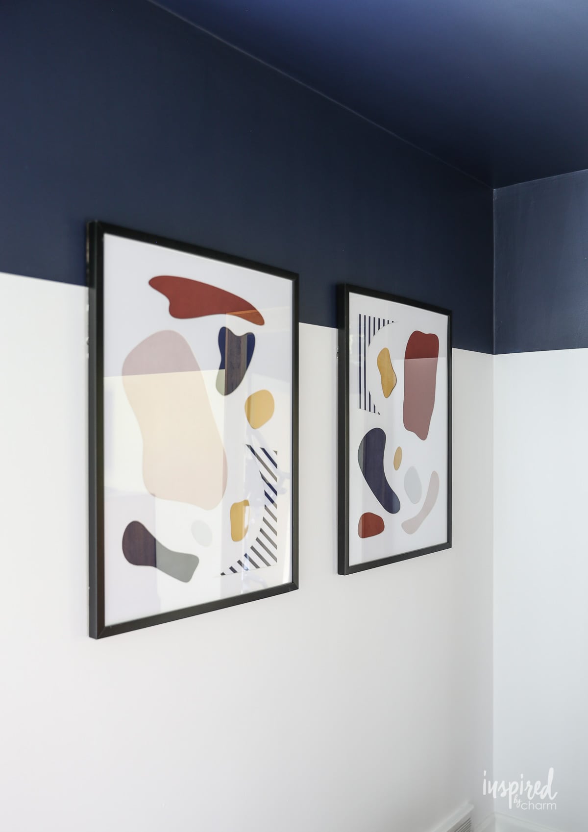
Just take a look at the art below—Naval looks good with every color there! See what I mean about versatile?
If you’re looking to incorporate Sherwin Williams Naval into your space but aren’t positive that it’s your ideal navy blue, these are some similar paint colors to consider.
Colors similar to SW Naval include:
- BEHR Dark Denim – Labeled as part of the black color family, Dark Denim is less rich than Naval with grayer, cool-toned undertones.
- Benjamin Moore Hale Navy – This shade has a slightly higher LRV, reflecting more light while keeping in theme with a moody, maritime feel.
- Benjamin Moore Deep Royal – This paint is very close to Naval and is referred to as dark, distinguished, and nearly black in some light.
- Sherwin Williams Anchors Aweigh – Very similar to Naval, Anchors Aweigh has a touch more green for a daring look.
- BEHR Soulful – While it’s technically in the purple family, Soulful is a true navy with less significant green undertones.
- Sherwin Williams In the Navy – Another close match, In the Navy has green undertones as opposed to Naval’s gray-green undertones.
- Valspar Patrician Purple – If you’re a fan of a purple-toned navy, Patrician Purple is the shade for you.
- Sherwin Williams Salty Dog – This deep blue is brighter with a lot more green, making it look teal under some lights. Overall, it’s less of a true navy but still delivers that bold effect.
Final Thoughts
Sherwin Williams Naval is a stunning shade that provides a dramatic look. When done correctly, it can fit seamlessly into pretty much any home style. Dark and moody or high-contrast and energizing, Naval can work for you!
Remember to swatch and study before you commit. Naval is truly a color you need to try and see for yourself!
More Paint Colors You May Love:
- Agreeable Gray – the “best” gray paint color
- North Star – sophisticated blue-gray
- Pigeon – cozy green-gray perfect for cabinetry
- Sage – my FAVORITE green
- Snowbound – the perfect off-white
- Rock Candy – pastel blue off-white color
So, is Sherwin Williams Naval your ultimate navy blue? Let me know what you think in the comments down below!
Want more from Inspired by Charm? Join the IBC Mailing List for inspiration in your inbox! Follow along on Instagram and TikTok for daily updates and behind-the-scenes looks at my processes. There’s even more inspiration on Facebook and Pinterest!