Sherwin-Williams Snowbound
This Post May Contain Affiliate Links. Please Read Our Disclosure PolicyIt seems like white-painted walls are all the rage these days. And, I’m all about it! While I don’t have every room en blanc, I do totally see the value of a crisp, clean backdrop. However, it’s a hard balance between crisp and blinding—which is why I’m so excited to talk about Sherwin-Williams Snowbound.
In my humble opinion, Snowbound is the perfect shade of paint for those who want white walls, but with a touch of cozy. It’s a lovely shade!
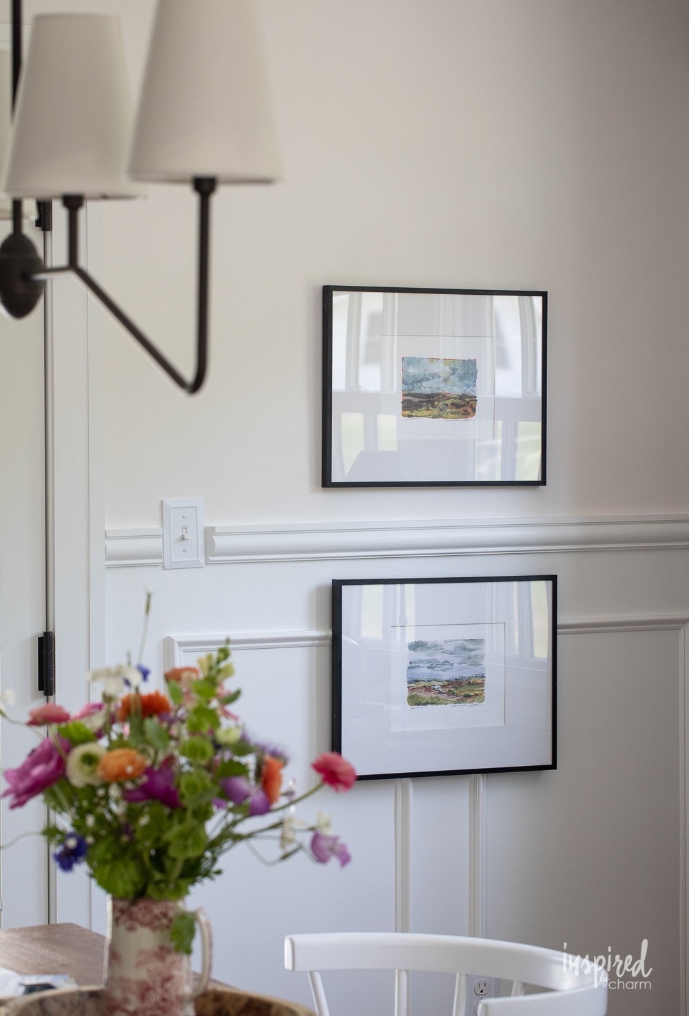
In fact, this creamy Sherwin-Williams white is at the top of my list of favorite paint colors, so much so that I gave it a spot of honor in the room I spend the majority of my time in: my very own kitchen! And, I liked how that looked so much I painted not one but TWO other rooms Snowbound as well! But, more on that in a bit.
In this post, we’ll dive into all things Snowbound, including the undertones, what shades to pair it with, and how to know if it’s the right hue for you.
Note: I’d be a bad friend if I didn’t tell you that even if you fall in love with this shade during this post (and you probably will!), don’t run out and buy a gallon.
Instead, pleeeeasee take the time to swatch your walls and make sure Snowbound works in YOUR home. It’s the most important step in choosing your paint colors, so don’t skip it!
What color is Snowbound?
Sherwin Williams Snowbound (SW 7004) is, at its core, a subtle creamy white that appears almost light warm gray at times. It’s not as white as some of the other popular shades, but it’s also definitely not a shade that screams gray, either. It’s subtle.
In fact, you’ll think it’s a pretty bright white until you hold a piece of white paper up against it. Then you’ll notice how it really is more of a very light creamy taupe-gray.
Sherwin Williams itself poetically says snowbound is like “stepping into a snow glade”. I couldn’t agree more. It’s an airy and bright hue that still feels cozy and soft at the same time. The best of both worlds!

Undertones
Snowbound has somewhat subtle undertones that can shift between slightly creamy yellow, gray, and even purple, depending on the lighting. Sherwin Williams calls this color a “cool white” which is interesting because I find it often looks like a warm shade.
You can see how the corner has a slightly purple tone to it where the shadow hits, while the rest of the space looks much brighter.
Either way, it invokes a cozy feeling, but if you are hoping for something that is a dazzling true white, this isn’t the one (and I honestly don’t think you should be painting your rooms a pure bright white anyway!).
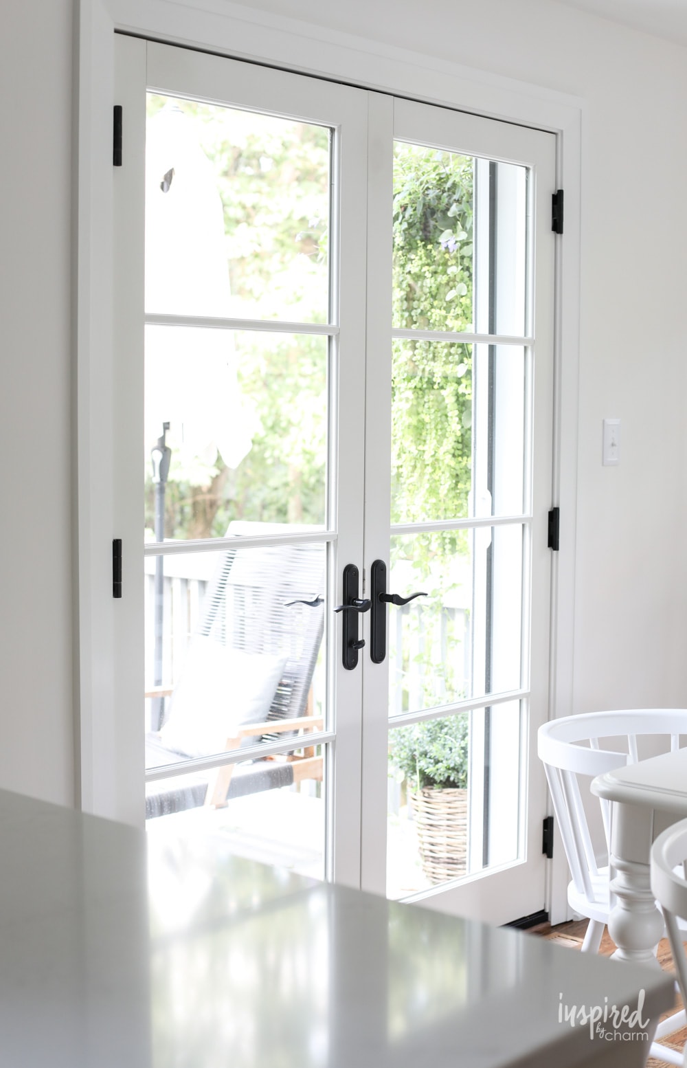
As a visual, you can see how it is much softer than the window trim here, which is painted Sherwin-Williams Extra White (SW 7006).

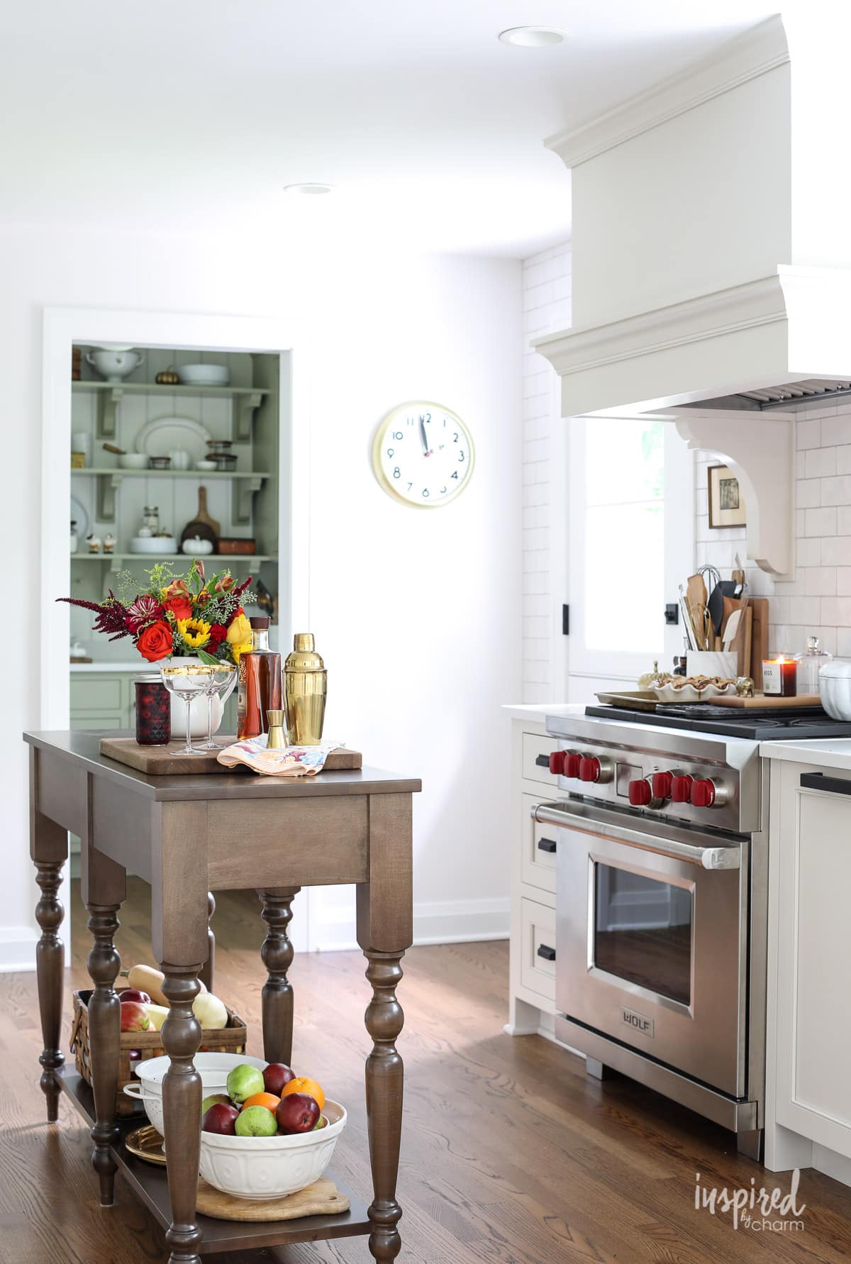
I, however, love this shade. So much so that I painted my walls Snowbound in my dining room, kitchen, AND pantry. Most of my rooms are south facing, but I do have one set of east-facing windows, so I get a good combination of balanced light.
Just be aware that the warmer your lighting, the more warm the color will appear to be. So if you have a space with tons of western-facing windows, Snowbound will start to show off those taupey purple gray undertones. This in itself isn’t good or bad, but it’s definitely different than how it looks in my own space…which is why I highly recommend you swatch your own space before you commit!
As an example, you can see Snowbound on the top, lit by very warm lighting. The purple is really peeking through!

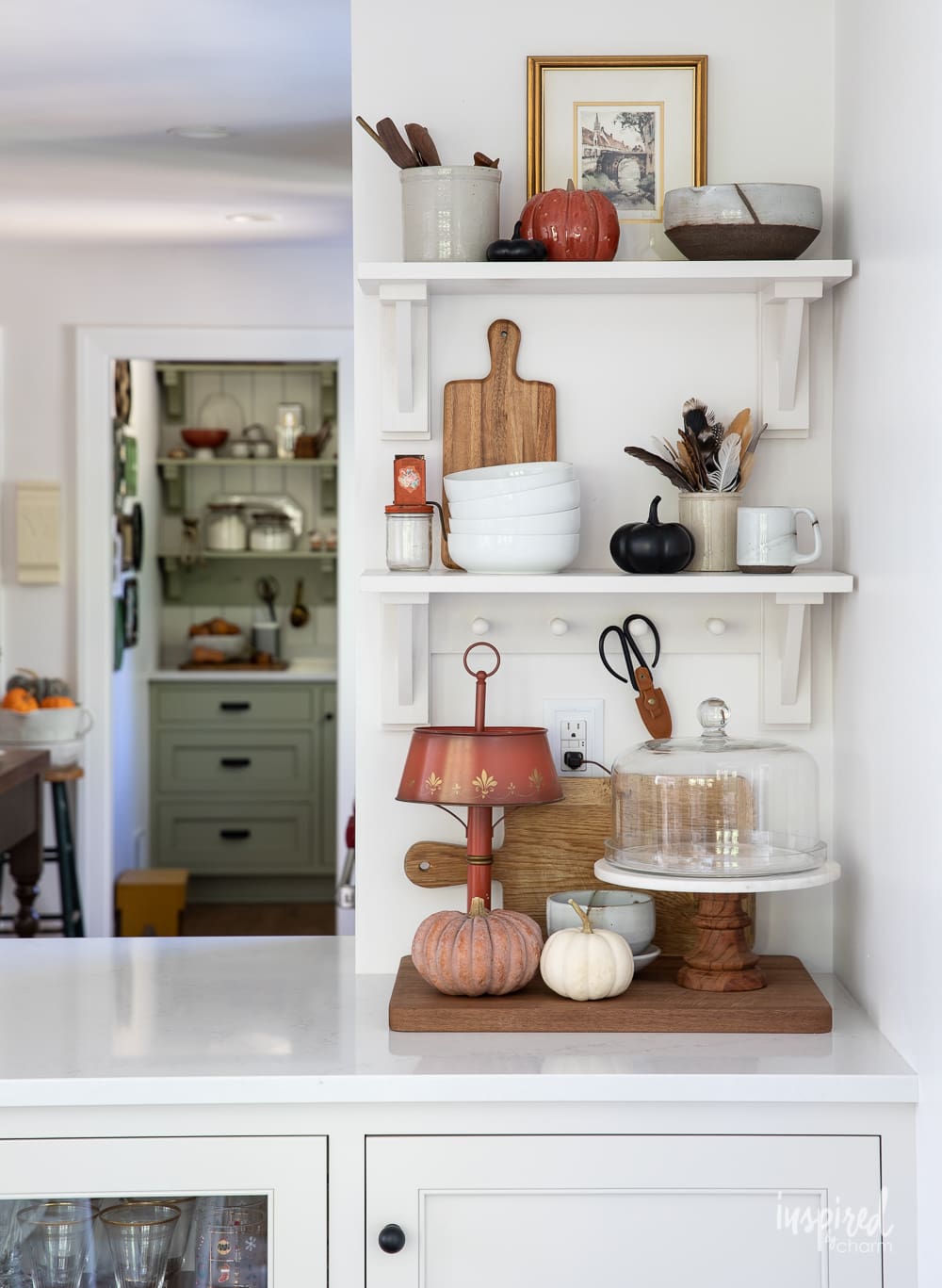
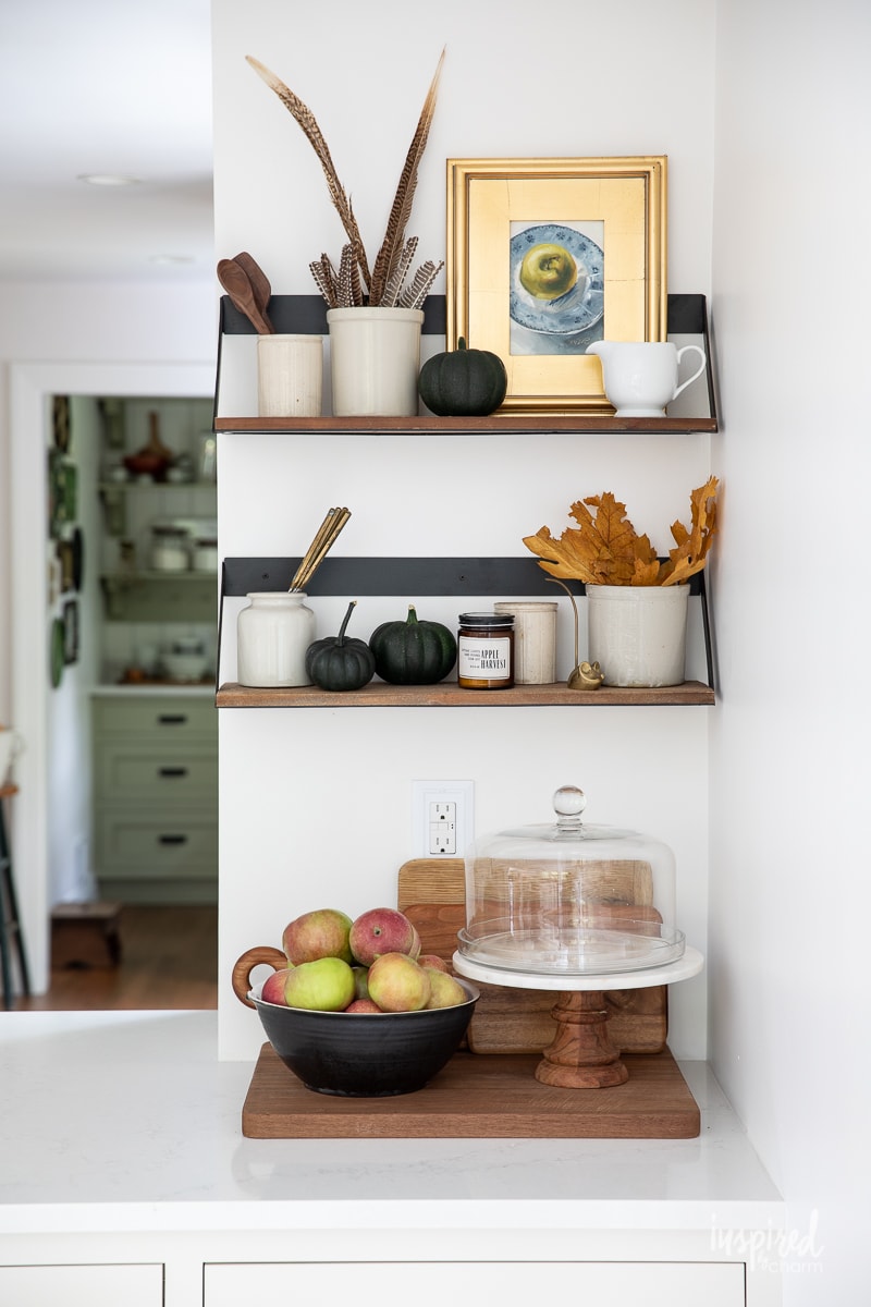
Also, because it is a creamy white, Snowbound will often reflect the color of the surrounding furniture and decor.
For example, my pantry cabinets are painted Sherwin-Williams Sage SW 2860. In some photos you’ll see how Snowbound is reflecting just a touch of sage vs the brighter white at the entry to the pantry.
💌 SAVE THIS POST / RECIPE!
LRV
LRV stands for “light reflective value”, which is basically a measure of how light or dark a paint color appears on a scale of 0 (pure black) to 100 (pure white). Snowbound has an LRV of 83, which means it’s definitely on the lighter side—but not super bright like some of the other whites out there.
Since a shade of pure white would have an LRV of 100, you can see that there are still a lot of brighter, whiter options out there, should that be the look you want.
I personally like that it isn’t so bright. I like to see some sort of contrast between my trim and my wall color. It’s subtle, but it’s there!
Where to Use
This creamy white is neutral enough to look good in just about any room of your house. I personally prefer lighter shades like this in common spaces more than bathrooms or bedrooms (I painted my own bedroom North Star as an example.).
As I mentioned above, I have 3 spaces in my own home painted Snowbound: my kitchen, my pantry, and my dining room. I spend a lot of time in these areas, and I really appreciate the cozy, bright space it creates.
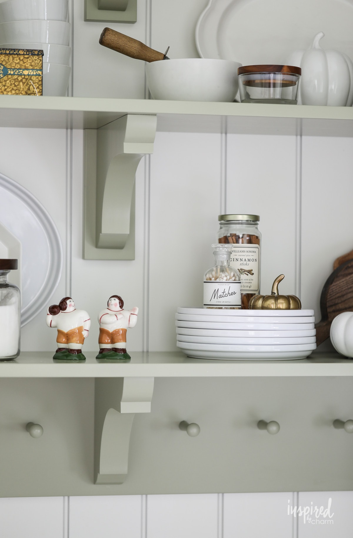
Plus, as someone who loves to decorate for each season, pretty much any type of decor looks fantastic on this natural backdrop, as you can see in the images throughout this post!
Snowbound is also a very popular exterior paint shade since it won’t wash out in the bright sun, or look too yellow.
Complimentary Colors
One of the great things about Snowbound is that it looks amazing with a wide range of other colors. Thanks to its versatility, there are so many directions you can go with this hue!
With that said, here are a few of my favorite colors to pair it with:
- Extra White (SW 7006): I love this combination because it gives me the crisp and bright look I want, and helps warm up Snowbound just slightly.
- Tricorn Black (SW 6258): This true black is a great choice if you want to add a little more drama and contrast.
- Agreeable Gray (SW 7029): This warm-toned gray pairs perfectly with Snowbound. It’s a classic and timeless combination that looks great in any home. In fact, it’s one of my own favorite paint colors – I did an entire post on Agreeable Gray here!
- Colonnade Gray (SW 7641): For those who want a no-fail option, this is one of the two pairings SW itself suggests! It’s a warm greige that will make Snowbound like quite crisp in comparison.
- Autumn Orchid (SW 9157): Here’s the other suggestion by Sherwin William for pairing. If you’re looking to bring out those slightly violet undertones in Snowbound this can be an option—but I have to admit this isn’t my favorite shade of paint!
- Egret White (SW 7570) If you need a slightly moodier option in the same color family as Snowbound, Egret White is a great choice. It’s not too bright but still noticeable enough to give you some contrast. You can see how the combo looks in my kitchen, as my cabinets are painted Egret White!
While it’s not necessarily a “color”, I also love how this paint color looks with warm wood tones. It helps my antique finds really pop throughout each space!
Colors Similar to Snowbound
If you’re looking for something similar but slightly different, here are few other shades of white to:
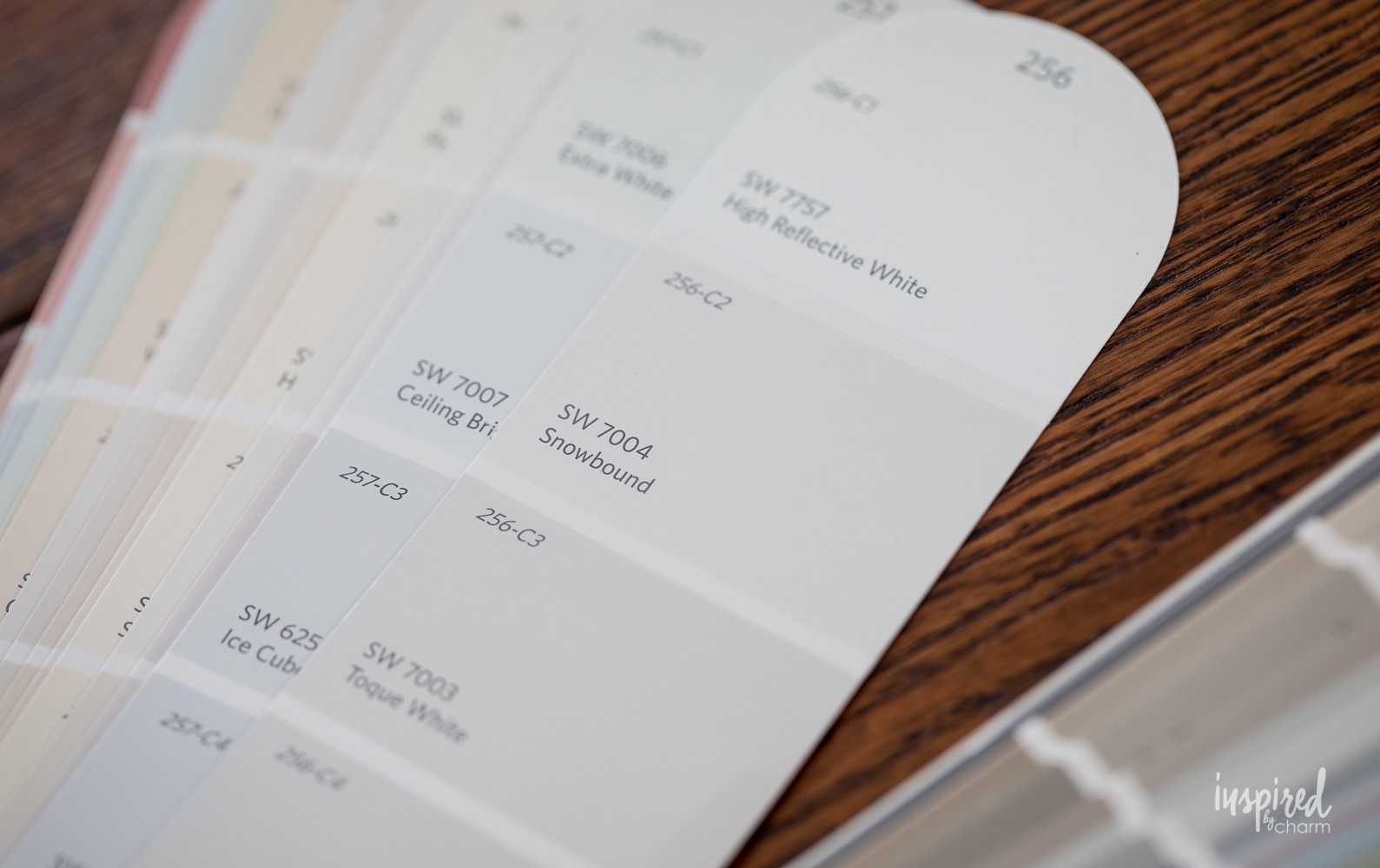
- Pure White (SW 7007): This is the closest shade that Sherwin Williams offers to Snowbound. It has more creamy undertones than Snowbound and is just very slightly lighter over all.
- Alabaster (SW 7008): This is a super popular classic white that’s more warm and creamy than Snowbound, but has just enough hint of gray to keep it from being overly so.
- Incredible White (SW 7028): This shade is a bit darker with a LRV of 74 vs Snowbound’s 83. But the undertones are very similar.
- Eider White (SW 7014): Again, this shade has a lower LRV than Snowbound, but it’s got those same versatile gray undertones.
Final Thoughts
Snowbound is a beautiful and versatile color, perfect for adding a touch of warmth to your space without overwhelming it. But, don’t forget—swatching is always a good idea to ensure you get the exact look you’re after.
Happy painting!
More Paint Colors You May Love:
- Agreeable Gray – the “best” gray paint color
- Pigeon – cozy green-gray perfect for cabinetry
- Naval – the ultimate navy paint
- North Star – sophisticated blue-gray
- Anew Gray – my favorite “greige”
So, what do you think? Is Snowbound the right hue for you? Let me know in the comment section!
Want more from Inspired by Charm? Join the IBC Mailing List for inspiration in your inbox! Follow along on Instagram and TikTok for daily updates and behind-the-scenes looks at my processes. There’s even more inspiration on Facebook and Pinterest!
Hi, I loved the color… what color did you paint the ceiling? Thanks.
It’s just SW white paint right out of the can, no color added.
xo Michael
What do you think SE Snowbound will look like with SW Realist Beige?
We are using Snowbound for our main walls inside the house. Our painter says she always uses Pure White for the ceiling and trim. I’m afraid they will clash. Would love your thoughts! Would extra white be better for both the trim and ceiling? Thanks!!
What is the best color for ceiling if you use Snowbound on your walls? What would you recommend for trim?
Thank you for all this valuable information. I’m repainting my whole house, walls, trim, ceilings and bathroom vanities and kitchen cabinets. Would it be too much to paint everything all the walls and ceilings snowbound? What would be the perfect trim and baseboard colors? What about kitchen cabinets and bathroom vanities? Planning on using black accent, knobs, handles, and lighting fixtures. Is this way too much? Help.
What cor trim goes with this paint color?
Can you tell me what colors snowbound is paired with here, in the pictures you posted? I don’t see a description of the images that specifies it, unless it’s a problem with my browser.
Are you looking for the trim color? Or another wall color? Cabinetry?
xo Michael
I’ve been thinking about painting my living room a different color. I have a small home ~ and I think it will look great.
Hello!
I stumbled across your posting for SW Snowbound as we chose it for our New Construction Home as a baseline paint for the entire home. We can add custom touches later on, but we got to choose one paint as a baseline and Snowbound is what I went with. The reason I chose it is because we will have elements of both cool and warm tones in our Home between flooring, cabinetry, and furnishings so I thought Snowbound would be the perfect balance. Would you agree? Thank you!
I think you’ll be happy with it. It’s basically a white, so as long as you’re okay with white walls, then you’re all good.
xo Michael
How do you like it? What accent colors did you go with? Planning to do the same color and wondering. Thanks
curious if you think you should do white curtains or ivory curtains (looking at pottery barn, east and south facing room) with snowbound walls ? I will have mid tone white oak floors with extra white trim.
This was a very helpful article. I do believe there’s a typo, the correct name for paint SW 9157 is Autumn Orchid not Orchard.
Thank you!!
xo Michael
Hello, I love this post. I’m plaining to use Snowbound on the trim and doors and still looking for a white color for the wall for my living room. My living room size is small and don’t have lots of light. I pick Natural White for the wall and am not sure if it will go well since it’s brighter than Snowbound. Please advise. Thank you very much.
What did you decide? I was just reading and was curious what you went with on the walls. I usually go with same color but different sheen and it will look different but no problems with clashing.
Completely agree with your take on SW Snowbound! :). I am a Home Stager and Interior Decorator and have recommended Snowbound countless times over the years for many different projects, both interior and exterior. And I have to say it has never failed! It has always looked great regardless of how we used it. And the combination of SW Snowbound and SW Tricorn Black is perfection in my book! Those are the current colors on the exterior of my own home. But I do agree with you that everyone should try a sample on their own project because it just might not work in that situation. (Although I would be surprised if it didn’t! 😉
Your posts are always filled with the important details we want to know!
Always appreciate your painting suggestions. Currently mulling over bathroom. Interior no light as condo. So appreciate your take on paint. Thanks.
Is extra white ceiling good match with snowbound walls south exposure orientation..tank you