Sherwin-Williams Agreeable Gray
This Post May Contain Affiliate Links. Please Read Our Disclosure Policy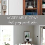
Agreeable Gray by Sherwin-Williams may be THE most popular paint on the market right now. It seems like every time I turn around, I see a new room painted that soft, pretty greige shade.
But, just because it’s popular doesn’t make it right for your space. So, is Agreeable Gray the color for you? Let’s find out!
If you have considered painting a room within the last year, you’ve undoubtedly heard of Agreeable Gray. It’s Sherwin Williams’ top-selling paint…and for good reason! This unobtrusive, warm shade is touted as the perfect “greige” (more on that below) by many.
Spoiler alert: I also happen to love this shade, and have it in my own home!
I get a ton of questions about the paint colors in my home, and thought it’d be fun to put together a new series featuring what shades I use (and why!). In this post, we’ll dive into all things about this hue, including the LRV, undertones, what colors pair well with it, and how to know if it’s right for your space.
So whether you’re just starting your search or you’re ready to start painting, read on for all the info you need about Sherwin Williams Agreeable Gray!
Note: as you’ll learn below, this paint looks very different depending on where and how you use it. If you are considering using this paint, I highly highly recommend you buy a sample of it first and see how it looks on your own walls before painting an entire space. In fact, swatching your walls is probably the most important step in choosing your paint colors. Don’t skip it!
What color is Agreeable Gray?
Agreeable Gray by Sherwin-Williams (SW 7029) is a greige. If you haven’t heard of that term before, it’s a catchy name that describes an entirely new category of neutral shades: colors that are a combination of gray + beige.
If you find gray paint too cool and beige paint overly warm, shades of greige may be just the perfect fit. While you’ll find greiges in all sorts of tones (they are surprisingly versatile!), this particular one is a somewhat warm greige that really is almost equal parts beige and gray.
Undertones
Undertones refer to the underlying color that is used in a paint. This can be anything from warm yellows or reds, cool blues or greens, and even purple or gray, depending on the shade. There can also be several undertones in one paint—it’s all part of what makes a color that particular color.
The undertones in Agreeable Gray are, for the most part, neutral, and can shift throughout the day depending on the lighting. Different decor pieces may also make one or more undertones stand out.
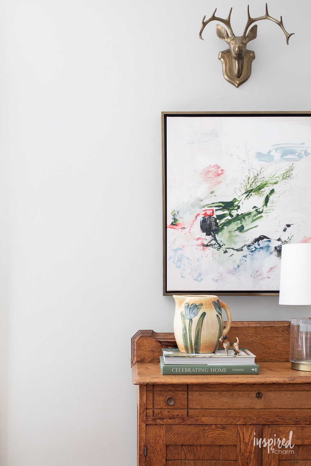
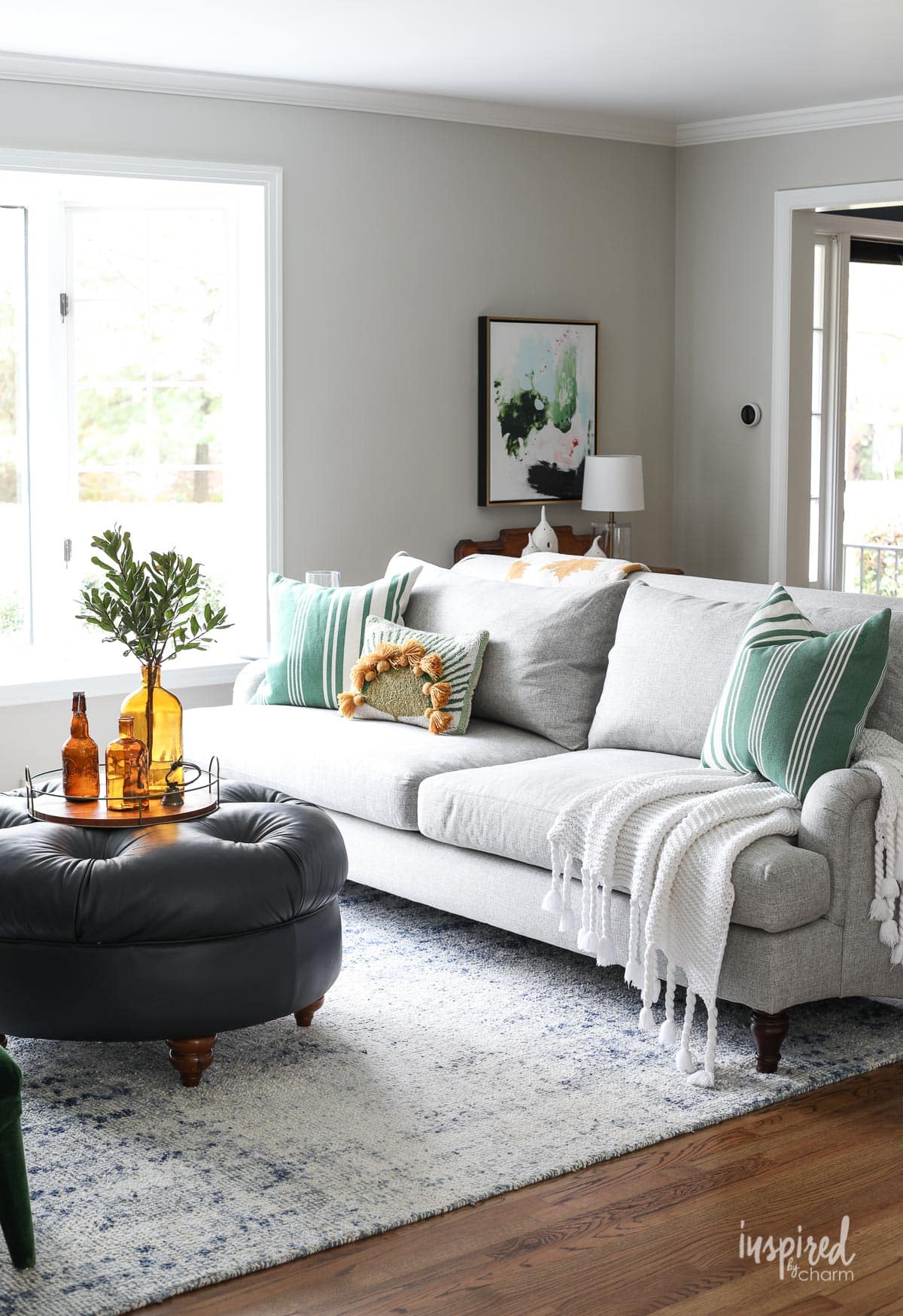
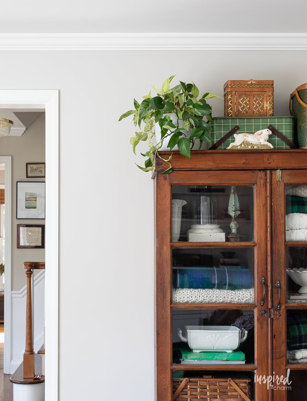
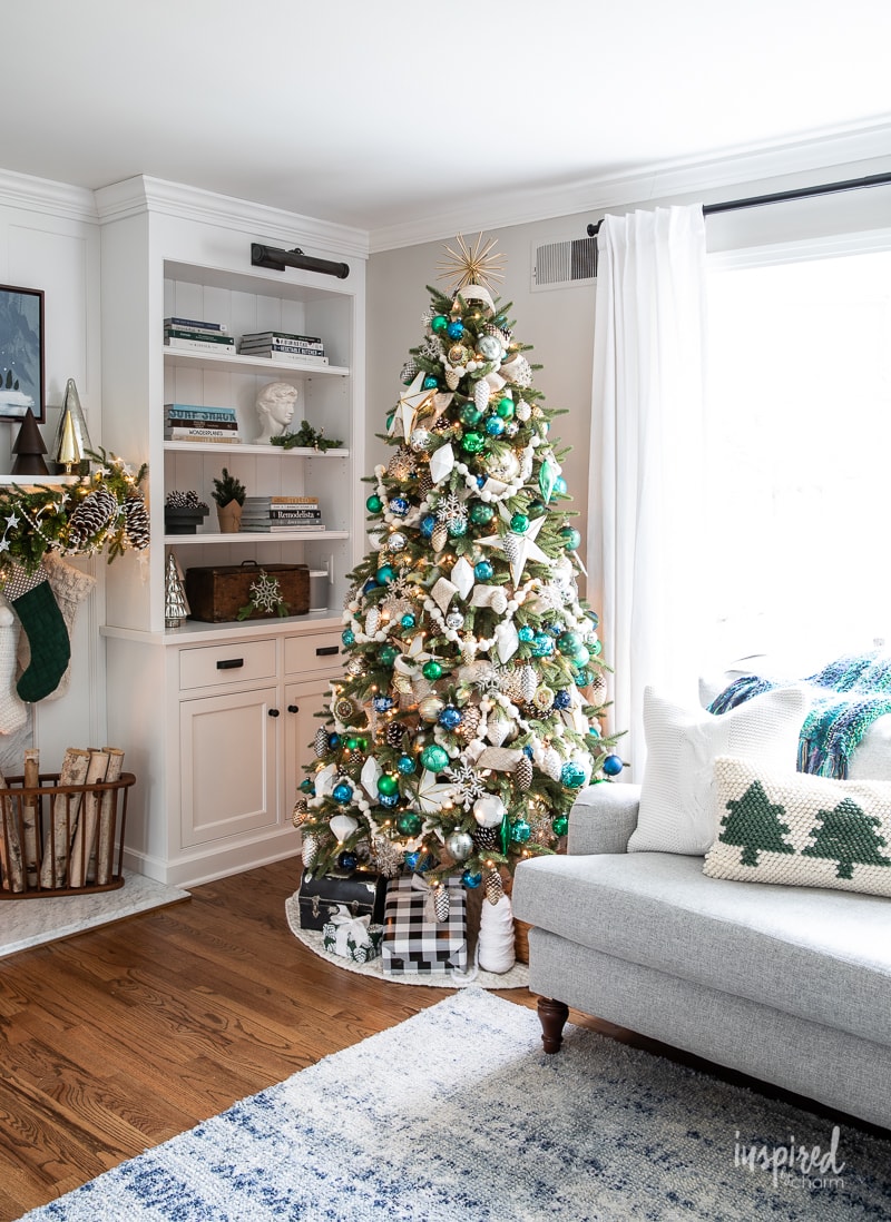
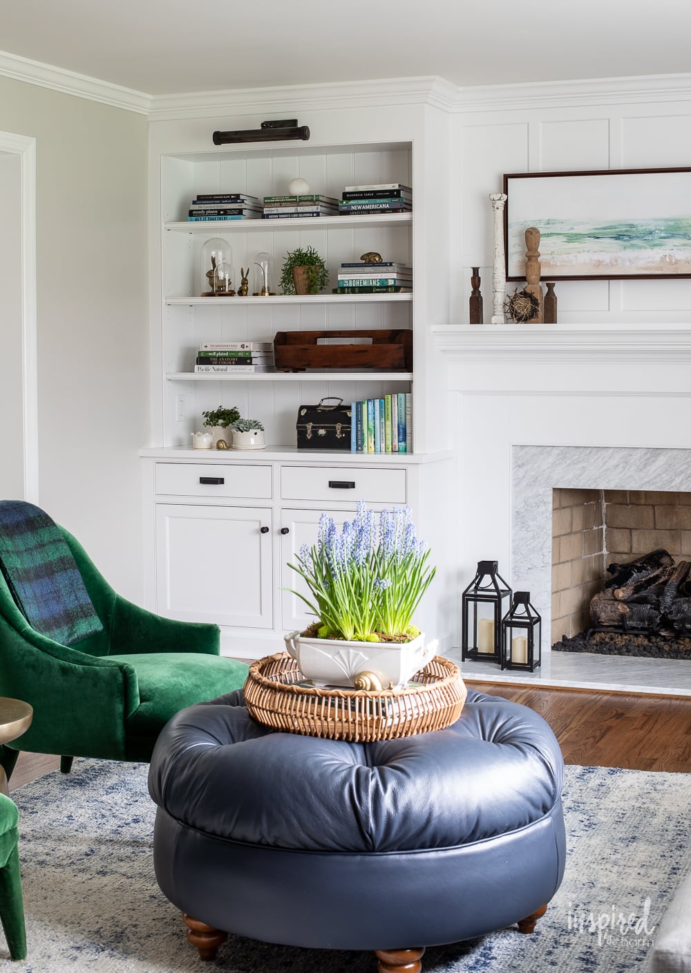
For example, this shade may look like a warm gray (and it is), but if you look closely, you’ll begin to notice some subtle green undertones. I can really see the hint of green peek through in this photo from my living room, probably because of the green chairs as well as the greenery outside the window.
I’ll also freely admit that I love this pair of velvet armchairs, and part of why I went with Agreeable Gray is that it looks SO good with them.

It’s worth noting that undertones will show more or less depending on which way your room is facing. My living room is north-facing, which means I get pretty crisp light versus a south or west-facing room which would pull out more of the warm purple tones in this shade.
LRV
When it comes to interior design, the LRV (Light Reflectance Value) of a color is an important factor to consider.
In case you are like most people and have no idea what LRV means, it’s a value that helps tell you how much light will be reflected off of a painted surface. The range is from 0 (pure black) to 100 (pure white).
A high LRV number indicates that a color reflects more light, making it appear brighter and lighter, while a lower value means the color will absorb more light – creating a darker look overall. It’s just another tool you can use to determine if a shade is a good fit for you!
SW Agreeable Gray has an LRV of 60, meaning it is considered to be a mid-toned paint color. It’s not too bright, nor overly dark, making it the perfect option for many rooms in your home.
LRV only tells us how the paint will reflect the light, but how it looks is very much dependent on how much light there actually is in a space.
As an example, my living room receives a lot of natural light, so there is plenty of light to be bounced around. Because of that, the shade appears brighter in my home than it might in a room with very little natural light.
Take a look at the photo below. Do you see how the color shifts based on where the light is? Above my cabinet and in the corner, the paint reads quite a bit darker than the space to the left in the photo.
💌 SAVE THIS POST / RECIPE!
Where to Use
Aptly named, this shade really is quite agreeable. It works well in practically any setting!
Here’s where you will really start to see why this shade is so popular. It has this chameleon-like quality that allows it to blend into the background and work in so many places.
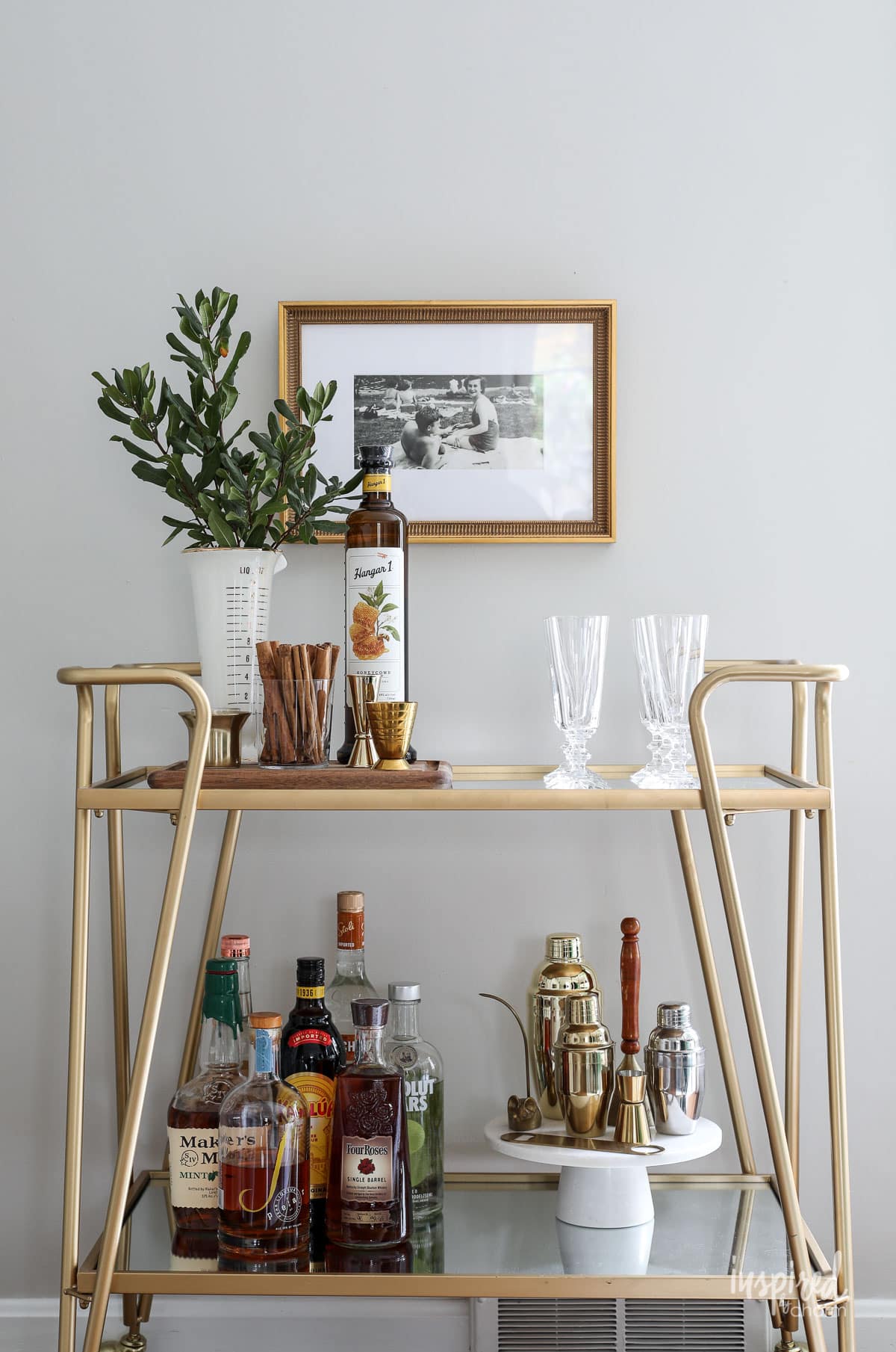
While I used it in my living room, it also would look lovely in a dining room, bedroom, or bathroom, either on all 4 walls or as an accent wall paired with a complementary color (see below).
If you are a fan of white trim and want it to really pop, Agreeable Gray is a great option. I love how it looks in kitchens with white cabinets—it just adds a warm, soft tone to the room. But, you can also flip it and have white walls with Agreeable Gray cabinetry for a surprisingly modern take. Both look fab!
It also works surprisingly well as an exterior shade. If you are looking for a warm shade that isn’t too bright or stark and will stand the test of time, give it a try!
Lastly, this soft shade looks lovely as a trim and door paint on its own. I particularly like this application when it’s paired with soft white walls.
Complementary Colors
It honestly would be easier to tell you which colors don’t go well with this shade—and none really come to mind.
That’s actually why I chose it for my own living room. If you have been a reader for any amount of time, you probably know that I love to decorate for the holidays. I wanted a shade that would look good with anything from Easter pastels to crisp Christmas greenery.
I’m happy to report that Agreeable Gray has looked incredible with pretty much anything I’ve thrown at it. I really don’t think you can go wrong with this shade!
In terms of painted accents, crisp whites are probably my favorite. In my own home, I paired this shade with SW Extra White (SW 7006) for trim. I used another crisp white, SW Bright White (SW 7007), for the cabinetry and ceiling. You can see how well they work together in this image:
Sherwin-Williams itself has a few ideas for coordinating colors. They recommend 3 shades in particular:
- Incredible White (SW 7028)
- Extra White (SW 7006)
- Coral Rose (SW 9004)
Because of its neutral color and unassuming undertones, there is very little that this color won’t look amazing with. I’ve seen it look beautiful with dozens of shades, including:
- navy
- charcoal
- soft blues
- sage green
Colors Similar to Agreeable Gray
If you are considering this popular Sherwin Williams color for your next painting project, but want to explore other options, I have a few suggestions for you:
- Anew Gray (SW 7030) is another popular shade from Sherwin Williams, and is in the same color family as Agreeable Gray. It’s a darker shade with an LRV of 47, but has many of the same undertones. I actually love this color too, and used it in my own bedroom makeover.
- Worldly Gray (SW 7043) has a similar LRV to Agreeable at 57 (vs 60). However, this shade is decidedly warmer, and while it is still a greige, it reads more taupe than gray.
- Edgecomb Gray (HC 173) is a Benjamin Moore offering that many have compared to SW Agreeable Gray. Again, the LRV is similar at 63. But, Edgecomb is a warmer shade that has even stronger green undertones. To me, it reads more like a taupe than greige.
Final Thoughts
In conclusion, Sherwin Williams Agreeable Gray is a popular greige that works well in many settings. It’s an easily adaptable color that can fit in with almost any range of colors and wood tones. It’s perfect for daylight spaces for an airy look, but also can be used in darker spaces if you want to create a cozy feel.
From walls to ceilings to trim and furniture pieces, you can use Agreeable Gray pretty much anywhere! While I still STRONGLY recommend you swatch this shade on your own walls before committing, it may be as safe to a close bet as you’ll get.
More Paint Colors You May Love:
- Pigeon – cozy green-gray perfect for cabinetry
- Snowbound – the perfect off-white
- Naval – the ultimate navy paint
- Sage – my FAVORITE green
- North Star – sophisticated blue-gray
- Alabaster – soft warm white
So, what do you think? Is agreeable gray the right hue for you? Let me know in the comment section!
Want more from Inspired by Charm? Join the IBC Mailing List for inspiration in your inbox! Follow along on Instagram and TikTok for daily updates and behind-the-scenes looks at my processes. There’s even more inspiration on Facebook and Pinterest!
Hi
I’m looking to paint in the spring. My living room, dining room and kitchen are open to one another. My cabinets are not quite white, but more a light creamy colour, in all three rooms. I don’t wish to introduce a gray at all as my new couch is also a very light creamy colour. The colour on the wall is a dark beige and I really dislike it. I have bay windows in both living and dining room, so pretty good light with a patio door in the kitchen. I’d like a light colour but I’m not sure what shade to use. Thanks
Does Agreeable Gray go with red cherry floors?
It can. I would try a sample in the space and see how you feel about it. Depending on the natural light in the room, where the room faces, etc. different factors can make an impact on what colors work.
xo Michael
If only I had seen this a few months ago. I went through every greige made and somehow missed this one. Beautiful!!
That always seems to be the case! Thanks for stopping by Lisa!
xo Michael
Hi Michael! I love everything you do, and get so much joy from looking at your posts! I was wondering if you could tell me the brand and where you got your sofa. I have been looking for something exactly like it with no luck. I love the style, color, and especially that it has just two cushions. A sofa with two cushions is really hard to find. Any help is greatly appreciated. Thanks! Karen Deal (Allison‘s mom)
I had Agreeable Gray in my previous home living room/dining room. I had originally painted that area SW Kilim Beige, but it was too warm. I was really happy with Agreeable Gray, although it really is a “changeable” color. It appeared a lighter, grayer tone in daylight, but seemed darker, more beige in the evening. When we moved, I considered it for our next house but it was a smaller mid-century cottage with lower ceilings and I knew Agreeable Gray would be too dark for that house. I went with SW Alabaster, a vanilla ice cream white. I agree that it is worth it to put samples up before deciding on a color and now that several companies offer larger sticker-like samples it is easier and more affordable than repainting. I look forward to other posts about colors in your home.
Our favorite color too!! The entire downstairs in our home is Agreeable Gray. Our daughter used it for her home too! So versatile….happy to see you feature this paint color 💜
I love agreeable gray , but my furniture doesn’t. I so appreciate Sherwin Williams they offer paint swatches, stick up paint “swatches” and sample jars of paint to make sure you get the right color. I have used Sherwin Williams in my entire house and have not been disappointed. Naval on cabinet doors just beautiful with brass hardware.
Try ginger spice or a grey without undertones like Light French Grey so browns are not involved
Just finished having the rest of my rooms done in Benjamin Moore Pale Oak, another wonderful greige. My rooms look very much like yours in the pictures.
Just wanted to throw that color in the hat too for those who are looking for the perfect gray!!
I really like that color Michael…when I repaint my kitchen I will grab it. I prefer Benjamin Moore paints. I do so enjoy your house tours!
Btw can you tell me where you got those green velvet chairs. I love them!
Hi there! I’m not sure, but I was surprised to not see a Benjamin Moore color on here. I have to lovingly disagree with you and tell you that, although this is a good color, I think the best grey color is Classic Gray by Ben Moore. It is absolutely amazing and as an interior designer, I have put it in so many homes, and it has just the perfect amount of warmth and it is definitely not too gray! I think it is a very Equal color, actually, I think a better color than agreeable gray! I do like Sherwin-Williams colors, though.
That’s the great thing about color – everyone has their personal favorites and colors that suit their designs, style, and esthetic. There’s no “right” or “wrong” answer. I’ll have to check out the color you suggested. Thanks for the input!
xo Michael
I chose Mindful Grey for trim in my bedroom, loved it so much I painted my bathroom walls and trim. I’m sure eventually it will make its way through the rest of my house. 😁
I always said I hated gray paint because the rooms I had been in were stark and cold….not my taste. Last year we moved into a house done totally in Agreeable Gray with SW Extra White trim and I love love love it! Lots of windows and light, but the gray is warm and, as you said, goes beautifully with every color I have tried. Especially nice since even though every room has same color walls, at least for now, I can use different colors in rugs, upholstery, bedding, etc for different looks in the rooms. Definitely a new favorite paint color for me! Always love seeing your rooms….such nice eye candy!
I love the greige tones of paint! I painted my living room SW Repose Gray but it pulls a bit cooler than I wanted. I want to repaint my small guest room which faces West with a red Japanese maple in front of the window. Would Agreeable Gray work well with dark wood tone furniture? There is a vintage mahogany wall unit and a gray sleeper sofa in the room. What’s your opinion? I love your decor and yummy recipes! Thank you for sharing your talents in your blog!
Apart from the wall color, which looks just right, I love the green chairs, all the green decor accessories and the navy accents. What a well balanced room!
I’m still stunned every time I see your interiors, Michael. They are so beautiful! I love your use of color – just enough yet a feeling of “neutral”. I love a calming space. I love agreeable gray and plan to paint my bathroom in it. Thanks for this informative and inspiring article on it! Best to you!
I have Agreeable Gray half cut tint on my wall with Mindful Gray trim. It is a light and bright without being white. Thanks for sharing all your fabulous ideas and beautiful home.❤️
Agree, everything he does is magic
Another great SW color is Aloof Gray! We painted our offices with it and love it!
I did a whole hime renovation in 2019. I painted the majority of my home Agreeable Gray and still love it. I used Pure White trim. The kitchen cabinets are Snowbound with the island ones Dorian Gray. I painted my adjacent laundry room Sea Salt. I did the guest rooms in Misty and painted the master bedroom/bathroom North Star/Hinting Blue. We redid the outside in 2021 and I painted it Accessible Beige with Gauntlet Gray accents and again Pure White trim.
Ok, so this might be the dumbest question ever, but how do you tell what direction a room is facing? Is it determined by the direction light is coming in through the windows? Or the direction You are facing looking out the window. I find this so confusing and have never seen an explanation.
If you’re standing in the room looking out the windows, it would be the direction you’re facing.
For example if you’re standing on your front porch with your back against the door. If you’re looking north, you’d be north facing. Does that make sense?
xo Michael
I used mindful gray , i have added turquoise and black rug , gray furniture, and sage grren . I absolutely love it
We love Agreeable Gray. We’ve used in in our kitchen, my home office, two hallways, a basement game room, and our primary bedroom.
The only room where it doesn’t look good is a tiny hallway that receives almost no natural light–it looks oddly like pale blue there.
Otherwise, Agreeable Gray is perfect in every space! In our kitchen, it works with our (hopefully soon-to-be-painted) maple cabinets. In my office, it provides calm and cheer, even on gloomy days. It’s calm and serene in our bedroom. It even works with the (gross cream) woodwork painted by the previous owners. But it really pops against white woodwork.
We’ve said for years that we wished we’d painted the whole house Agreeable Gray when we moved in. It really IS agreeable.
Thanks for spotlighting this awesome color!
It really is! I love it! It works with basically everything and every season! So nice to hear you love it too!
xo Michael