Sherwin-Williams Sage
This Post May Contain Affiliate Links. Please Read Our Disclosure Policy
Sage (SW 2860) is a flexible and pretty paint color that can warm up your space with its earthy, green-gray tones. If you’re looking for a comfortable and calming hue, the subtle nuances of Sherwin-Williams Sage can make it an excellent choice for your home.
While Sage is certainly not a neutral color in the traditional sense, the undertones of this shade make it warm and inviting and give it a versatility that can work in so many spaces. It does a great job blending the traditional as well as modern, so while gray-greens are extra trendy right now, this particular shade is timeless enough to have staying power.
In fact, I think this lovely color can work pretty much in any room. Sage is likely my favorite green paint color of all time, and I opted to use it in my own home in one of my favorite rooms.
So, let’s dive right into Sage so you can discover if it’s the paint color you’ve been searching for!
Note: Even if/when you fall in love with Sage, please take the time to swatch paint color samples in your own home, as the lighting can absolutely alter the shade (as you’ll see in this post!) I also recommend taking the time to view the paint in your home at different times of day—how it will look in the early morning light is very different from sunset and at night!
I know swatching seems like an extra step (and it is), but it’s one of the most important steps of choosing a paint color. Trust me, don’t skip it.
Now, onto all things Sage!
What color is SW Sage?
Sage is a light, muted green-gray that isn’t bright or overly bold, but can still make a statement.
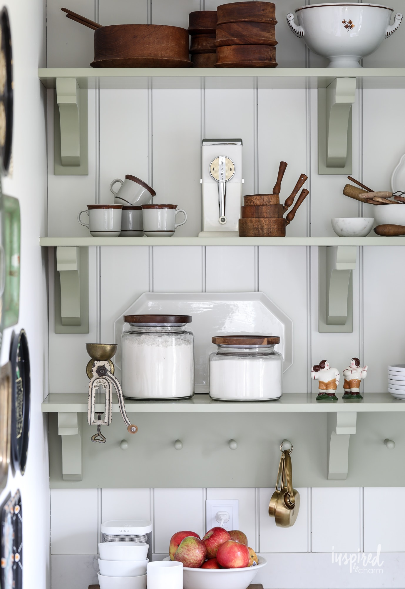
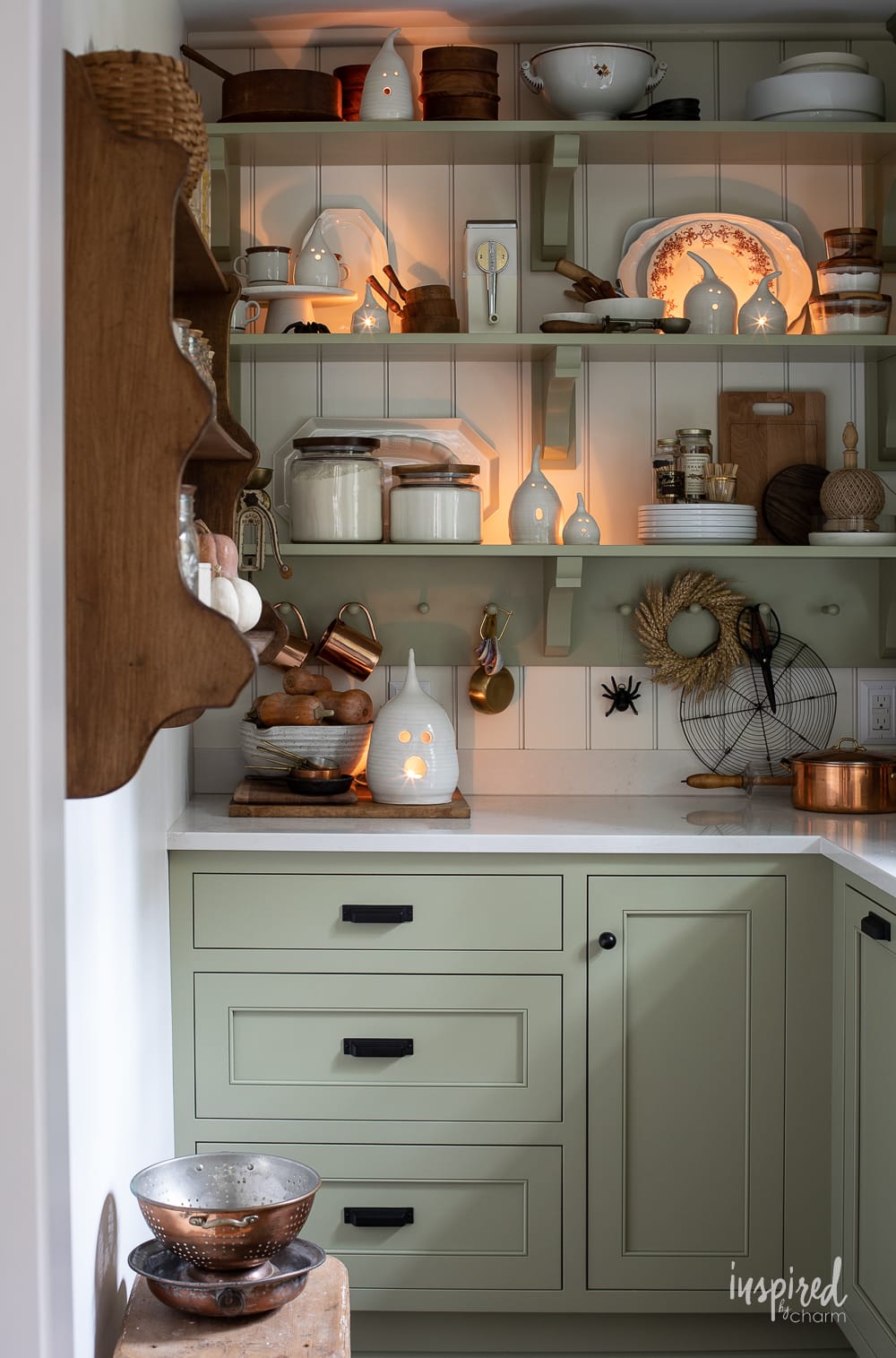
Depending on the lighting, it can look like a light green or a dark green (remember – swatch this one on your walls before committing!). I painted my pantry cabinets Sage, and I find that at times, they look like a brighter yellow-green, and other times they look closer to an olive shade.
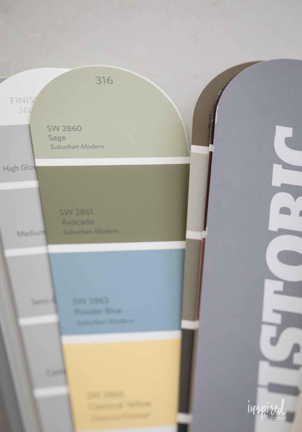
It’s also worth noting that Sage is part of Sherwin-Williams’ Historic Colors, which means it’s lasted the test of time and is still beautiful by today’s standards.
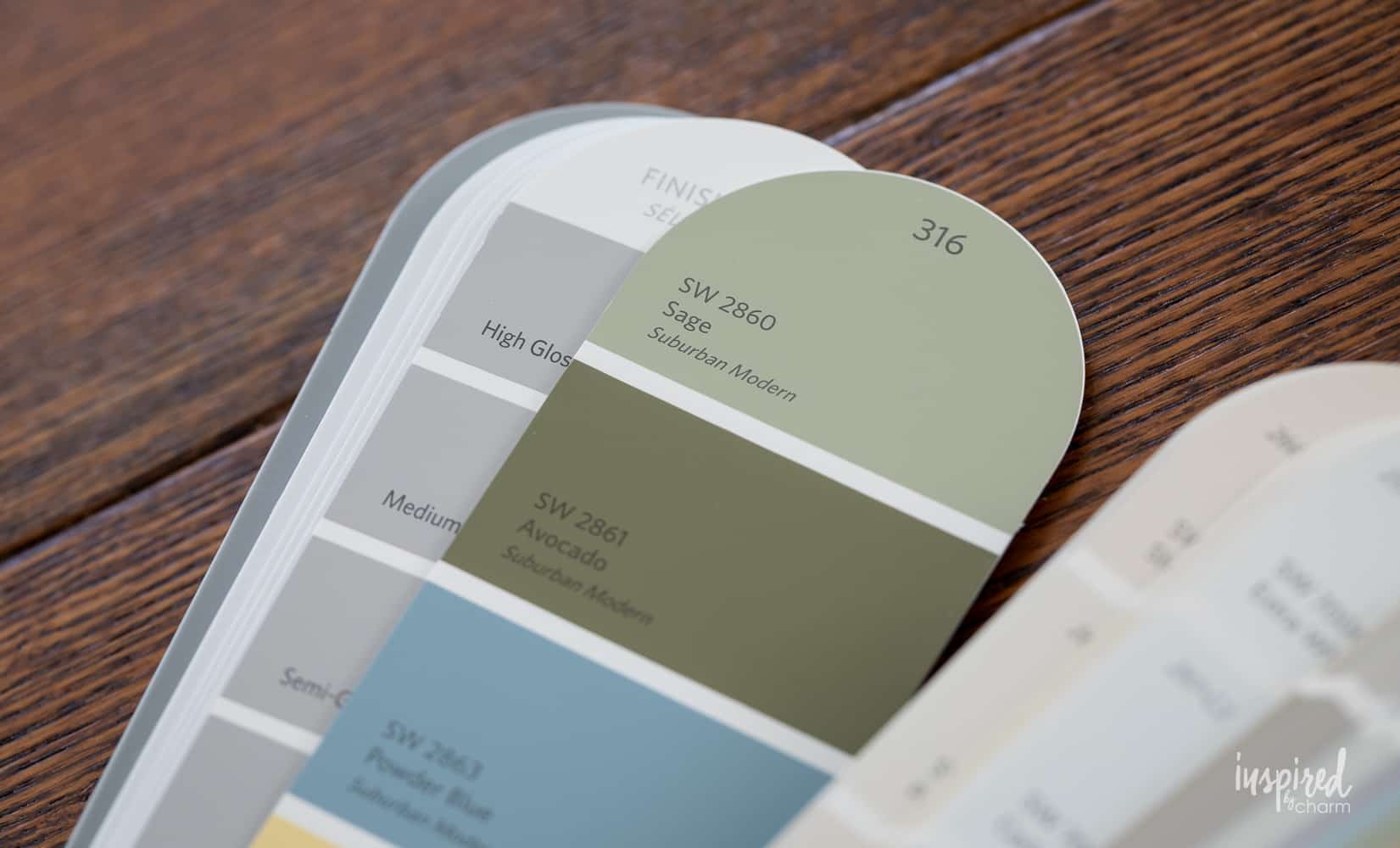
Also, to clear up any confusion, Sherwin Williams has several paint colors that have the word “sage” in their name, but for this post, we are chatting exclusively about straight-up Sage (SW 2860).
Undertones
Understanding undertones is a critical factor when it comes to choosing paint colors, and Sage is no exception. Just think of how many different shades of “green” there are in the world—undertones are a huge part of what makes each shade look so different.
Part of what gives this particular hue staying power is the classic earthy undertones it has. These undertones add complexity and warmth to the color, while being traditional enough to ensure it doesn’t become dated.
Depending on the light, you may see a range of different undertones peeking through, ranging from brown to yellow to even warm gray.
In warmer light, the yellow undertones will peek out a bit more, while in darker spaces, you’ll see more of the brown or gray.
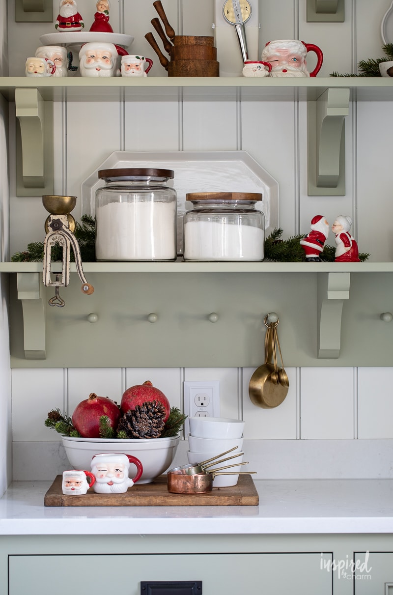
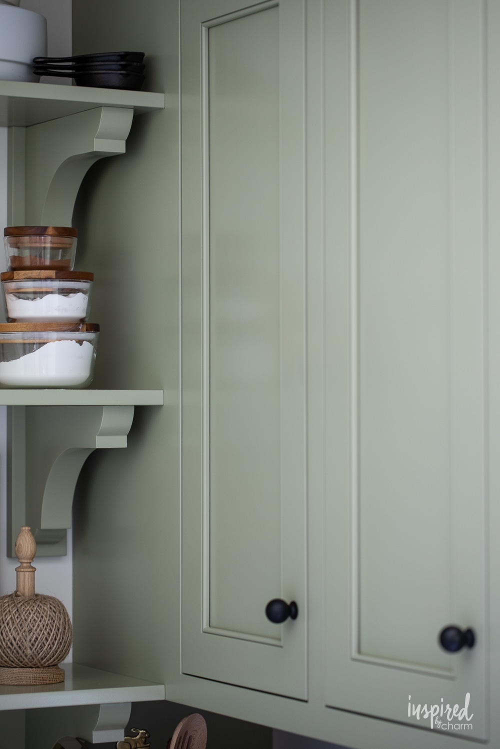
I think this photo is a fantastic example of all the subtle (and not-so-subtle) nuances of Sage. On the bottom left, you can see where the natural light hits the cabinetry and the paint appears much brighter with gray undertones. This is a pretty striking contrast to the top right shelf, where that warm candlelight from my spooky-chic Halloween decor is showing off brown undertones.
Same exact color, but very different results. Fascinating, right?
LRV
Another important part of selecting the right paint color is understanding LRV (light reflective value). LRV is the measurement of how much light a color will reflect or absorb. The scale is from 0 (total blackness) to 100 (pure bright blinding white).
Sage has an LRV of 42, which means it absorbs slightly more light than it reflects. In practical terms, this shade may work better for you in a room that gets a decent amount of natural lighting, vs one that doesn’t.
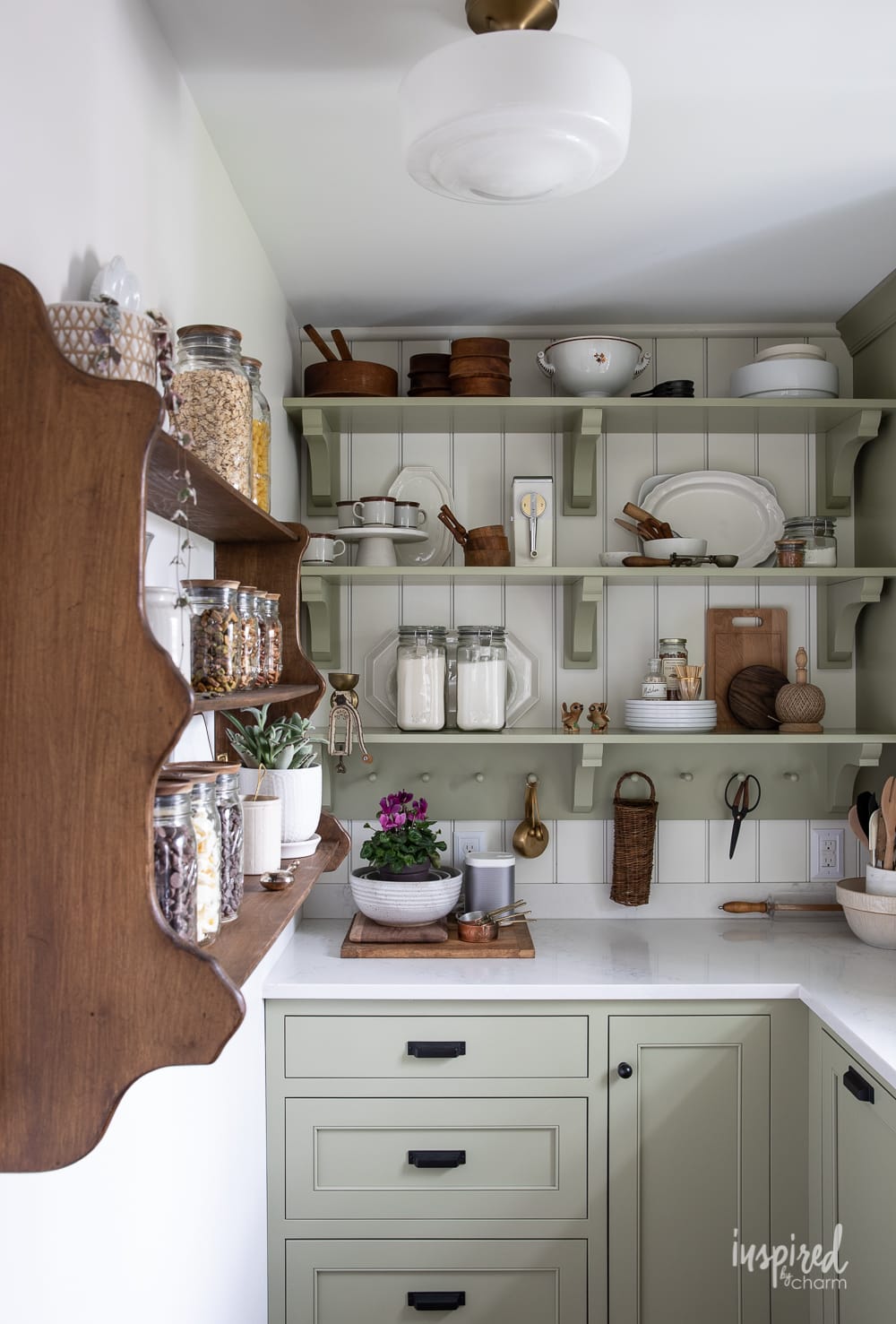
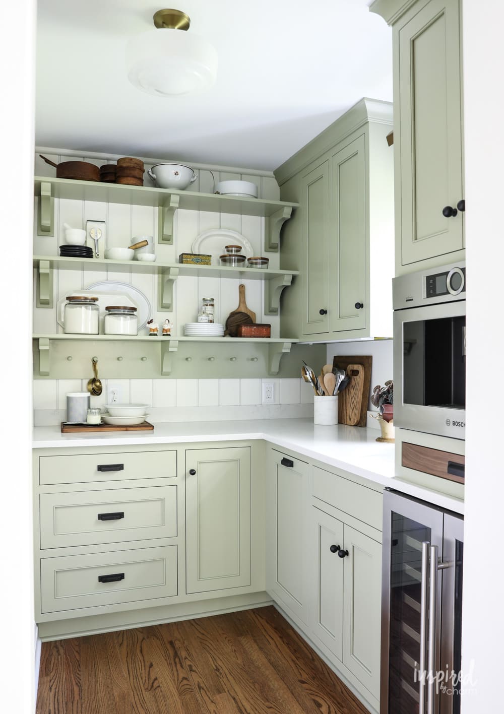
In my pantry, I have a south-facing window, as well as light that floods in from the kitchen. Because of this, Sage appears pretty mid-toned rather than overly dark or dim.
💌 SAVE THIS POST / RECIPE!
Where to Use
Sage is an incredibly versatile paint color and would look great in almost any room.
In bedrooms, I think it’s a particularly lovely option because of its calming nature. You could use it as an overall wall color or perhaps just as an accent wall to bring some life into the space.
It can also look great in bathrooms and can actually help create a peaceful, spa-like environment.
Of course, my favorite application may be for cabinetry, like my very own pantry cabinets! I’ve also seen beautiful images of bookshelves and other furniture pieces painted SW Sage, and I love the idea of this color for a front door.
Honestly, while I chose this as a cabinet color, it could be beautiful wall color in basically any room.
Complementary Colors
Now that you know a bit more about Sage, what colors should I pair it with?
Because of its muted nature, this shade looks best when paired with other toned-down hues. Fortunately, there are plenty to choose from! My top picks are:
- SW Snowbound (SW 7004) – I have a soft spot in my heart for this shade as it’s what I personally selected to paint the walls of my kitchen, dining room, and pantry. You can see from the photos that it works perfectly with Sage!
- SW Egret White (SW 7570) – This is the color that I choose for my main kitchen cabinetry. The cabinetry pairs beautifully together.
- SW Alabaster (SW 7008) – in the same vein of creamy whites, I think Alabaster is another excellent option that will help pull out those warm undertones slightly more than Snowbound.
- SW White Heron (SW 7627) – if you’re looking for a bit more contrast, White Heron is a beautiful choice. It’s one of Sherwin Williams’ most popular colors and the company’s personal pick to pair Sage.
- SW Urbane Bronze (SW 7048) – this is the perfect shade if you want to add a slightly darker element to your space without going too dark. It’s a great way to bring out the earthy undertones in Sage while also creating an interesting contrast.
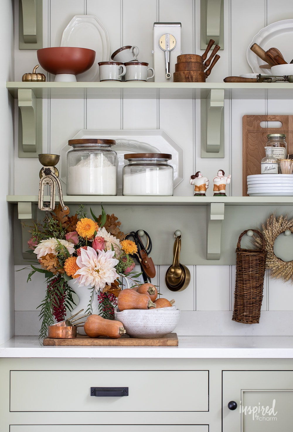
I also have to give a special shoutout to Sage for looking amazing with pretty much any decor. It pairs really nicely with yellow, which I use a good amount of in spring and summer, orange (fall) and red for Chrstmas. Here’s some visual proof!
Colors Similar to Sage
While SW 2860 is my personal favorite sage color, the good news is that gray-green shades are all the rage these days! So, if you’d like to check out a few other options, I’d recommend looking at:
- Aloe (SW 6464): A soft and calming green with a hint of gray, similar to Sage but slightly lighter and brighter.
- Oyster Bay (SW 6206): A muted green with subtle gray undertones, creating a serene and sophisticated look.
- Rainwashed (SW 6211): A delicate green with a just a touch of blue-gray, which evokes a tranquil coastal vibe.
- Retreat (SW 6207): This is maybe my second favorite green-gray! It’s a cool and muted green with those classic gray undertones that create a serene, yet sophisticated look.
- Sea Salt (SW 6204): This is another popular green-gray color with a hint of blue. In my opinion, it’s a bit less saturated than Sage, and it’s definitely lighter, so it’s a good option if you have a space that doesn’t get as much light.
Additionally, Sherwin Williams provides a pretty robust list of options for similar colors to Sage, including:
- Svelte Sage (SW 6164)
- Meander (SW 9522)
- Outrigger (SW 9517)
- Silver Gray (SW 0049)
- Frosted Fern (SW 9648)
Final Thoughts
Overall, I think SW Sage is one of the more versatile color options out there that isn’t a straight-up neutral. It’s a great way to add a bit of life and warmth to any space in your home while still maintaining that calming vibe.
Just remember to try out some sample swatches first, please! Other than that…happy painting!
More Paint Colors You May Love:
- Agreeable Gray – the “best” gray paint color
- Pigeon – cozy green-gray perfect for cabinetry
- Naval – the ultimate navy paint
- North Star – sophisticated blue-gray
- See All The Paint Colors in My Home
So, what do you think? Is Sage the right green-gray for you? Let me know in the comment section!
Want more from Inspired by Charm? Join the IBC Mailing List for inspiration in your inbox! Follow along on Instagram and TikTok for daily updates and behind-the-scenes looks at my processes. There’s even more inspiration on Facebook and Pinterest!
After reading your post last year, we decided to consider Sage in our kitchen. We’re doing a full house renovation of an old farmhouse and I love the groundedness of green. We’ve decided to do SW Sage for the cabinets and SW Avocado for the kitchen island. Alabaster is likely the wall color, but I’ll get some Snowbound and test a swatch. We have one large west facing window over the sink and the other natural light that slips in somewhat is from both north and south facing adjoining rooms. I’ve been trying to decide on cabinet pulls between Champagne Bronze and Brushed Gold…I “think” I’m going with Champagne Bronze…
I am considering SW Sage for my kitchen cabinets with a darker green for the island. Do you have any suggestions for the island color? My kitchen has a large, west facing window and does get light from both north and south facing windows in adjoining rooms.
You have a lovely website.
Wow! I love your choice of colours and I will definitely use Sage for the armoire that my son is giving me soon. I thought I was crazy wanting that combination of greens, blues and yellows but you have proven that there may still be hope for me… lol… thank you. Love your kitchen! Thank you for the inspiration!
The front door had been black for 7 years. I painted it to Sage last Fall and it changed everything to the positive.
Sage then was used on our back sun porch above the windows – stunning.
Timeless and looks great.
Thanks for breaking down the details in this lovely color. We’ve finally made the decision to paint our coffee bar base cabinets Sage, and the uppers Oyster Bar. I think these colors will look lovely together, along with a butcher block counter and inset shelving. What do you think? I’d love to know. 😊
It’s hard to give advice without seeing the space, your style, etc. They are two lovely colors though!
xo Michael
I just LOVE your pantry painted Sage! I picked out Clary Sage several weeks ago for my lower kitchen cabinets where I have tons of natural light but I may have to paint a Sage and Clary Sage swatch after seeing yours. Thanks for the inspiration!
Great post! SW sage is a beautiful color.
What a helpful post! Thank you. I’m going to buy a sample size of Sage and give it a try.
I’m seriously thinking of using this beautiful color (Sage) on the walls in my laundry room which gets absolutely no natural light and only a ceiling fixture. I’ll be sure to check out some of the other recommendations and get a color swatch of each to see what works best. Thanks so much for the information. Your pantry is so intriguing and beautiful!
I love sage! I’ve been considering painting my kitchen cabinets in it!
I painted my bedroom this color over twenty years ago. It is the only room in my home I have never repainted. I think at the time it was called “putty grey” but it is a soft grey/green that I continue to love.
Love that! It really is such a beautiful color. It’s a classic and I can see it being a forever favorite of mine.
xo Michael