Sherwin-Williams Extra White
This Post May Contain Affiliate Links. Please Read Our Disclosure Policy
Lookin for the best white paint color? Sherwin-Williams Extra White is crisp, versatile, and a certified fan favorite. Discover why so many go ga-ga over this seemingly simple white paint (myself included!).
All home decorators have a go-to white paint. Don’t believe me? Just ask them!
I bet you they won’t even hesitate before blurting out some form of “cloud” or “blank slate” shade name.
For myself, Extra White Sherwin-Williams, SW 7006, is my white of choice.
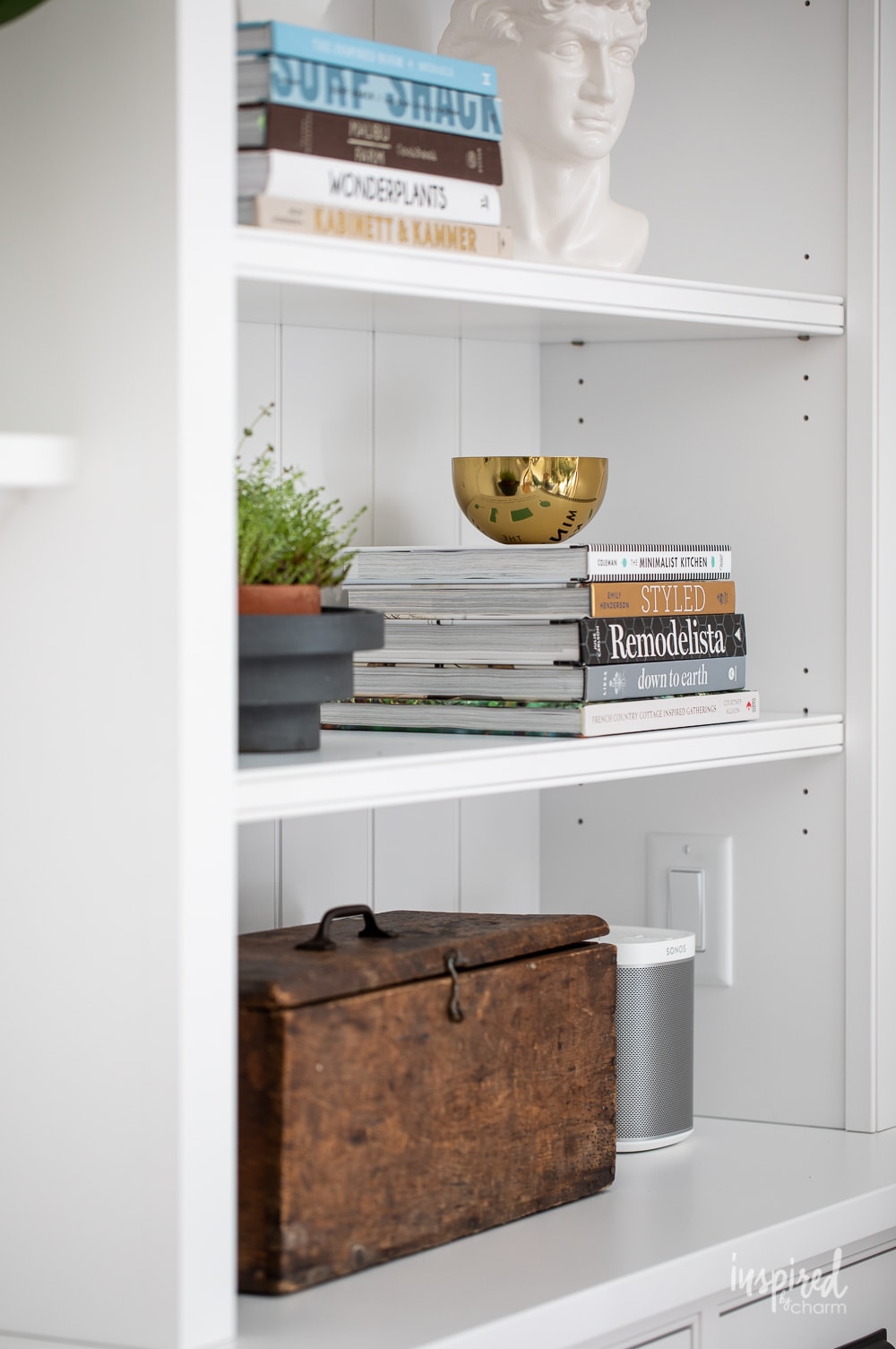
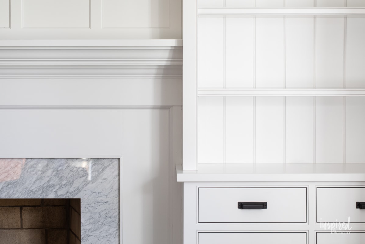
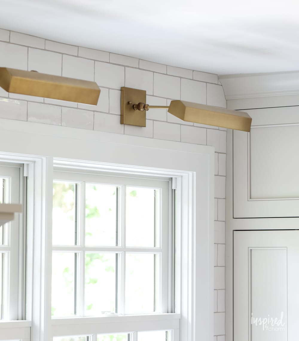
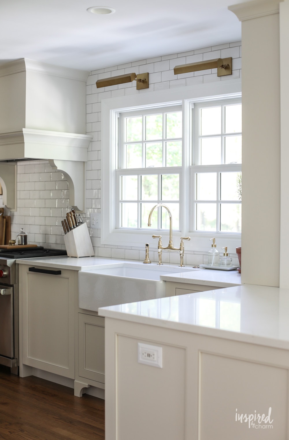
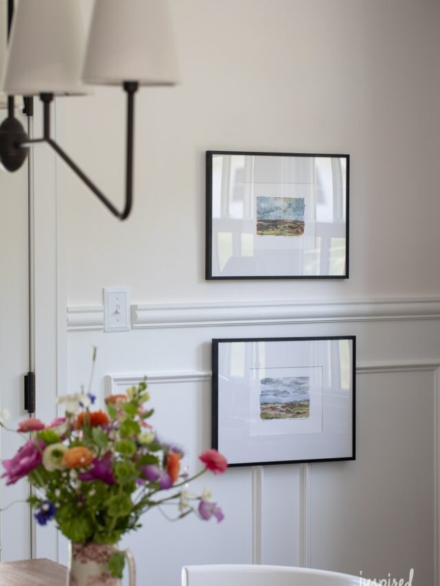
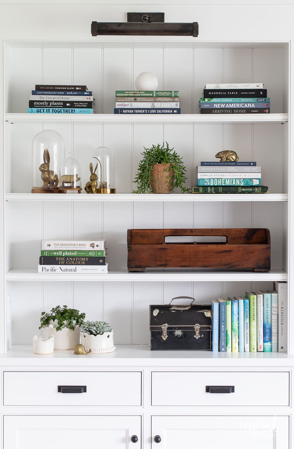
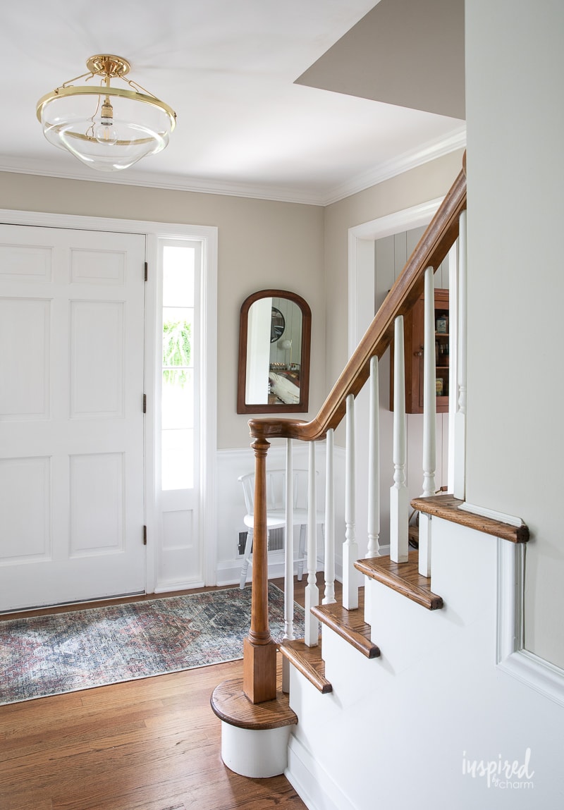
Just a quick jaunt through my home would prove so – with it gracing the majority of the molding and trim work around my house. Even my living room cabinetry has earned the privilege.
I can always count on this white paint to look clean and gorgeous straight from the can. It doesn’t even need to be mixed!
Leaning cool while working well with pretty much any color, SW Extra White has a crisp and bright appeal that is perfect for any trim work, ceilings, and more.
In this post, I’m exploring the possibilities for this clean white shade, including where to use it, coordinating colors, and shade comparisons for your convenience.
What color is Sherwin-Williams Extra White?
Definitely a clear white, SW Extra White looks super on any wall or trim.
I often use this color because it is so pure white, with a hint of cool-toned interest that makes it all the more special.
If you’re looking for a dependable and versatile white paint, Sherwin Williams Extra White should be your first stop!
Undertones
Okay, while this color is decidedly called “Extra White,” there is a little more to it than that.
All paint colors have a little something under the surface called “undertones.” These undertones make up whether a paint is warm, cool, or neutral.
Significant red or yellow undertones make a warm color, blue, purple, and green undertones make a cool color, and neutral undertones have a good mix.
Sherwin Williams Extra White has RGB (red, green, blue) color values, including R:238G:239:B234.
This makes the shade close to neutral, with just a hint of coolness played up by blue and gray undertones.
These undertones will cause Extra White to look super bright under natural light, with any nearby warm colors appearing slightly yellowed.
Because of these undertones and morphing possibilities, it’s always best to swatch your paint color to see how it’ll perform in your space.
While this step may seem redundant for a white paint color, I guarantee you’ll appreciate the effort. There’s nothing like painting an entire room before deciding that you’re unhappy with the paint’s performance!
For more information on choosing paint and swatching potential colors, check out my post on How To Choose Paint Colors.
LRV
Another important aspect to consider when choosing a paint color is to investigate the LRV, or light reflectance value.
This scale refers to how much light will be reflected off a given color. A high LRV of 100 would be the purest, most reflective white. A low LRV of 0 would be the darkest black possible.
Sherwin Williams Extra White lands itself as an 86 on the scale, classifying it as a light, bright, and highly reflective color.
Still, 86 may seem a tad bit low based on its “Extra White” namesake.
In my opinion, this is a good thing, keeping the shade from looking too stark or clinical when used in brightly lit rooms or a cool color palette.
Where to use
To put it simply, Sherwin Williams Extra White can be splashed about pretty much anywhere in your home!
This color is my go-to trim shade because it’s clean and versatile while slightly more forgiving than a starker white.
I’ve also used it to paint my living room cabinetry to provide the perfect blank canvas for my decor.
You could also use Extra White on your ceilings to add more height to your room or in small, darkly-lit spaces for a brighter, expanding effect.
I’ve even seen this color used as an exterior paint all over your home. The results are incredibly chic and clean.
Finally, I think this paint color would be wonderful for white-washing exposed brick, both for interiors and exteriors.
Complementary colors
Because this paint color is so neutral, it can go with just about any color palette you can dream up!
💌 SAVE THIS POST / RECIPE!
It does run slightly cool, favoring cool-toned combinations, including icy blues, mid-tone purples, and soft greens.
Other fun options are bright and bold contrasting colors for a dramatic effect, a plethora of whites for a monochromatic look, or a dreamy combination of pastels.
My Recommendations
Here are just a few fun pairings I think would best enhance SW Extra White’s potential.
Icy blues
- Icy (SW 6534) – Cool-toned blue/purple with a calming essence.
- Mild Blue (SW 6534) – Gentle purple/blue with gray undertones.
- Moon Mist (SW 9144) – Airy, neutral blue with cool gray and yellow undertones.
Mid-tone blues and purples
- Searching Blue (SW 6536) – Pensive, peaceful shade of mid-tone blue/violet.
- Dried lavender (SW 9072) – Soft, muted periwinkle.
- Luxe Blue (SW 6537) – Deep and lush blue/violet for a bold pop of color.
Greens
- Jasper Stone (SW 9133) – Cool-toned green with blue and gray undertones for a balanced, nature-inspired shade.
- Window Pane (SW 6210) – Blue-green pastel with a bright and citrusy feel.
- Quietude (SW 6212) – Tranquil, neutral green with a blue-gray undertone.
- Relish (SW 6443) – Playful, soft yellow-green.
Bright and bold
- Azure Tide (SW 9684) – Deep and classic denim blue.
- Briny (SW 6775) – Bright turquoise blue with a cool base.
- Starboard (SW 6775) – Vivid Kelly green with a vintage charm.
Pastels
- Rarified Air (SW 6534) – Very light pastel purple with a hint of cool-toned blue.
- White Mint (SW 6441) – Subtle pastel green.
- Teaberry (SW 6561) – Pastel red like a sweet, muted strawberry.
Bright whites
- High Reflective White (SW 7757) – Super clean and bright white.
- Rhinestone (SW 7656) – Blue undertones, crisp, clear, bright white
- Snowbound (SW 7004) – Snowy, cool white with a bit of gray undertone
Sherwin Williams Recommends
Sherwin Williams opts for classic blue shades to pair with Ultra White for a tranquil, almost nautical combination.
Their recommendations include:
- Smoky Azurite (SW 9148) – Cool-toned denim blue with yellow-gray undertones for complexity and serious sophistication. It will look smart and vivid against SW Extra White.
- Charcoal Blue (SW 2739) – Dark and dramatic, this deep navy is almost black for a bold statement. Pair with SW Extra White for an incredible contrast.

Sherwin Williams Pure White vs. Extra White
Within the Sherwin Williams color family, SW Pure White and SW Extra White are amongst the closest compared.
So, how do these popular neutrals compare to one another?
Extra White has an LRV of 86 in comparison to Pure White’s 84, making Extra White appear slightly brighter and more reflective under natural and artificial light.
Pure White also has a bit of a yellow undertone for a warmer effect than Extra White’s blue/gray undertones.
Overall, these colors are similar in makeup, though Extra White is better suited for tranquil, cool-toned palettes of blues and greens, while Pure White suits warmer, sunny palettes of reds and yellows.
Colors similar to Sherwin Williams Extra White
While Sherwin Williams Extra White is perfect for pretty much all of my bright white needs, it may be a smidge off from your ideal color.
Whether it’s slightly too cool-toned, you prefer a higher LRV, or it’s a little out of your price range, some colors come super close to this paint with small differences.
Here are the colors most similar to Sherwin Williams Extra White:
- Billowy Down (BEHR 780E-1) – Almost identical, with a slight increase in LRV at 87.
- Cabbage White (Farrow & Ball 100269) – More blue with a lower LRV of 84.
- Snow Storm (PPG 1172-1) – Features a mauve, purple undertone.
- Bistro White (Valspar 7006-4) – Just a touch more red while still decidedly cool-toned.
- Super White (BM OC-152) – A close match, with a bit brighter LRV of 87.
- Pure White (SW 7005) – Lower LRV of 84, slightly warmer, yellow undertones.
- High Reflective White (SW 7757) – Brighter white with an LRV of 93 and more neutral undertones.
- Gypsum (SW 9543) – A tad darker with an LRV of 82 and more neutral undertones.
- Ceiling Bright White (SW 7007) – Similar blue undertones, with a darker LRV of 83.
Final Thoughts on Extra White
And that folks is the full scoop on my favorite trim and molding color – Sherwin Williams Extra White.
Whether you follow my example and pepper this paint into nearly every room in your home, use it as a brilliant cabinet color, or love it enough to splash your entire house in it, Extra White is sure to perform.
Now, I’d love to hear your thoughts! What’s your opinion on Extra White by Sherwin Williams? Chic and classic? Too plain for your tastes? Let me hear it in the comments down below.
Happy painting!
More Paint Colors You’ll Love
- Farrow & Ball Pigeon No. 25 – neutral blue-gray with hints of green
- Sherwin-Williams Naval – the ultimate navy blue
- Sherwin-Williams Sage – my favorite green paint
- Sherwin-Williams Rock Candy – calming light gray blue
- Sherwin-Williams Agreeable Gray – my favorite griege
Want more from Inspired by Charm? Join the IBC Mailing List for inspiration in your inbox! Follow along on Instagram and TikTok for daily updates and behind-the-scenes looks at my processes. There’s even more inspiration on Facebook and Pinterest!
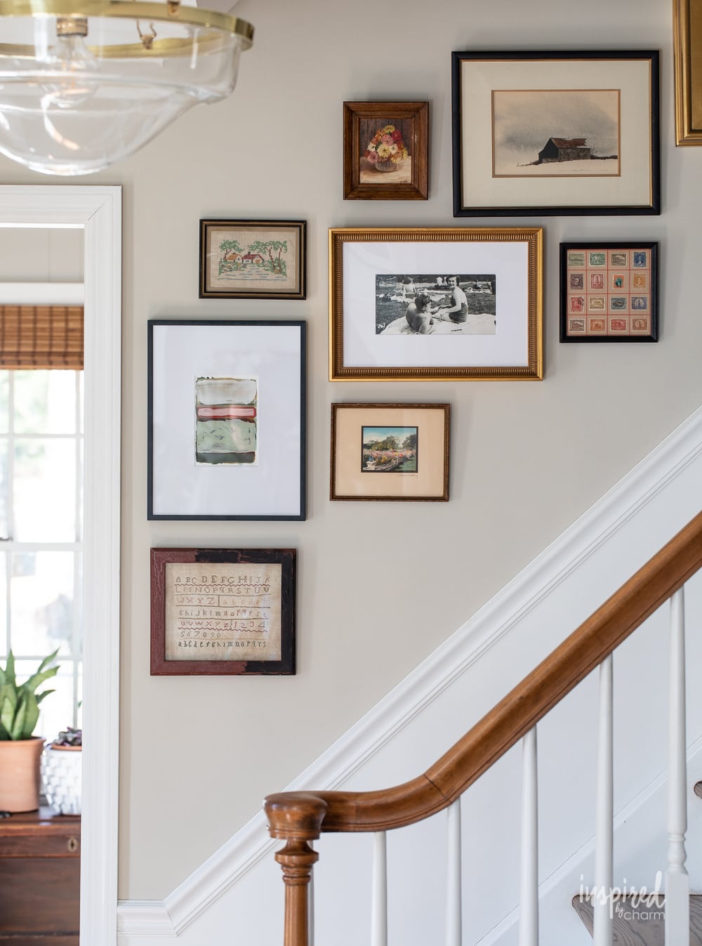
I’d like to know what paint colors you have in the photos above? Such as the kitchen with beige cabinets, and the beige entryway with the wood banister? (Accompanying the Extra White?)
Could you use Extra White on ceiling, walls and trim incorporating three different sheens?
As a fellow enthusiast of interior design, I found your recommendations for using Extra White on cabinetry and molding particularly inspiring. The color pairings you suggested are a delightful bonus and will undoubtedly help readers create cohesive and aesthetically pleasing color schemes.