Painting my Living Room
This Post May Contain Affiliate Links. Please Read Our Disclosure PolicyThere’s nothing like the upcoming holiday season to push house projects to the top of the list. Am I right? That’s why, after living in Bayberry House for four months, I finally decided to start painting.
As many folks know, I love dressing up my space for Christmas. Before the tree goes up, however, there are a few big things I want to accomplish. One of those projects was painting my main living room.
I’ll admit that the existing color was perfectly fine. It was a creamy beige that would probably work well with almost anything. But I prefer gray over beige.
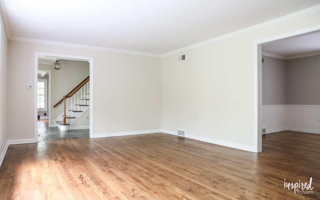
Although I have bigger plans for this room down the road, including reworking the fireplace surround and mantel, I wanted to give it a fresh new look now so it felt a bit more like me. Since paint is the quickest fix, that’s where I decided to start.
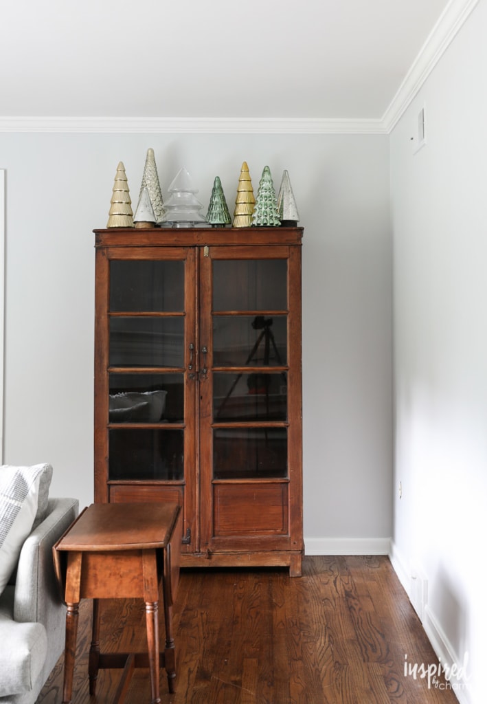
I came across a color I liked on Pinterest. It’s Farrow and Ball’s Blackened. I have their fan deck of colors, and Blackened seemed to work well with the new pieces I’m planning to bring into the space. Being a bit lighter, the color will also brighten up the room.
Since I’m a Sherwin Williams loyalist, I had them match the color, and then I sampled it on my walls. Even though it didn’t have any blue tint in it, it felt blue on the wall. Wanting gray and not light blue, I decided to try another sample. I looked through the color deck again and chose Farrow & Ball’s Dimpse. This was a bit darker, and it appeared grayer to me. – I even did a few google searches to see what the color looked like on other people’s walls.
Once again, I had the color matched by Sherwin Williams and tried it in my living room. It was much better, but I still thought it felt kinda blue. After testing it in various parts of the room, I decided to forge ahead. (Spoiler alert: I should have trusted my “it’s still too blue” gut instinct.)
I finished painting on Saturday afternoon and, unfortunately, I’m just not feeling the results.
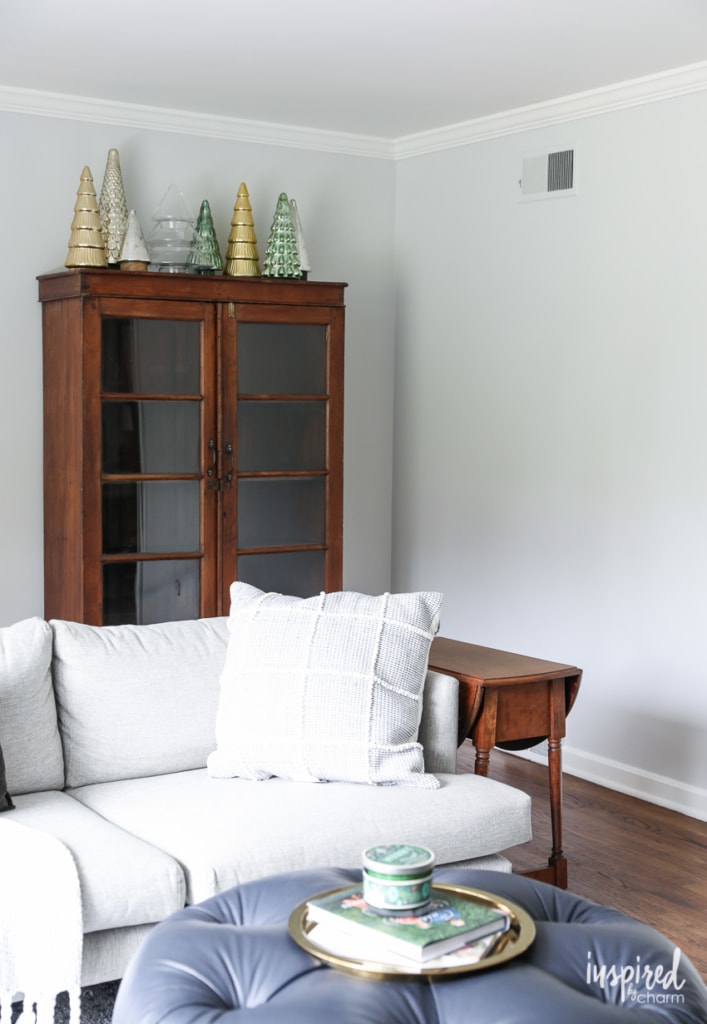
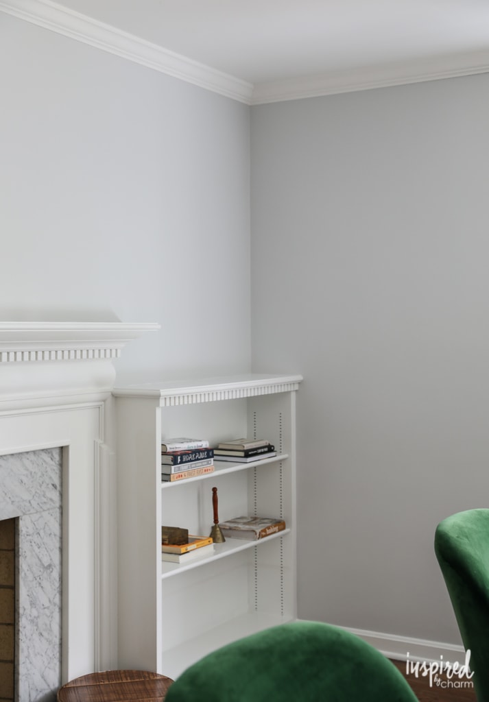
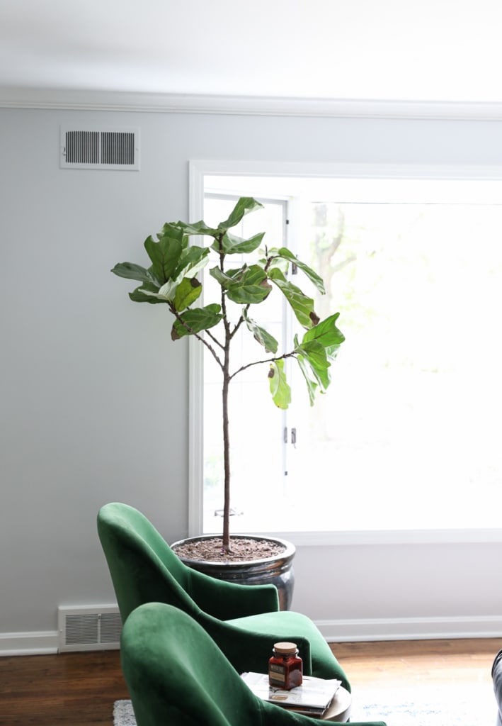
I’m not sure how the color comes across here on the blog or on your screen. Because of lighting and different screen settings, it may not appear blue at all. However, in person, it looks like a soft baby blue.
💌 SAVE THIS POST / RECIPE!
And while Dimpse is a lovely color and I could make it work, baby blue walls are just not my jam for this space. I actually like it more in pictures, but less in real life.
I’m going to live with it for a few days and see how I’m feeling about it, but my gut tells me that I’ll be repainting it next week. Lol.
I don’t mind painting, and this room came together quickly. but I’m still kicking myself for not getting it right the first time. Still, it’s the first room I painted in the house so I’m allowing myself a bit of grace.
This is an excellent example of the importance of testing paint colors on your walls. You may love the color of a wall you see online, but because of light (or lack thereof), the color could look completely different in your home. I also believe that your house will reveal what colors it wants. Not in like a creepy, ghostly way, but it will be obvious when a color doesn’t work.
I should note that the color from Sherwin Williams matches the Farrow & Ball color card perfectly according to my eyes. I did have them match a color for another project I’m working on, and the results were not as close. (This other color is much darker, so I assume that’s why it didn’t match as well.)
Anywho, that’s my painting adventure for the day. I’ll keep you posted on what I decide to do and how things work out. (I’ll talk to you more about my new cabinet and emerald chairs in another post. Stay tuned.)
In the meantime, I’d love to know what you think of the color or if you’ve had a similar painting “fail.” Decorating is an adventure, isn’t it?
While horribly frustrating, at least your painting “fail” is still completely livable. When I was 9 months pregnant, my husband and I finally got around to painting our sons nursery. Word to the wise- never trust the color judgement of a woman who is 9 months pregnant! (Or at least don’t trust me!) I had read that brighter colors are good for an infant so I chose a cheerful grassy green shade. Unfortunately after my husband painted the entire nursery in this color I realized I made one EPIC mistake. It was a sickening, alienesque green that made us sick. YUCK. Thankfully my hubby came up with the idea of painting the bottom half of the room in a calming tan tone and added a white chair rail. After those two additions the green finally looked the way we (or really I should say I) wanted it to. PHEW. My husband is a saint to have been able to survive that disaster! So no worries about a slightly blue-ish tint. It’s a much easier fix than mine was! Oh, and you’re right- the color looks lovely in the photos but I can imagine that in real life it is quite underwhelming when you consider your design scheme. Can’t wait to see what you decide!
I completely understand what you are going through with your gray color. My husband and I repainted our bedroom over the summer and the next day, I woke up and said, I hate the new paint color! It had a blue hue to it and we have a medium oak bedroom set, and I didn’t like it with the furniture. Then we went back to the paint store got new paint, repainted a little darker color! I like the color with the furniture, but it still looks blue! We have lived with it, and moved on to other projects and those colors have turned out great! I recently found out for a small fee, SW will come to your house and help you pick out colors for your room! Maybe worth a try! Hoping you have better luck with your paint colors!
Love your new house. Being a color-phobe myself I tend to stick to pale yellows. BUT I’m getting ready to paint my kitchen cabinets and want to use grays, light on top, darker for the bottoms.. So I love this feed and all the gray colors and paint brands everyone is talking about.
How frustrating! It’s great to know, though, that someone as experienced as you are,Michael, anguishes just like we do, over picking the color that is Just Right – and then, even with all the care you have taken, have it turn out to be – not THE one – just like us!
Houzz had an exploration of shades of gray paint about 6 to 9 months ago- I’ll try to find it and send you the date.
Given that you tried so hard to get just the right color paint and it was still not quite right, you might want to wait till after Christmas is over and then repaint it when you are under less stress to make the right choice! (Though it’s not quite the shade I would pick, It really looks pretty much grey from here!) I will say though that – at first when I saw the light beige on the walls I thought, “It’s fine, why change it”? But then when I saw the grey paint up – even if it’s not yet quite right-I realized that _ although I can’t explain why- the grey will bring much more elegance to the room!
I’d like to repaint my warm beige walls a gray, but my ceiling is a creamy off-white. What color is your ceiling?
Just a standard ceiling white.
xo Michael
Sorry you have to probably repaint, but that color just looks cold to me, and your rooms are usually so fun filled and warm! You know you can have them up the intensity, like 125 percent or 150 percent to deepen, but i think i would get some sample pots and paint patches first, because real life seldom resembles a paint chip……
I have seen a few people who have had issues trying to have a color match done to Farrow and Ball colors. The problem is that Farrow and Ball is a clay based paint. This gives their paint very different qualities that makes color matching very difficult but also makes it a beautiful to work with. Their price point is high but I have found that in some cases it is worth the splurge.
This is great to know! Thank you so much!
xo Michael
I have the same problem with grays. I have painted my living room twice in two years and each time I thought I was getting a light gray and it turned out light blue! Others have also saw it as blue. I’m sticking with it for now but who knows if I might change it down the road. Ugh. I wish I could find a true gray. Good luck Michael! I understand your frustration.
Oh darn, it does look baby blue. Pretty, but likely not the right vibe here! Glad you enjoy painting (me too)!
I had a very close call with a giant painting fail recently. I selected paint colors for our house exterior, and, because of rain delays, the painters wound up putting on the color while I was out of town. After putting on one coat (with no trim color), the painter sent me a picture of the house. The color didn’t translate well on my phone, and I hated it. HATED it. “What have I done?” I thought the remainder of my trip. It’s a big old Victorian house, so I couldn’t afford to have it repainted, and it looked like a cheap teal/swimming pool blue green instead of the lovely sage green (with bright white trim) that I had chosen. Kicking myself the whole way home, and in tears, I kept thinking I should have just painted the house white and been safe. I was never so relieved as I was when I pulled up to the house after the trip. I actually love the color, my sage green after all!
Hello Michael,
Can’t paint be so tricky! I have learned the hard way that lighting, room size, furnishings etc can make a color look so differently in each house. I would like to suggest BM Edgecombe Grey (one shade lighter than Revere Pewter) for a clean, modern gray shade. Also, you might want to go over to “Young House Love” blog and take their current house tour. They live in my hometown (Richmond, VA) and have written books, been on several shows and designed a décor line for Target and Universal Furniture. They use some great gray colors in their house that you might like. If nothing else, you will love touring their Colonial house and seeing all the upgrades they have done.
We painted our family room Smooth Stone by Glidden but mixed in Behr. It is perfect. However, when we went paint the connecting living room with it, because of the different lighting I guess, it came out looking purple-ish! Yuk! So I found a similar color, Dolphin Fin and we painted it that color and it came out beautifully. They look exactly the same, but they are different paint colors.
Oh dearie!!! I think everyone has lived through the “what was I thinking” stage re a paint colour. Trusting your gut says it all. If you don’t quite like it in the beginning…nothing will fix it except repaint. With the rush re time maybe a path to take is go with a white up or down one shade from your trim…or use trim colour. Everything will pop esp those emerald chairs , your Christmas lights etc. This will bide you time and who knows maybe it will stay. Enjoy your new digs. Just found your blog and loving all you write and do.
It does look blue-grey on screen…but if it’s not for you then repaint! We have had similar painting failures…in our first home, the first room we painted was our living room and hallway. Hubby got one wall done and I said “eh, let’s wait before doing the rest”. Well, he wanted to get it done and did the rest while I was out. Michael, it was so horrible. We still refer to the color as “Bordello Yellow” and paired with the curtains which had a lot of red in them…it was just horrendous and looked like décor in a bordello from a 1950’s Western movie!! He repainted into a much softer buttery color I had in mind and all was good!
It looks great on screen, but I can understand being frustrated that it doesn’t look the way you pictured it in real life. I made a similar mistake with the first room we painted in our new house. I picked out a fun coral for the baby’s room, and it just looks…kinda salmon-y, LOL. I think you’re right that our houses kind of tell us what colors they should be. For the rest of the house we went with more muted, pastel type colors, which is NOT something I ever would have thought I would like, but it works here. Good luck finding your perfect color!
I have had the worst time finding a grey that I don’t feel is too blue, so I’m glad to read it’s not just me. Khaki, I can do. White, no problem (I used Valspar’s off-the-shelf “perfect white” on the most recent room makeover, and it truly is perfect and I want to use it everywhere forever).
I have to say that one of the many things I love about you is your use of the word “anywho.” Kindred spirits!
It looks grey on my screen, but I totally get what you’re saying. I painted a room what I thought was grey once, and it turned out blue. Not grey with a hint of blue, just blue. I’m a slow painter and I don’t enjoy it, so it was really frustrating. Ugh. I can’t wait to see what color you end up with, and as a long time follower, I know whatever you choose will look great!
This is a bit like “what color do you think ‘the dress’ is?”, isn’t it? I see gray, however, I know others see blue. I can’t wait to see what you decide. It’s all very beautiful.
I had the same thing happen when choosing a paint for our main living areas with tall ceilings – yep, had it done twice, and yep still some blue tint. I probably would have chosen another color (third time was not going to happen), but it has grown on me. And I have had compliments on the color. So certainly understand your dilemma. One positive though, it does look very nice with your wood accents and furniture. Whatever you decide I am sure it will look fabulous!
It does read blue to me. I’m feeling your paint I’m having a hard time picking paint for my kitchen. I’ve tried the beloved sea salt and it’s baby blue in my bright room. Not what I was going for! I just used sw mindful gray in my great room and I love it.
I can’t see blue in it, but then pictures don’t usually don’t show the “true” color. I like it!