Painting my Living Room
This Post May Contain Affiliate Links. Please Read Our Disclosure PolicyThere’s nothing like the upcoming holiday season to push house projects to the top of the list. Am I right? That’s why, after living in Bayberry House for four months, I finally decided to start painting.
As many folks know, I love dressing up my space for Christmas. Before the tree goes up, however, there are a few big things I want to accomplish. One of those projects was painting my main living room.
I’ll admit that the existing color was perfectly fine. It was a creamy beige that would probably work well with almost anything. But I prefer gray over beige.
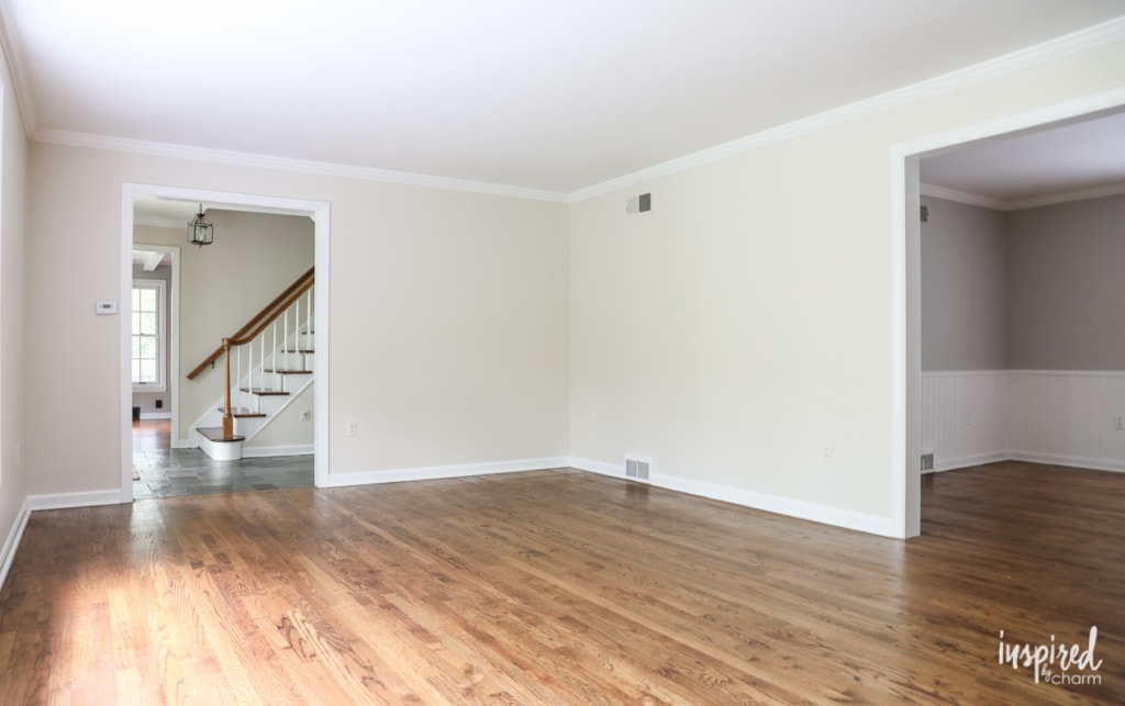
Although I have bigger plans for this room down the road, including reworking the fireplace surround and mantel, I wanted to give it a fresh new look now so it felt a bit more like me. Since paint is the quickest fix, that’s where I decided to start.
I came across a color I liked on Pinterest. It’s Farrow and Ball’s Blackened. I have their fan deck of colors, and Blackened seemed to work well with the new pieces I’m planning to bring into the space. Being a bit lighter, the color will also brighten up the room.
Since I’m a Sherwin Williams loyalist, I had them match the color, and then I sampled it on my walls. Even though it didn’t have any blue tint in it, it felt blue on the wall. Wanting gray and not light blue, I decided to try another sample. I looked through the color deck again and chose Farrow & Ball’s Dimpse. This was a bit darker, and it appeared grayer to me. – I even did a few google searches to see what the color looked like on other people’s walls.
Once again, I had the color matched by Sherwin Williams and tried it in my living room. It was much better, but I still thought it felt kinda blue. After testing it in various parts of the room, I decided to forge ahead. (Spoiler alert: I should have trusted my “it’s still too blue” gut instinct.)
I finished painting on Saturday afternoon and, unfortunately, I’m just not feeling the results.
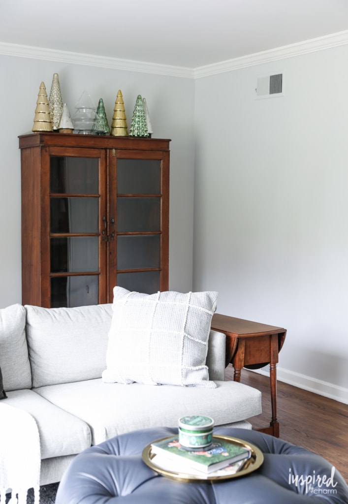
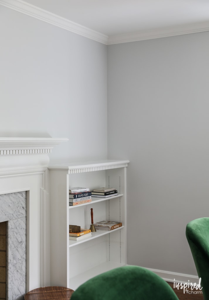
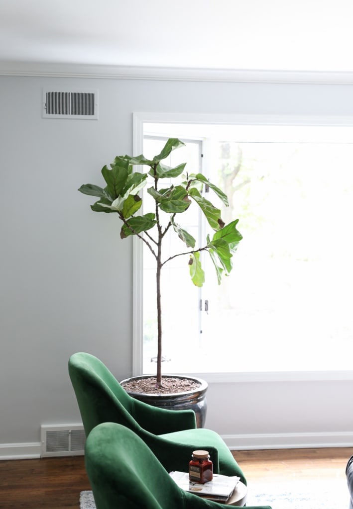
I’m not sure how the color comes across here on the blog or on your screen. Because of lighting and different screen settings, it may not appear blue at all. However, in person, it looks like a soft baby blue.
💌 SAVE THIS POST / RECIPE!
And while Dimpse is a lovely color and I could make it work, baby blue walls are just not my jam for this space. I actually like it more in pictures, but less in real life.
I’m going to live with it for a few days and see how I’m feeling about it, but my gut tells me that I’ll be repainting it next week. Lol.
I don’t mind painting, and this room came together quickly. but I’m still kicking myself for not getting it right the first time. Still, it’s the first room I painted in the house so I’m allowing myself a bit of grace.
This is an excellent example of the importance of testing paint colors on your walls. You may love the color of a wall you see online, but because of light (or lack thereof), the color could look completely different in your home. I also believe that your house will reveal what colors it wants. Not in like a creepy, ghostly way, but it will be obvious when a color doesn’t work.
I should note that the color from Sherwin Williams matches the Farrow & Ball color card perfectly according to my eyes. I did have them match a color for another project I’m working on, and the results were not as close. (This other color is much darker, so I assume that’s why it didn’t match as well.)
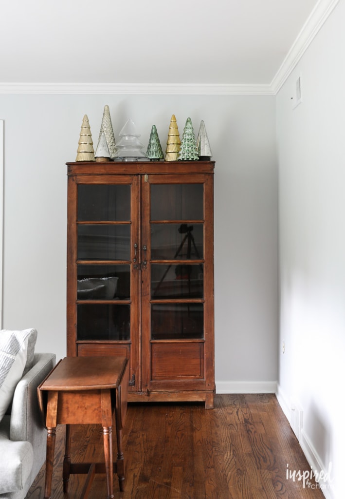
Anywho, that’s my painting adventure for the day. I’ll keep you posted on what I decide to do and how things work out. (I’ll talk to you more about my new cabinet and emerald chairs in another post. Stay tuned.)
In the meantime, I’d love to know what you think of the color or if you’ve had a similar painting “fail.” Decorating is an adventure, isn’t it?
On some of the photos it does appear to have a blue tinge. I noticed that the adjoining room on the other side of the arch looks like a perfect gray. Have you considered that paint color? It would also expand and connect the rooms.
Paint not working is The Worst. I think I went through roughly 20 test pots for my living room after the first color was soooooo much darker than I could handle. It’s a north facing room, looking into an alley, and would you believe colors look dramatically different? Finally went with BM Bunny Grey. Looks blue all over the internet but somehow just looks grey in the room. Yay! It’s been painted for nearly a year now and I’m so glad with how it turned out.
Maybe try agreeable gray by Sherwin Williams. I’ve used it in 2 homes and it’s about the same color without the blue. Revere Pewter is close, too.
We have a light gray scheme and used SW Egret White. It is very light gray, but next to a white ceiling or trim it looks great. We have an accent wall of SW Samovar Silver, and like your room, it turned out blue. Because blue is our accent color in the room, we left it.
Try Behr “Statuesque” – I think it might be close to what you’re looking for!
Hi! I’ve had the same issue a couple times now and I’m also a SW fan. I finally solved it by picking a similar gray to what I wanted, but something that noticeably had more of a warm green undertone compared to the other grays I was considering. Even if I thought it was a little too green on the paint chip, it seems to work out on the wall almost every time. Good luck and happy painting!
Check out Miss Mustardseed’s website. She just moved into a new home and her gray color selections were spot on I thought.
That’s what I was going to suggest. 🙂
I feel you! I recently chose a color for our open-plan house so it had to go on a LOT of different walls and it looks great on every wall except one where it feels a little green. Unfortunately that’s the wall in front of me when I sit on the couch at night…. 🙁
Is this room north-facing by any chance? That pale watery north-facing light is the kind that always gives me the most paint color headaches.
Light french grAy by Sherwin Williams….a true light gray…IT’S BEAUTIFUL]
I’m a Benjamin Moore loyalist and absolutely love Revere Pewter. May be a bit too dark for your living room (I used it in our bedroom) but it’s a true gray.
I’ve had two expensive painting fails and for exactly the reason you mentioned. The color matched by a different paint company was wrong. I didn’t test the paint either time (my mistake; btw these two fails were decades apart so I’m not that slow a learner) and I paid someone else to paint it so didn’t discover it until it was done. The first painter rightfully expected to be paid to paint again The second, since he insisted on the paint manufacturer did paint for free.
Hi Michael, Love what you are doing with your home! I have had great luck with Benjamin Moore Stonington grey. We did a bath remodel last year and it is very nice. Also will be using it in the master bath in our new home.
I have never had good luck color matching one brand to another’s mixing. I now stick with Benjamin Moore and have been really happy with the results. I have had to the-do a grey in my bedroom a couple of times, it looked purple at night. Greys are really hard and lighting makes a huge difference. Good luck, you always do such a beautiful job!!
Paints not pants.lol
Many nice real grey tones by Benjamin Moore pants, and also Sherwin williams that don’t have blue undertones and also pinkish undertones. Please take look at their colors too.
Hi Michael! Your photos look great but I know what you mean. The same thing happened to me. After searching colors online and putting swatches around on my walls I picked Ben Moore Moonshine but it looks purple in my house! Still searching for the perfect neutral gray so i can paint it over! I love following you by the way! -Jenn
It’s definitely looking blue to me too. And when you want gray, blue is just not cool, right?? I just finished painting my living room the gray I wanted all along after letting my mom influence me to paint it beige 5ish years ago. Why I listened to her is beyond me! And why I spent my time in a room I didn’t like for that long is beyond me too! LOL. I’m never painting anything beige again. But, also, I think gray is kinda hard. The gray I used in my house looks almost white to me, but when I took it to my grandmas to try it there it looked baby blue. I’m guessing the lighting? Anyway, I think you should definitely do what makes you happy and not sit in a room you only kind of like for the next 5 years like I did with that atrocious beige. Ha!
Michael, The color complements the fireplace tile and looks gray next to it. But, on the window wall, I’m picking up pale blue. I feel your frustration. Honestly, though, I’d accessorize and see if that solves your dilemma before re-painting. but then, I hate painting. lol, Hugs!
Having Been through the paint color selection process many times, the one thing I know for sure is to trust your gut. If it doesn’t feel right, you will constantly be fighting with it in all the other selections you make for the room, to make it work. Far better to spend the time getting a color that you totally love! Also, is there a reason you aren’t bringing home SW color swatches to use in your selection process if you are going to use SW paint? I’ve had color matches done with different brands and sometimes it just isn’t the same once it’s on the wall. I think it has to do with what base they start with….a dark or a light, or something like that. Good luck, and don’t let yourself feel this is a failure! Love your house and all you’ve done so far!
It does look gray on my iPad but I understand the frustration of the real thing once the paint drys.
I love reading your blog and seeing the pics of your new home.
Keep em’ coming!