Painting my Living Room
This Post May Contain Affiliate Links. Please Read Our Disclosure PolicyThere’s nothing like the upcoming holiday season to push house projects to the top of the list. Am I right? That’s why, after living in Bayberry House for four months, I finally decided to start painting.
As many folks know, I love dressing up my space for Christmas. Before the tree goes up, however, there are a few big things I want to accomplish. One of those projects was painting my main living room.
I’ll admit that the existing color was perfectly fine. It was a creamy beige that would probably work well with almost anything. But I prefer gray over beige.
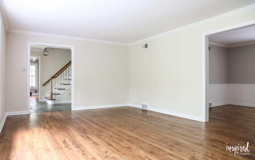
Although I have bigger plans for this room down the road, including reworking the fireplace surround and mantel, I wanted to give it a fresh new look now so it felt a bit more like me. Since paint is the quickest fix, that’s where I decided to start.
I came across a color I liked on Pinterest. It’s Farrow and Ball’s Blackened. I have their fan deck of colors, and Blackened seemed to work well with the new pieces I’m planning to bring into the space. Being a bit lighter, the color will also brighten up the room.
Since I’m a Sherwin Williams loyalist, I had them match the color, and then I sampled it on my walls. Even though it didn’t have any blue tint in it, it felt blue on the wall. Wanting gray and not light blue, I decided to try another sample. I looked through the color deck again and chose Farrow & Ball’s Dimpse. This was a bit darker, and it appeared grayer to me. – I even did a few google searches to see what the color looked like on other people’s walls.
Once again, I had the color matched by Sherwin Williams and tried it in my living room. It was much better, but I still thought it felt kinda blue. After testing it in various parts of the room, I decided to forge ahead. (Spoiler alert: I should have trusted my “it’s still too blue” gut instinct.)
I finished painting on Saturday afternoon and, unfortunately, I’m just not feeling the results.
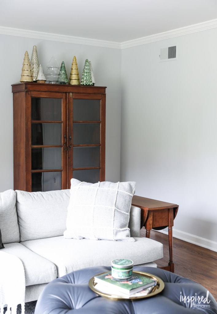
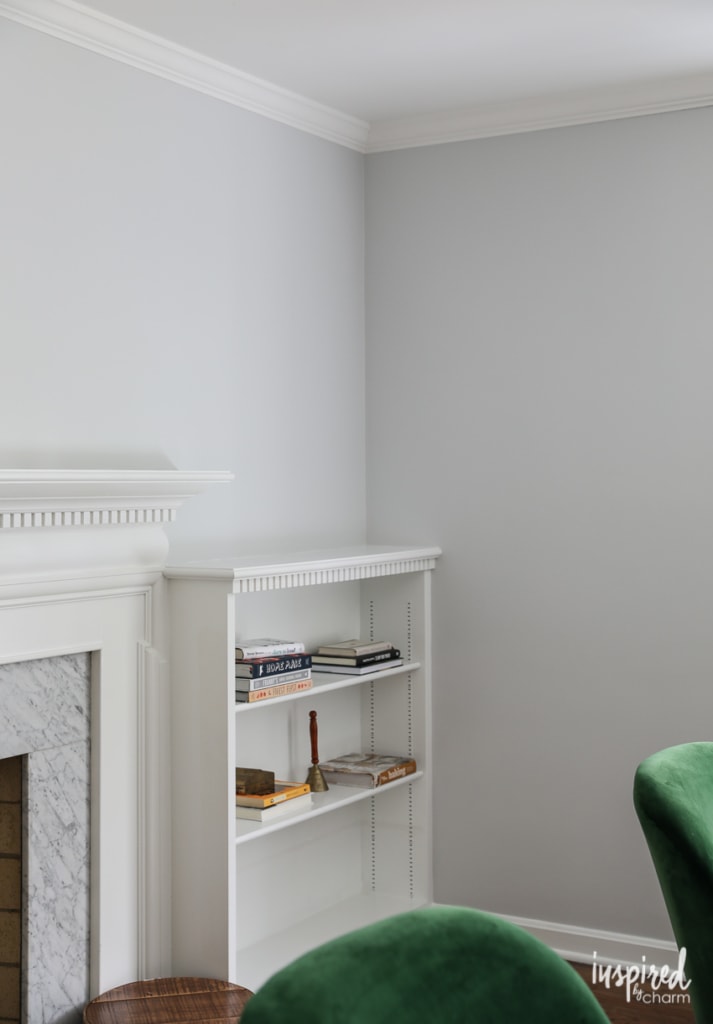
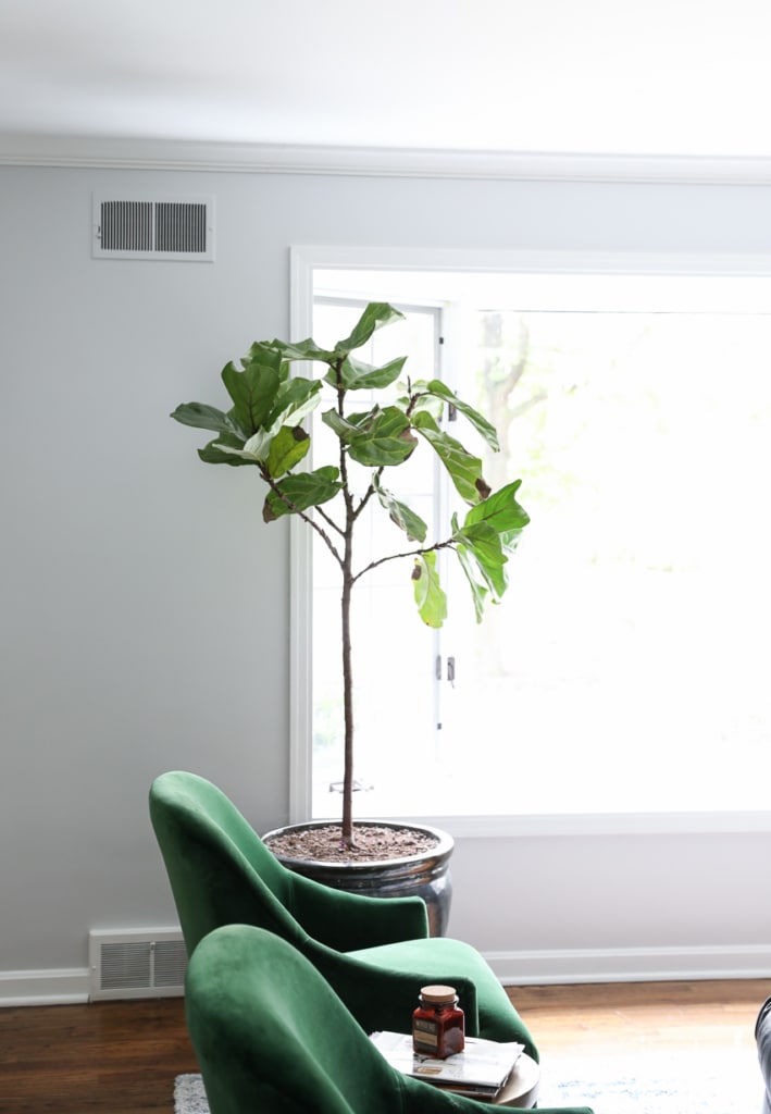
I’m not sure how the color comes across here on the blog or on your screen. Because of lighting and different screen settings, it may not appear blue at all. However, in person, it looks like a soft baby blue.
💌 SAVE THIS POST / RECIPE!
And while Dimpse is a lovely color and I could make it work, baby blue walls are just not my jam for this space. I actually like it more in pictures, but less in real life.
I’m going to live with it for a few days and see how I’m feeling about it, but my gut tells me that I’ll be repainting it next week. Lol.
I don’t mind painting, and this room came together quickly. but I’m still kicking myself for not getting it right the first time. Still, it’s the first room I painted in the house so I’m allowing myself a bit of grace.
This is an excellent example of the importance of testing paint colors on your walls. You may love the color of a wall you see online, but because of light (or lack thereof), the color could look completely different in your home. I also believe that your house will reveal what colors it wants. Not in like a creepy, ghostly way, but it will be obvious when a color doesn’t work.
I should note that the color from Sherwin Williams matches the Farrow & Ball color card perfectly according to my eyes. I did have them match a color for another project I’m working on, and the results were not as close. (This other color is much darker, so I assume that’s why it didn’t match as well.)
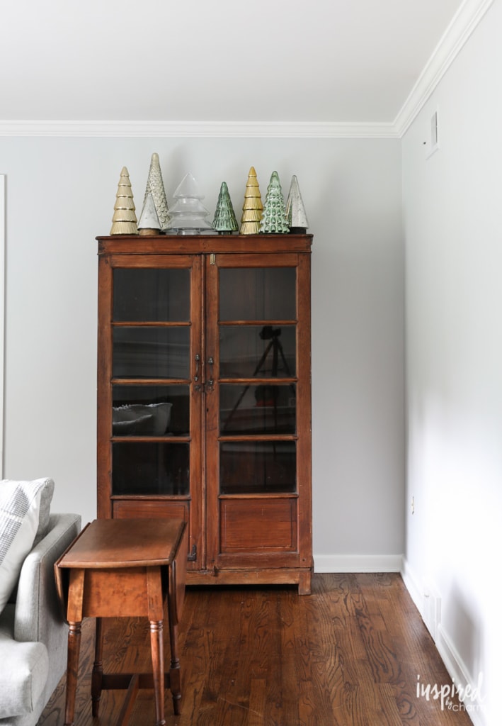
Anywho, that’s my painting adventure for the day. I’ll keep you posted on what I decide to do and how things work out. (I’ll talk to you more about my new cabinet and emerald chairs in another post. Stay tuned.)
In the meantime, I’d love to know what you think of the color or if you’ve had a similar painting “fail.” Decorating is an adventure, isn’t it?
A word of advice…the magic and quality of Farrow Ball paints is in the original paint mix itself that can not be replicated by paint mixed by othrr top brands. Original farrow ball colours will change tint under different lights, you won’t get this with mixed paint. Explains the baby blue tint I suppose.
Both Dimpse and Blackened are Farrow and Ball colors that just can’t be replicated by color matching. I’ve tried color matching with both colors and was disappointed until I got the real thing on the walls. Some colors are easier to match (dark colors) but the light ones are too subtle to duplicate. Dimpse sometimes looks gray, at other times lavender or blue but never one dimensional, always ambiguous.
Curious if you could tell me by whom the beautiful green velvet chairs are made? Thank you. Beautiful design!
Sherwin Williams paints have a gold (warm) base. Harder to color match Barrow or Benjamin Moore colors which begin with a black (neutral base). In such a case, stick to the color brand or, in my experience, use BM for the color match.