Inspired by Charm Paint Colors
This Post May Contain Affiliate Links. Please Read Our Disclosure PolicyI’ve been meaning to put together this post for awhile. Since I’ve been painting lately, I figured now was an opportune time.
People often ask about the paint colors I’ve used in my house. I thought it might be helpful to have a central location where folks can reference paint colors. This information will appear as a post today, but I will update it as I add and/or change colors. I will also create a button on the side bar so that you are able to easily reference this post whenever you may need it.
Because questions about items in the rooms may also arise, I will link a few related posts below the room colors. If you notice something is missing or you’re curious about something I don’t have linked up, just leave a comment below and I will link it if I can. Sound good?
So, without further ado, grab your party hats and paint brushes and let’s get this painting party started.
Kitchen
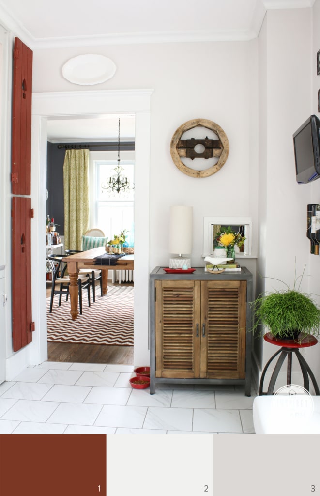
1. Fireweed (shutters) // 2. Heron Plume (walls) // 3. Moderne White (cabinets)
Dining Room
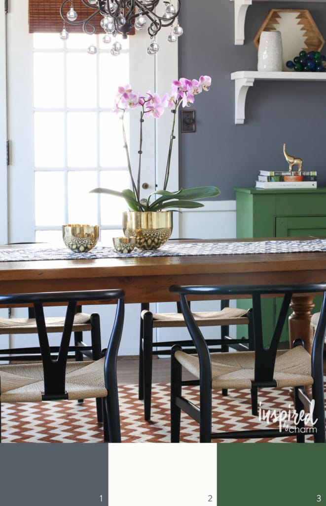
1. Dior Gray (walls) // 2. Extra White (trim) // 3. Greenfield (cabinet)
Front Entryway
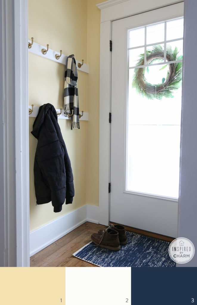
1. Banana Cream (walls) // 2. Extra White (trim) // 3. Commodore (rug)
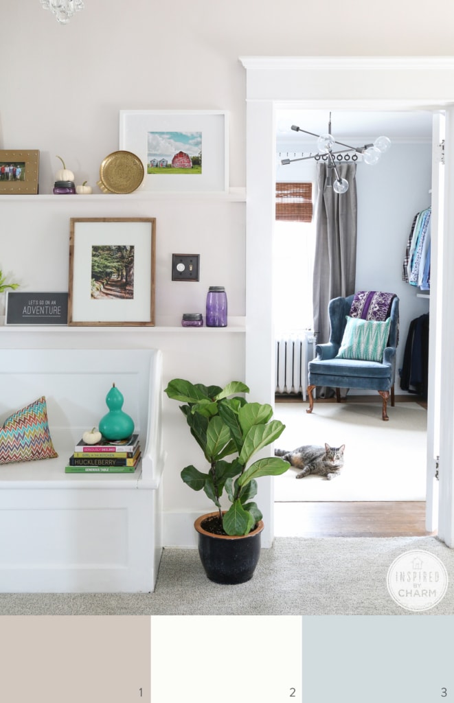
Office
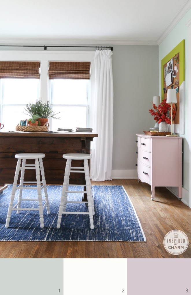
1. Aloof Gray (walls) // 2. Extra White (trim) // 3. Rosy Outlook (rug)
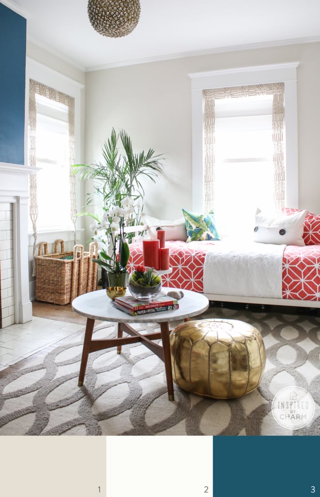
Living Room
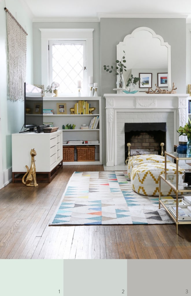
1. Lighter Mint (accent wall) 2. Aloof Gray (main walls) // 2. Sensible Hue (around mantel)
💌 SAVE THIS POST / RECIPE!
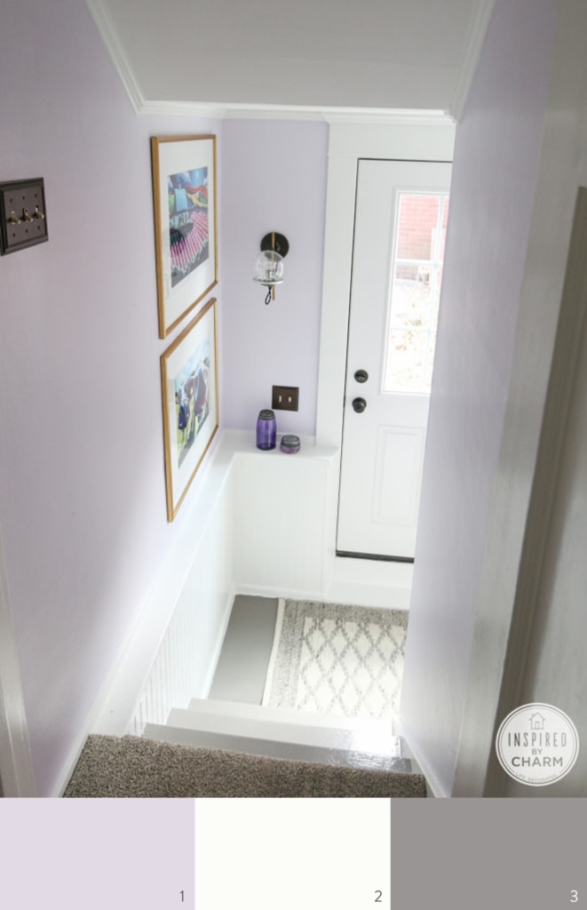
Hallway
1. Angora (walls) // 2. Extra White (trim) // 3. Rock Candy (bedroom walls)
Back Entryway
1. Elation (walls) // 2. Extra White (trim) // 3. Cathedral Stone (floors)
Master Bedroom
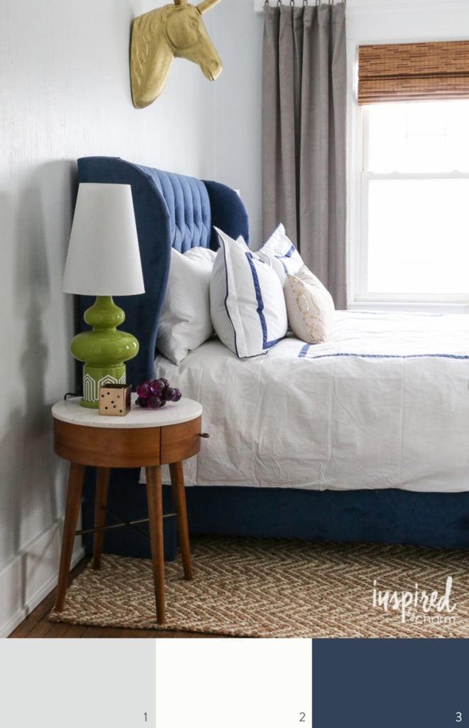
1. Rock Candy (walls) // 2. Extra White (trim) // 3. Loyal Blue (bed)
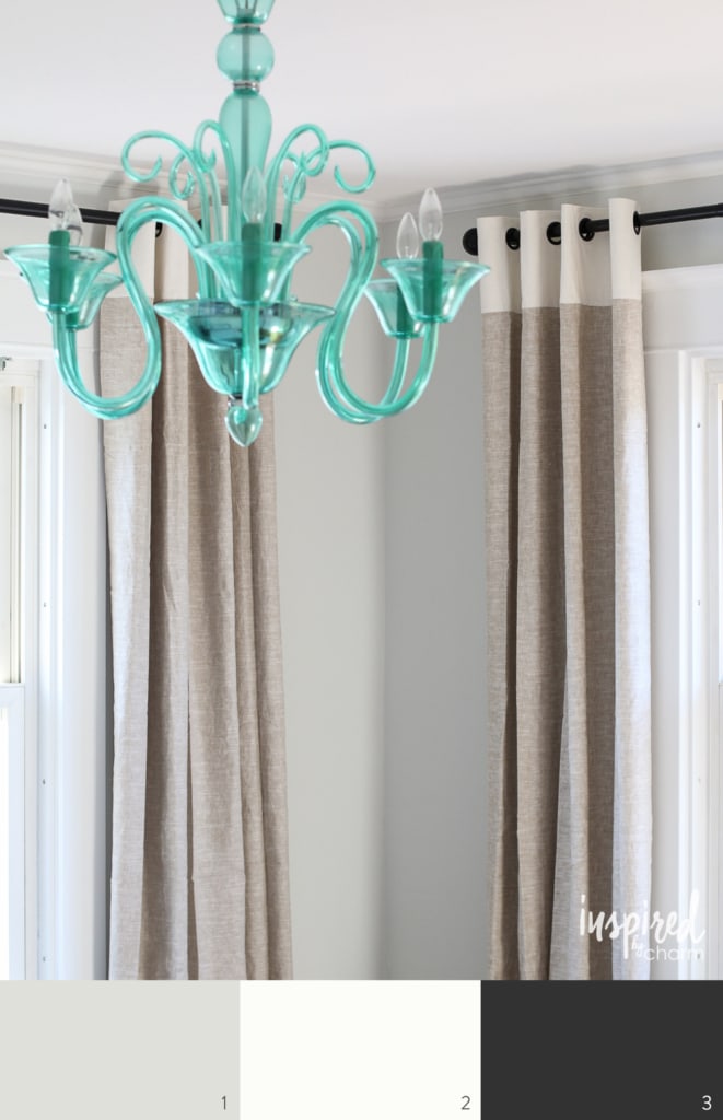
Master Closet
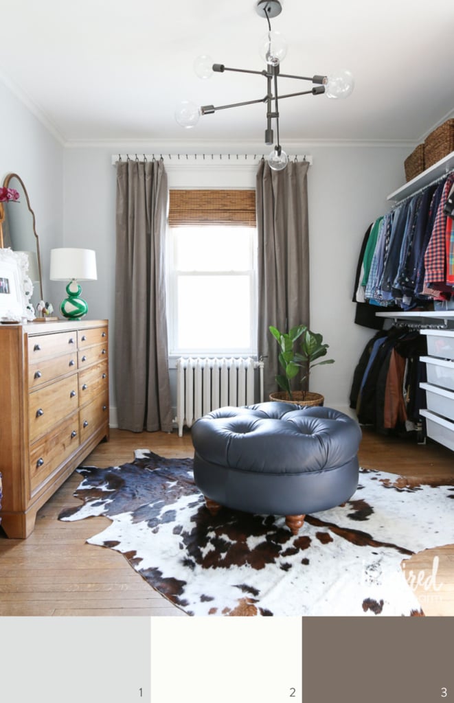
1. Rock Candy // 2. Extra White (trim) // 3. Ellie Gray (curtains)
Guest Room #1
1. Reserved White (walls) // 2. Extra White (trim) // 3. Black Magic (bed frame)
Guest Room #3
1. Shoji White (walls) // 2. Extra White (trim) // 3. Slate Teal (accent wall)
All of the trim throughout the house is Extra White (right out of the can) by Sherwin Williams. It’s their ProClassic trim paint in semi-gloss. All of the walls are a satin / eggshell finish.
I hope this answers your painting questions. Again, if there are additional details you’d like, please leave your questions below. Happy Painting!
The chandelier over the dining room table… would you mind sharing where you purchased it? It is adorable!
It was from Pottery Barn.
xo Michael
Stunning home, my favorite and most Christmas spirit of all the open homes this season! Just amazing!!
I love how you posted color swatches, links, and actual painted room/decor ideas to this post.
We are a small painting service business and our clients always asks for swatches as well as “the final look” pictures if possible.
Also, it’s always hard to picture the paint colors with furnitures and decors. Great article.
Thank you!
Hi, do you have a source for the mirror above the mantel? thanks!
It was from JcPenney several years ago.
xo Michael
You just made it SO simple to paint my house! All of those color combinations will be easy to re-create when I do a complete house make-over! Thank you for your creativity!
We at Ready2Paint love painting surfaces with Farrow and Ball paint!
Awesome post and very nice choices. Very helpful as I am trying to figure out colors for a new (renovated) house. Thank you!
Awesome reference post. Finding some great inspiration here!
These colors are so beautiful!! My kitchen and sun porch are both painted Banana Cream, and my parents unknowingly did their bedroom in the same exact color. Crazy! Out of all the shades of yellow!! Your use of it makes us feel as if we’ve really done something right!! You’re awesome!
Wonderful. However whats an additional period? we wanna escape this trench!
Sitting here on NYE with my husband while he watches football, and I’m obsessing over your blog. I lived in Carlisle PA for 7 years… So I feel like we are central PA kindred spirits!! Your house is fantastic!
Absolutely LOVE your home! Oh if only I could make mine look half as good as yours. It is absolutely DIVINE!
So, I would like to try out some of these paint colors. I went onto the Sherwin Williams website and there are so many different kinds of paint: Ovation, Cashmere, Harmony, Duration, Emerald. Which type of paint did you use for your walls?
Recently I’ve been using the Emerald and really love it.
xo Michael
Hi, Michael! I’m completely enamored with your home! I absolutely love every single detail, and I’ve been pouring over your blog for months now. So, can you come to Saint Louis and decorate my home now? It’s 100 yrs old and reminds me a lot of yours as far as the ceiling height and tricky spaces that aren’t squares. That’s why I have an awful time making decorating decisions! That, and I don’t want to invest time and money and be wrong. I need courage and help! My question for you is: how do you like your mint/gray side by side in the living room? In your pics, they don’t look so much as separate colors, and I wonder how they do in person. I’m thinking of using your downstairs colors as my palette but need guidance. Thanks! Also, I’d be honored if you checked out my Etsy store: http://www.etsy.com/shop/ohsopoppy. I’d love to gift you a piece! Let me know!
I know, it’s nothing you haven’t heard before, but you are SERIOUSLY talented. I adore your home! One of my friends saw your living room pinned on my pinterest board and is coming over tomorrow to help me move around my furniture/layout to look more like yours… but will she help me paint? That is the question. Anyway, thank you for the beautiful inspiration and sharing it with everyone!
Hi Michael,
Just found your blog and have been pouring over it, and Love your style and your fearless color choices. Just want to let you know that your trim color is really called Extra White -SW7006 “right out of the can” because it comes from the factory that way as opposed to tinting at the store. Just clarifying because Sherwin does have a color SW7007 Ceiling Bright White. I will definitely be back to visit and will recommend! Best, Karen
I really liked how Aloof Gray looked in your home that I decided to use it in mine and I love it! It has hues of green and blue that change throughout the day depending on the light. A while back you had a link to another blogger who painted her home the same color and it looked so sophisticated. Thanks!
You’re so welcome! I’m thrilled it worked out for you. And yes, it was Emily Henderson, my design goddess! Haha.
xo Michael
I’ve coveted the pink chest of drawers in your office for ages. Care to share it’s paint color? Thank you
Great question! This is actually a vintage piece. I didn’t paint it. However, it does need a fresh coat of paint as it’s pretty chippy and not in a good way. I just looked at my Sherwin Williams palate and Rosy Outlook ( http://www.sherwin-williams.com/homeowners/color/find-and-explore-colors/paint-colors-by-family/SW6316-rosy-outlook/ ) is almost a perfect match! Hope that helps.
xo Michael
I don’t know what it is. I usually blame the fact that I’m slightly colored blind because I always pick the wrong paint colors. Wow thanks for sharing and I’m going to be using some of these!
Glad I could help! 🙂
xo Michael
Finally, I’ve been hoping you’d list all your paint colors in one spot. Thank you! Thank you! And just in time for SW’s sale. I’m excited to try “Aloof Gray.”
It’s one of my favorites! Hope you love it.
xo Michael
All the colors you’ve chosen are beautiful, Michael! I’m not fond of yellow walls, but that Banana Cream my very well change my mind! The reference button for this post is a great idea! Your house is absolutely lovely and you should be very proud of all the hard work you’ve done. It shows! TFS
Thanks Kris. And yes, Banana Cream turned out to be a great color. There is a bit of orange in it, so it’s not in-your-face yellow.
xo Michael
Great job! Really pretty color scheme…
Also thanks for the color block guides..
Now I know exactly what colors I need & the names…. Hope you have a lovely,
Meaningful Thanksgiving?